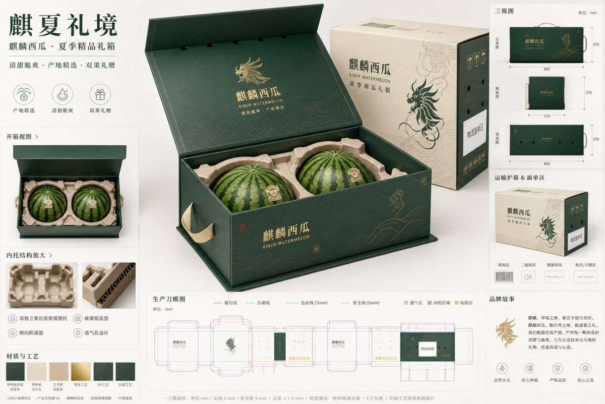
Premium Kirin Watermelon Ecommerce Packaging Concept Board
Prompt
Task: Design a high-end fruit ecommerce packaging proposal board for "Kirin Watermelon", themed "Kirin Summer Gift Realm", targeting urban high-end families for gifting, corporate bulk buying, and boutique fresh-food ecommerce gift box scenarios. The output should be a professional, restrained, and realistic packaging design proposal board, not a standard advertising poster.
Brand Positioning and Audience: premium fresh fruit ecommerce gift packaging for Kirin watermelon, restrained luxury agricultural gifting, trustworthy, fresh, premium, modern Chinese aesthetic, audience includes urban families, summer seasonal gifting buyers, enterprise welfare procurement, boutique fresh-food ecommerce consumers.
Hero Packaging Structure: At the center of the frame is an oversized 45-degree hero package, occupying about 50% of the image. The packaging follows the logic of an "integrated book-style flip-top gift box + external shipping protector box". The gift box is a horizontal rectangular prism with a stable proportion and crisp edges; when the cover is fully opened, the inner tray and two fruit slots are visible. The shipping protector box appears as a secondary module on the side, demonstrating its pressure resistance, protection, and shipping label area in a simple manner. The gift box handles should not be fragile cut-outs, but reinforced webbing handles or hidden side-carry structures. The bottom structure must be thick, with a locking bottom or tray-style load-bearing logic. The entire packaging must not look thin or cheap; it must have realistic rigid board and corrugated structure thickness.
Fruit and Inner Tray Logic: Kirin watermelons are large and heavy; the solution uses a 2-fruit pack. The interior features a dual independent fruit slot array using a molded pulp insert / paper-pulp tray with contour support, each watermelon seated into a shaped cradle, with honeycomb-paper bottom cushion, top stabilizing ring, side anti-roll ribs, clear lid clearance, and visible ventilation path. The fruits must not be suspended, must not press against each other, and must not rely on the rind for direct load-bearing or impact. In the unboxing module, two fruit slots, limiting rings, bottom cushioning, extraction hand-positions, and ventilation hole paths should be clearly visible. A single sliced watermelon can be added as a small auxiliary element to emphasize category identification, but it should not overshadow the main packaging.
Visual Identification System: The overall style is high-end Oriental agricultural gift packaging, clean premium packaging board, modern Chinese typography mood, restrained composition. Primary colors are deep ink green and jade white, with pale wisteria yellow as an auxiliary color and small accents of watermelon red and low-saturation gold foil. The graphic language is derived from "abstracted Kirin patterns + watermelon vine curves + summer wind field textures," but it must be minimalist, regular, and suitable for large-area packaging, avoiding traditional complex "Guochao" clutter. Surface materials are depicted as special paper laminated on greyboard, partial gold foil logo, partial UV product names, and delicate embossing. The number of processes should be restrained, not exceeding three key effects. Paper texture, corrugated edge thickness, and the fiber feel of the molded pulp tray should be clearly visible.
Proposal Board Composition: Use a clean studio presentation board with a light warm white background and a slight jade gradient. In addition to the central hero package, surround it with 7 to 8 auxiliary modules arranged in a modular grid:
1. Unboxing View: showing the dual fruit slot inner tray structure after opening the flip cover
2. Three-View Drawing: small thumbnails of the packaging exterior from the front, side, and top
3. Inner Tray Detail: showing the pulp tray, honeycomb bottom pad, top limiting ring, and extraction hand-positions
4. Shipping Box Module: showing the outer protector box, shipping label area, barcode area, and QR code placeholder
5. Dieline Structure Schematic: production-intent dieline visualization, not pretending to be a fully production-ready file
6. Material and Process Swatches: special paper, pulp tray, gold foil, partial UV, embossing
7. Key Dimension Annotations: gift box outer dimensions, single fruit slot clearance, handle position, ventilation hole avoidance logic
8. Brand Story Module: a small area displaying the "Summer Boutique Melon Gift" positioning phrase and origin emblem
Dielines and Production Markings: Arrange a readable but non-distracting dieline module at the bottom right or bottom. Use standard legends: red solid line for cut, blue dashed line for crease, green for bleed, purple for safety line, light green for ventilation holes, light brown for inner tray cushioning areas, and yellow for adhesive positions. Annotations should be clean modular annotations, unit mm, bleed 3 mm, safety margin 5 mm, finished-size tolerance +-1 mm, die-cut tolerance +-0.5 mm, print registration tolerance +-0.3 mm, logistics label zone, barcode placeholder, QR placeholder, traceability code placeholder, batch/date placeholder. All code areas must be clearly labeled placeholder zones, not fake readable codes.
Lighting and Camera: soft studio lighting, premium commercial packaging photography, realistic shadows, subtle reflections, balanced white background, sharp focus, high resolution, professional industrial design board, clean alignment, generous negative space, realistic scale, luxury ecommerce proposal board, landscape composition, 16:9 ratio. The hero package is most prominent, with auxiliary modules clear but smaller, overall resembling a real packaging concept board presented to a client.
Packaging Copy Blocks: Attempt to render short and clear text on the packaging, avoiding dense long paragraphs. Visible text control is limited to a few short phrases:
Main Brand: 麒麟西瓜
English Subtitle: KIRIN WATERMELON
Proposal Title: 夏季精品礼箱
Auxiliary phrases: 清甜脆爽 / 产地精选 / 双果礼赠
Corner labels: Origin emblem / Variable information area / Logistics label area / Barcode area / QR code area
Treat all text as short label-style typography, maintaining a high-end feel and white space, without generating large blocks of illegible text.
Final Effect Requirements: professional premium fruit ecommerce packaging proposal board, one oversized 45-degree hero package, photorealistic paper and corrugated texture, heavy-fruit protective insert, coherent opening structure, realistic rigid gift box plus shipping sleeve logic, production-intent dieline visualization, restrained luxury agricultural brand identity, clean technical annotations, physically plausible structure, elegant high-end Chinese packaging presentation.
Copy PromptCopied!Jade WhiteProfessionalTechnicalModular Gridclean compositionGPT Image