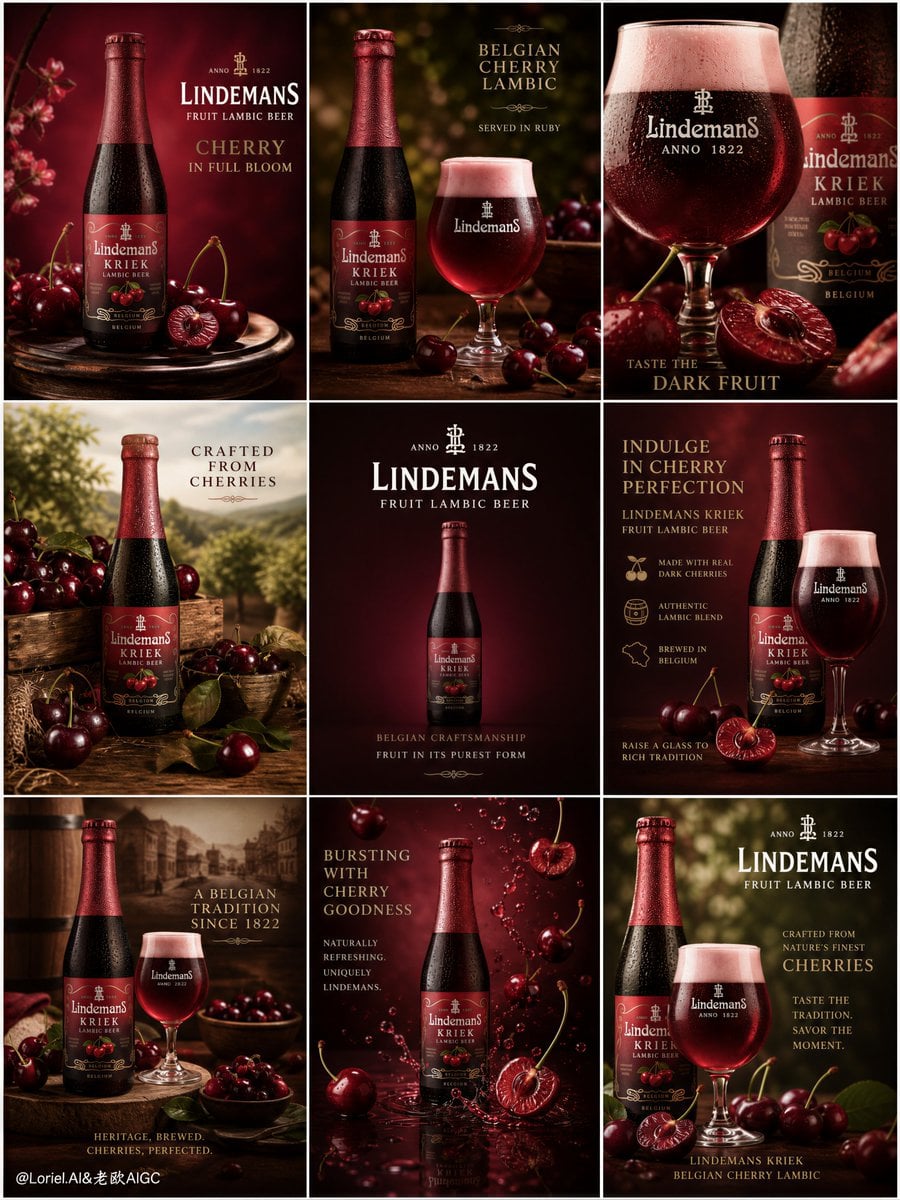
Lindemans Cherry Lambic Luxury 9-Panel Campaign Matrix
Prompt
Create an ultra-premium 9-panel editorial campaign board for Lindemans Fruit Lambic Beer, designed as a cherry-flavor-dominant luxury beverage marketing matrix. The final result must feel like a world-class brand launch system for a cherry-led Belgian fruit lambic: visually rich, commercially intelligent, highly polished, and unmistakably premium. Use a refined 3x3 grid where every tile belongs to the same cherry universe, while each panel serves a different campaign function and product scenario.
Use a clean 3x3 square grid layout.
Each panel must feature a real Lindemans Fruit Lambic Beer product rendered with absolute fidelity:
authentic bottle or glass silhouette,
correct Lindemans label design,
legible branding,
realistic bottle glass,
premium reflections,
true beer color,
subtle condensation if appropriate,
and unmistakable product identity.
The product must remain the hero in every tile.
The key visual concept is one unified cherry campaign world.
Across all nine panels, build a refined brand universe centered on:
dark cherries,
split cherries with rich juicy interiors,
cherry stems,
deep ruby-red beer tones,
Belgian orchard romance,
premium serving ritual,
and elegant fruit-lambic atmosphere.
Every panel should feel linked by the same cherry-led art direction, but still offer a distinct creative marketing role.
Panel direction suggestions:
1. Hero bottle tile:
single Lindemans bottle on an elegant pedestal, surrounded by a few deep red cherries, with strong brand headline.
2. Bottle + glass ritual tile:
bottle beside a poured tulip or beer glass glowing in ruby cherry tones, with restrained cherry garnish.
3. Close-up flavor tile:
tight crop on the glass and beer body, foam detail, bottle secondary, cherries in foreground blur.
4. Orchard still-life tile:
bottle nested among refined cherries, leaves, wood textures, and soft Belgian orchard cues.
5. Centered product authority tile:
clean, minimal, centered bottle with strongest logo hierarchy and premium negative space.
6. Promotional copy tile:
bottle and glass with elegant campaign typography, subtle offer-style layout, still premium and not cheap.
7. Heritage serving tile:
Belgian-inspired serving scene with wood, deep fruit tones, and a curated cherry presentation.
8. Atmospheric campaign tile:
bottle with suspended cherries or delicate falling cherry droplets, showing motion and freshness in a highly controlled way.
9. Signature end-frame tile:
strongest brand-signature composition with bottle, glass, cherries, and final campaign tagline.
The whole 9-grid must balance:
product-first clarity,
flavor storytelling,
marketing variation,
and cherry-led brand cohesion.
Each panel should feel like it belongs to the same campaign family but performs a slightly different role:
hero shot,
flavor emphasis,
serving ritual,
offer tile,
brand signature,
or atmosphere tile.
The cherries must be rendered with exceptional realism:
deep burgundy-red skin,
wet reflective gloss,
subtle bloom,
natural stem texture,
split flesh with juicy translucency,
and believable organic variation.
They must feel luxurious and appetizing, never decorative clutter.
Beer rendering:
the liquid must feel rich, ruby-toned, fruit-lambic specific, luminous, and premium.
Foam should be subtle and elegant where present.
Glass reflections, liquid depth, and bottle surfaces must be physically believable and highly polished.
Background and set styling:
build a premium cherry campaign world through recurring elements such as:
deep cherry red,
black-cherry crimson,
burgundy gradients,
dark wood,
soft cream highlights,
aged orchard green accents,
and elegant Belgian rustic textures.
Allow each tile to vary slightly in composition, but keep all of them within the same tonal and material family.
Lighting:
use soft premium studio lighting with commercial beverage polish across all nine panels.
Each tile should include:
clean highlights on glass,
luminous ruby beer glow,
subtle sheen on cherry skins,
Copy PromptCopied!BurgundyDeep Tonesluxuriousstudio lightingReflective glass3x3 gridGPT Image