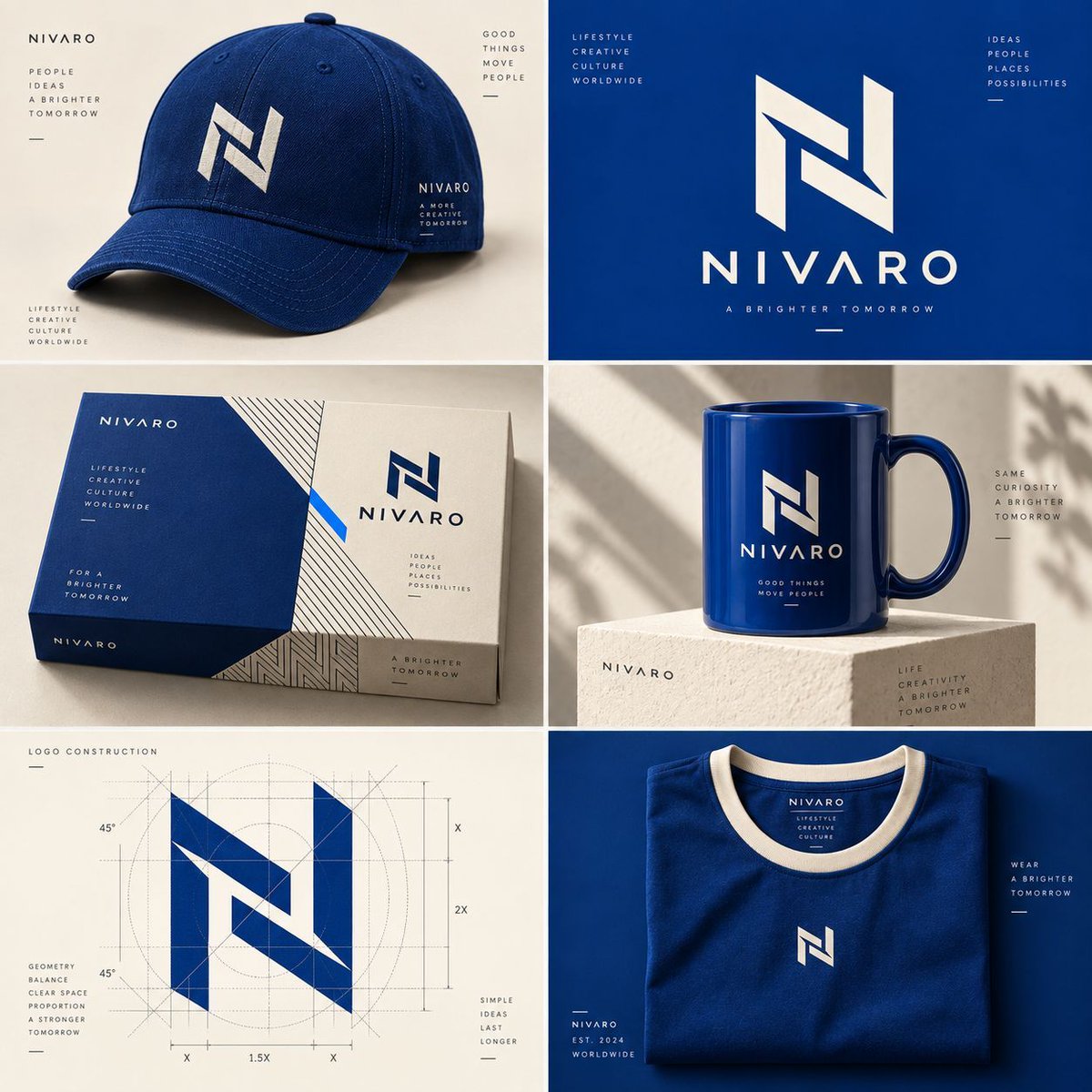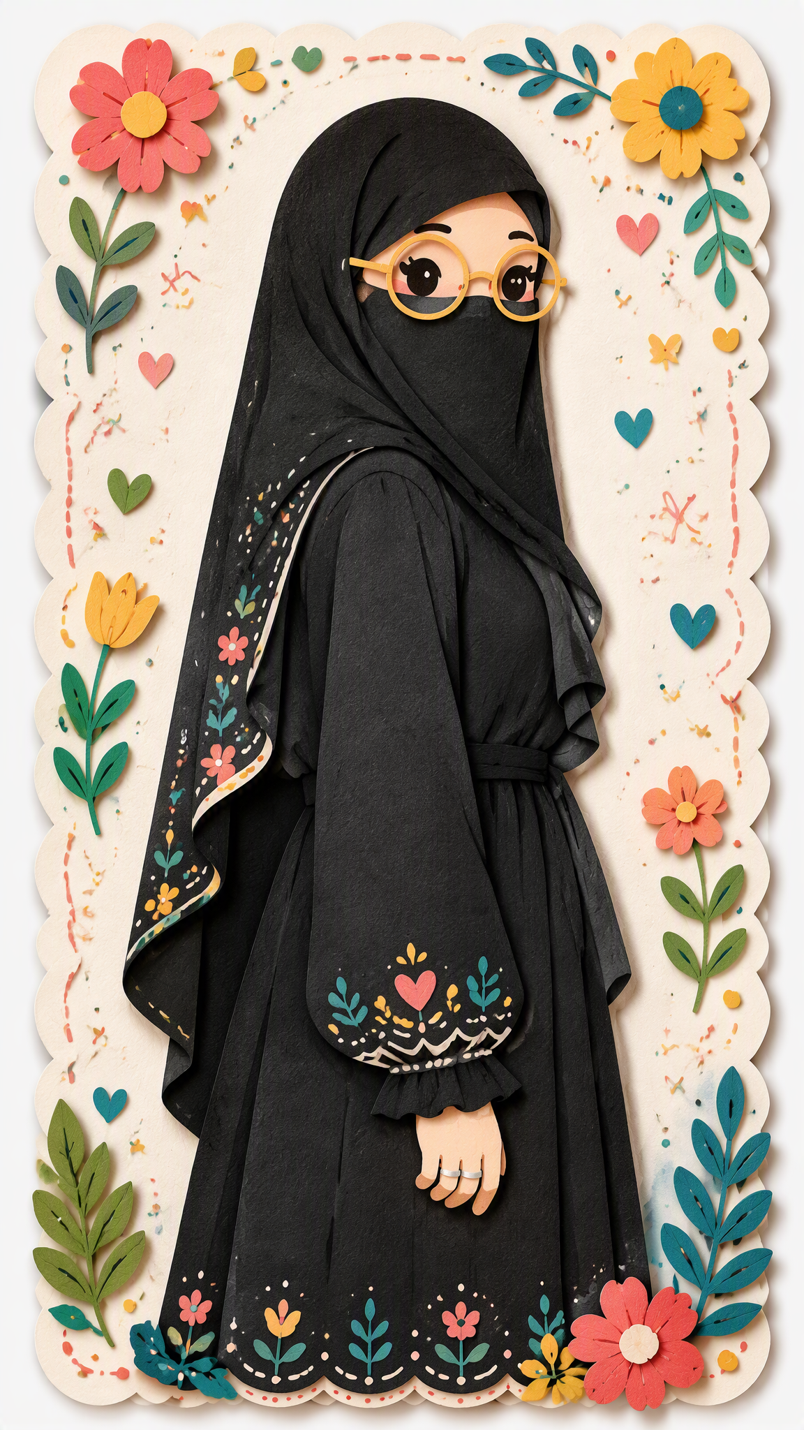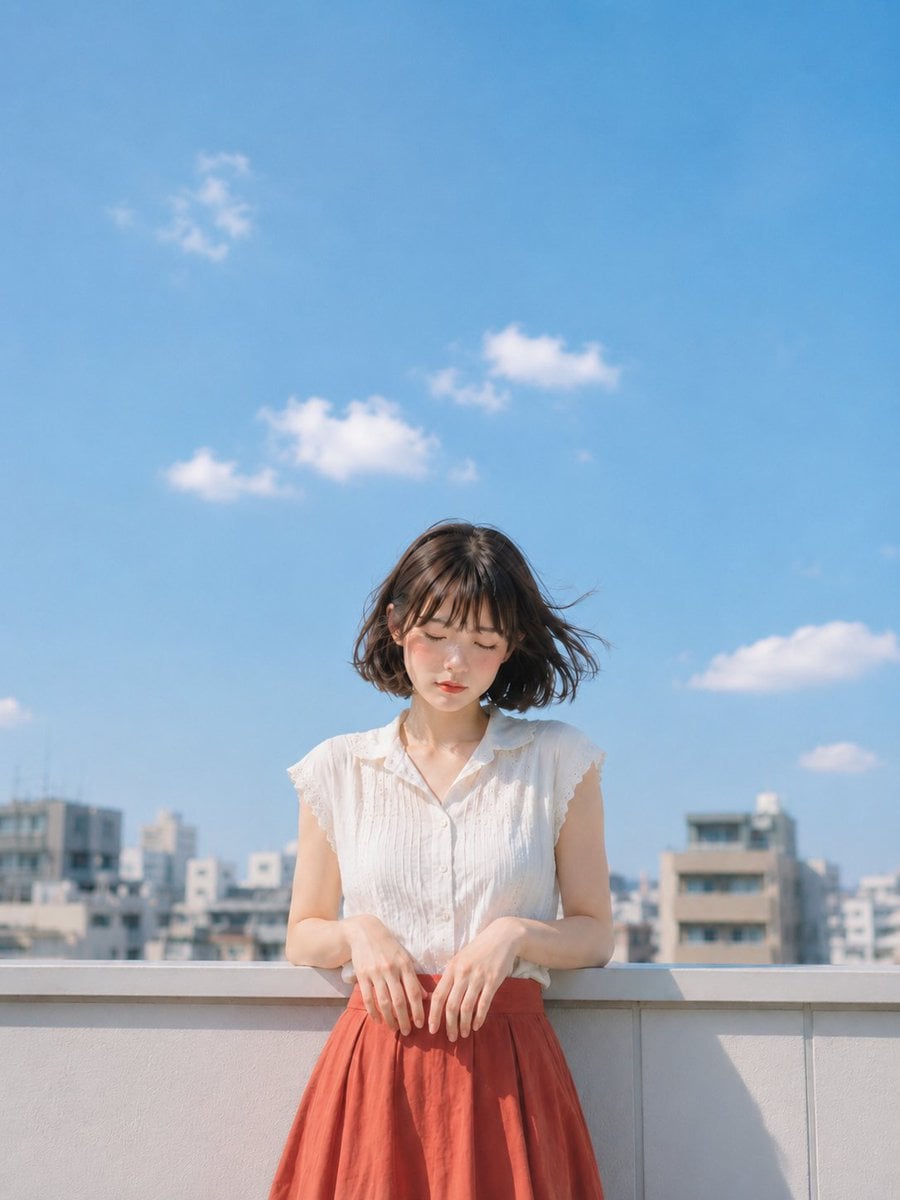
Ethereal Minimalist Information Poster
Prompt
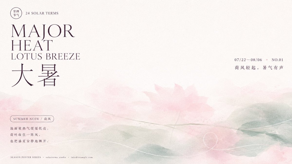
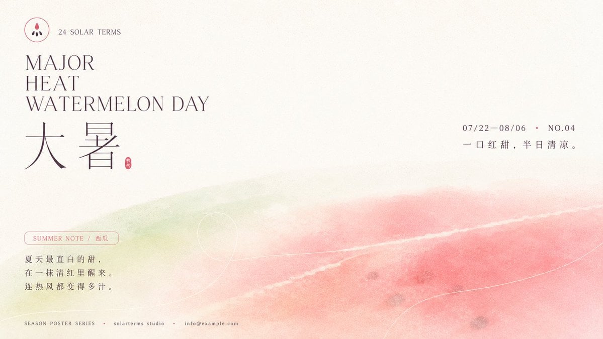
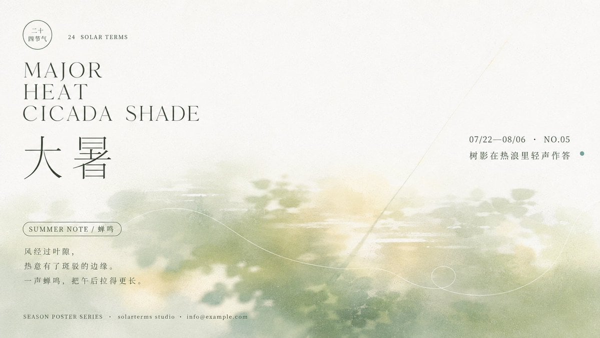
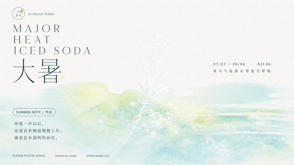
Build a clear, quiet, and breathable information poster centered around [Subject]. Let a large area of high-brightness, near-white background be the primary space. The subject imagery should not appear as a clear, realistic entity, but instead be translated into shimmering, wide-format color blocks, soft contours, and horizontal faint traces, concentrated in the middle and lower parts and naturally diffusing toward the edges; locally preserve a slightly clearer, thin directional mark penetrating the hazy area to create a slight tension between the void and the scenery. The upper part of the image remains open, with a small circular identifier and a short name placed in the top left, followed by two to three rows of staggered titles in high-contrast, thin serif English uppercase with significantly varying line lengths, followed by a set of more prominent Chinese theme characters; the Chinese characters use a slender, restrained modern Songti framework with thin horizontals and stable verticals, and the English and Chinese share a similar ink color to form continuous visual weight. In the middle right, suspend the date, symbols, and short notes, with small font sizes and generous line spacing, balancing against the large title in the top left across a wide open field. At the bottom left, arrange a rounded thin-line label with several lines of short text, where the text extends from compact short lines gradually toward the right; the bottom edge forms a long baseline with tiny contact information. A very thin, light-colored free curve enters from the bottom edge, forming a relaxed large arc and a single loop, passing through the hazy color field while avoiding main text, acting as a light rhythmic conclusion. Colors are derived entirely from the emotion and symbolic meaning of the future theme: a near-white highlight field occupies most of the space, with a low-saturation theme color forming a semi-transparent main color mist layer, supported by even lighter colors of adjacent warm or cool tendencies for transition. Text takes the deepest and most stable ink color from the theme palette, and small symbols may have a very small amount of more vivid, homologous accent colors; always maintain high brightness, low to medium-low saturation, and a clean, transparent feel. Color blocks diffuse like diluted paint, soft-focus photography, and thin air, with wide and soft boundaries, avoiding heavy shadows or strong gloss. The entire frame is covered with fine, uniform micro-grains and slight colored noise, affecting the void, color mist, and text edges to simulate a soft digital print and ink-absorption feel on paper, though the paper remains bright and clean without stains or aging browning. Finally, maintain a distinct asymmetrical hierarchy, a sharp contrast between the crisp text at the top and the hazy imagery at the bottom, and a sense of seasonal breath and modern editorial aesthetic brought by the vast amount of negative space. Subject: [Subject Content]. Aspect ratio 16:9.
Copy PromptCopied!high brightnessPastelMinimalismModern EditorialQuietEtherealasymmetricalnegative spacepaper textureHazyGPT Image