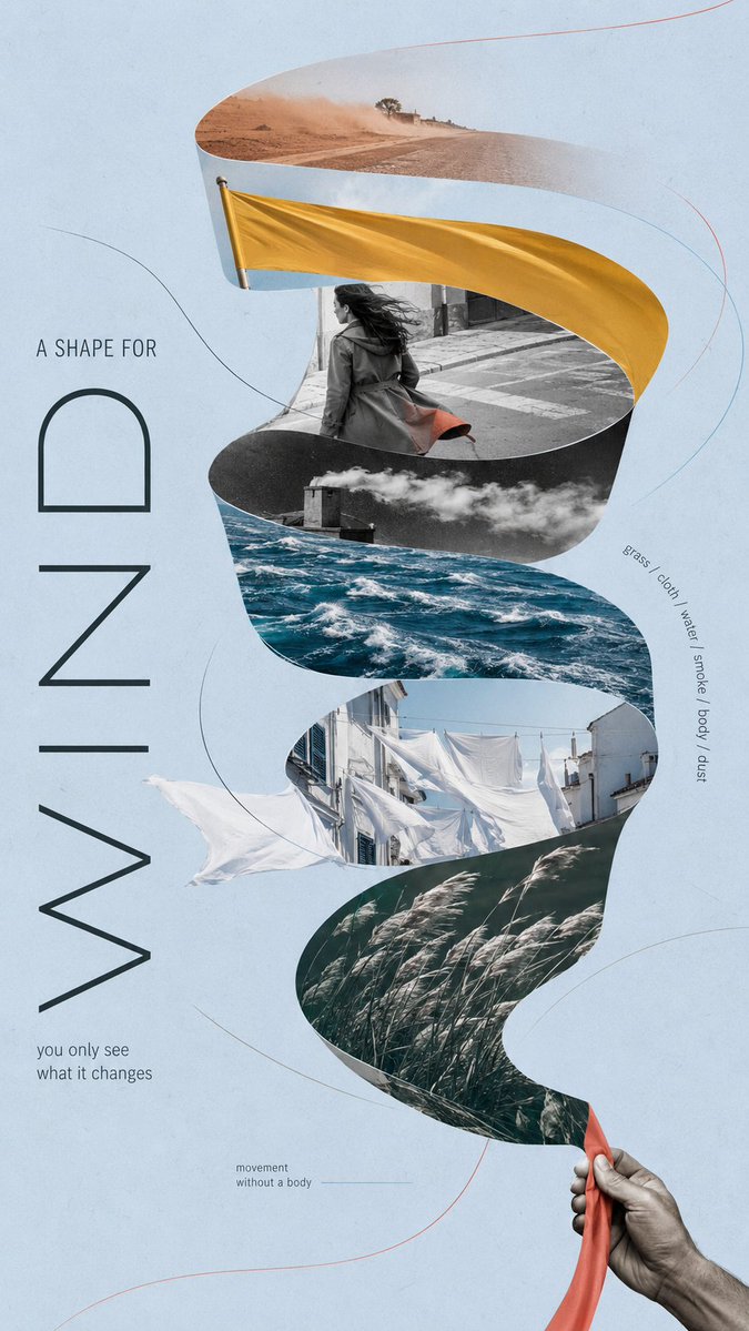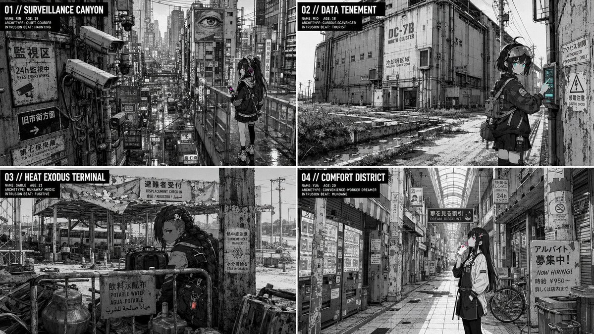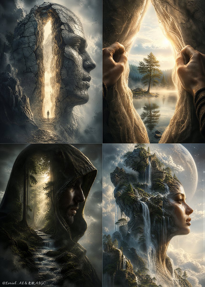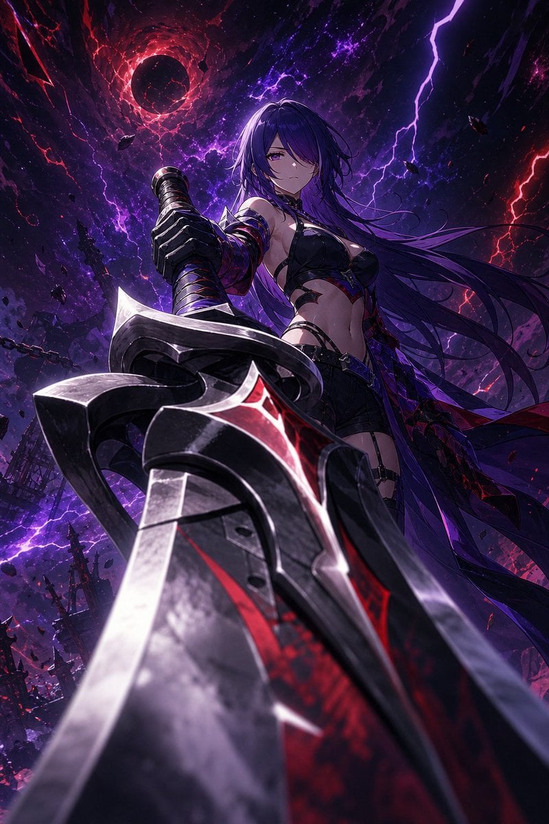
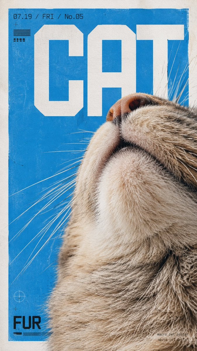
Experimental Macro-Photography Grid Poster
Prompt
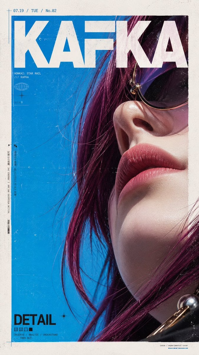
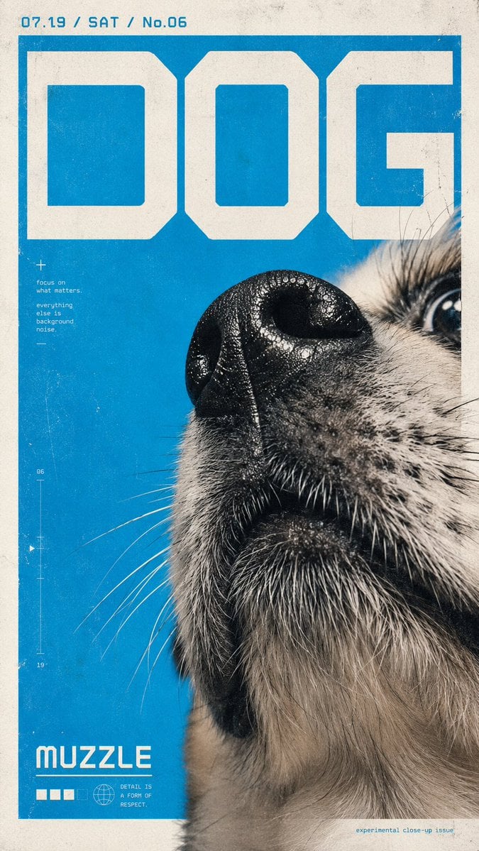
Create a vertical experimental design poster with the theme [Subject]. The overall style combines ultra-close-up macro photography, Japanese experimental graphic design, Swiss grid layout, Y2K geometric digital fonts, an independent magazine cover feel, and a printed poster texture.
The [Subject] is presented using an extremely close-up partial detail method; it does not seek a complete display, but instead chooses the most recognizable part to enter the frame, such as a face, the tip of a nose, mouth, chin, hair, surface texture, edge contours, or structural details. The lens uses an ultra-low angle close-up shot or a close-fitting wide-angle macro perspective, creating a significant 'large-near-small-far' perspective and a visual effect of 'everyday objects filmed as giant landscapes'.
The composition is a 9:16 vertical layout. A large, clean white border is reserved on the periphery, with the internal subject area appearing like a vertical poster embedded in a piece of paper. The subject enters the frame boldly from one side and extends beyond the layout edges, creating a strong sense of cropping and volumetric pressure. The subject typically occupies most of the lower and right side of the image, leaving a large area of pure background color on the other side to form a sharp visual white space and dynamic balance.
The background uses a high-saturation pure single-color base, prioritizing bright sky blue, cyan, ice blue, or electric blue to create a vivid warm-cold contrast with the subject. If the subject has warm-colored hair, skin, metal, wood, or surface textures, it should stand out more against the blue background. The overall color scheme remains simple, vivid, and restrained, centered on 1 main color + the subject's own colors + the white paper surface.
The layout includes large-scale geometric display text; the text is not just information, but a graphic structure. The typeface should be ultra-bold sans-serif, geometric cut-corners, modular strokes, digital, futuristic, and architectural, crossing the top or upper-middle area of the image in large block-like forms, interacting with the subject via intersection, occlusion, cutting, and overlapping. The text can take the form of titles, abbreviations, letters, numbers, dates, or short words; the focus is on visual shaping rather than information volume.
In the upper-left corner or top, add a set of small date / number / day of the week / issue number information using a narrow tech-style font. A larger style word or title word can be placed in the lower-left corner. In the lower-right corner, add extremely small layout information, such as poster number, design signature, series name, or a short descriptive phrase. The overall text system forms a hierarchy of Giant Title + Small Auxiliary Information + Micro Corner Layout.
The imaging quality emphasizes the feeling of a combination of photography and printing. Add fine grain, paper texture, slight wear, scratches, fading, uneven ink, old poster friction marks, screen printing feel, Risograph vibe, and a slight photocopied poster texture to the image surface. The background color blocks are not absolute digital flat fills but have slight mottling and grain. Subject details remain sufficiently clear, especially micro-textures of hair, skin, edges, beard, fibers, and reflections.
The overall atmosphere should present a sense of cold humor, youth culture, independent design, experimental visuals, and a coexistence of cuteness and hardcore. The image has a strong graphic design feel while retaining the real tactile touch of the photographic object. The final effect should be like an independent design poster / trendy magazine cover / pet art poster / experimental visual poster.
Copy PromptCopied!Electric BluewhiteHigh SaturationSwiss DesignY2KexperimentalUltra-Low AngleSwiss Gridasymmetric balancepaper textureScreen Printingdigital photographyother
![Fine-art black and white photograph of a [Subject], clean...](https://cdn.guidesref.com/trk_6a9e54a840a457.10992175.jpg)