Minimalist Designer Layout Reference Guide
Prompt
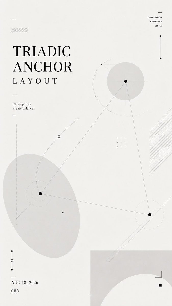
Create a 9:16 vertical composition reference poster.
Layout name: [Layout Name]
Core relationship: [Core Relationship]
Main title: [Title]
Short line: [One Short Sentence]
Date: [Date]
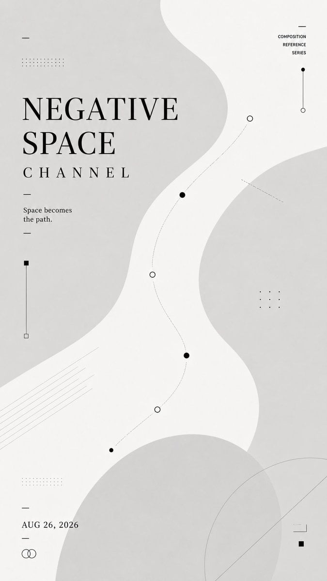
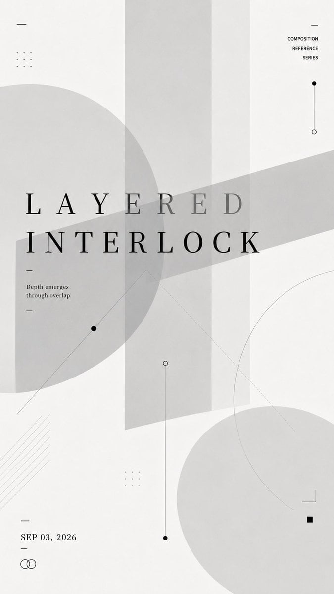
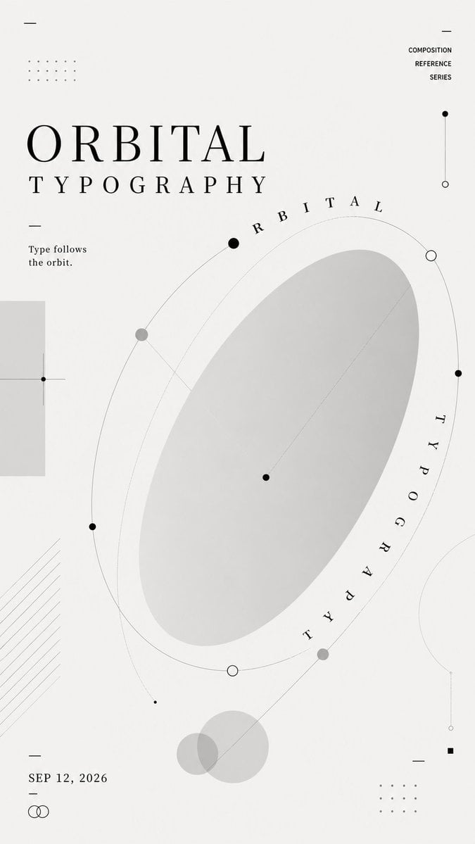
Use a soft off-white background, charcoal typography, pale gray geometric forms, thin lines, dotted paths, small nodes, and subtle transparent layers.
This is not a tutorial, infographic, or finished commercial poster. It should feel like a designer’s layout study: light, restrained, experimental, and reusable as an upstream visual reference for AI image generation.
Let the title, shapes, lines, and negative space build the composition together. The title position must follow the selected layout logic rather than always sitting at the top.
Keep the text minimal and readable. Use only the main title, one short supporting line, and the date. Do not add numbered steps, design explanations, labels, or long paragraphs.
Make the layout visually rich without becoming crowded. Add enough secondary lines, nodes, transparent shapes, cropping, and overlapping elements to create depth and structure.
The final image should clearly demonstrate the chosen composition through the layout itself, without needing written explanation.
Copy PromptCopied!Off-WhitecharcoalMinimalismSwiss DesignrestrainedexperimentalVertical Compositionnegative spaceGPT Image