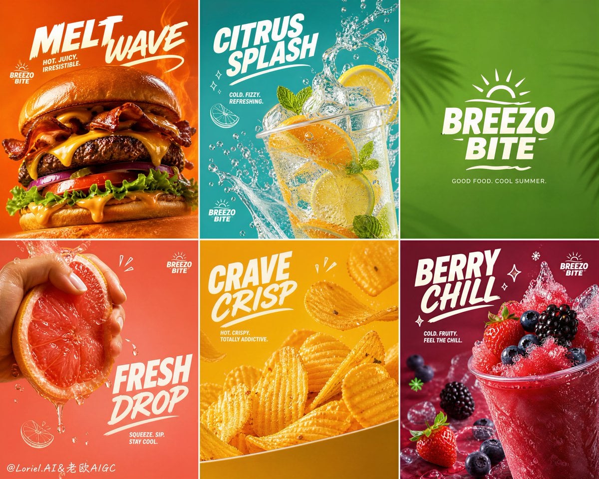
BREEZO BITE Thermal Contrast Summer Fast-Food Grid
Prompt
Create an ultra-premium 2x3 six-panel summer fast-food campaign poster for a self-created western fast-food brand called “BREEZO BITE”. The final artwork must feel like a world-class seasonal brand promotion: bold, playful, ultra-clean, highly appetizing, graphically strong, and product-dominant. Preserve a strict six-tile grid system with absolute series unity, where each tile functions like a mini flagship ad while still belonging to one coherent summer campaign. Use refined English branding, minimal supporting copy, saturated seasonal color fields, subtle playful graphic accents, and extremely realistic food photography.
Creative direction:
Follow the Milk Cloud Orbit direction and make the hot-versus-cold contrast much more explicit. The campaign must communicate summer appetite through temperature tension:
hot panels should feel molten, savory, grilled, crispy, glowing, and freshly made;
cold panels should feel icy, wet, translucent, refreshing, juicy, and instantly cooling.
The visual system must clearly separate thermal moods while still belonging to one premium summer brand world.
Core composition:
Use a strict 2x3 grid with six equal square or near-square panels. Each tile must feature one dominant summer fast-food hero or one brand-identifying seasonal lifestyle-food composition. The full board must feel rhythmically varied but tightly unified. Keep each panel clean, bold, and immediately readable, with strong product hierarchy and premium negative space.
Brand direction:
Create a self-invented western fast-food summer brand system:
BREEZO BITE
Use elegant bold English headline typography only, with a youthful, refreshing, premium fast-casual identity. Typography must feel graphic, modern, clean, and highly branded, never cheap or cluttered.
Thermal contrast logic:
This is critical. The six panels must be split clearly between hot appetite and cold refreshment.
Hot food panels should show:
molten cheese, warm steam, crisp fried edges, grilled sear marks, amber heat glow, rich sauce shine, toasted bread warmth.
Cold refreshment panels should show:
ice clarity, citrus moisture, soda fizz, berry chill, condensation droplets, wet fruit flesh, cool splash arcs, blue-green freshness.
The viewer must instantly feel the summer contrast between craving heat and cooling refreshment.
Six-panel content system:
Panel 1: an extreme hero cheeseburger close-up, towering and irresistible, with melted cheese, bacon, glossy bun, lettuce, tomato, and juicy beef, against a hot orange summer background. This panel must feel hot, rich, and molten.
Panel 2: a refreshing citrus soda or sparkling lemonade tile with sliced oranges, splashing ice water, mint, bubbles, and a cool blue-green background. This panel must feel cold, wet, and crisp.
Panel 3: a clean brand-logo tile with a fresh green seasonal color field and subtle graphic texture, acting as a visual breath between hot and cold worlds.
Panel 4: a hand squeezing a ruby grapefruit or orange wedge with chilled juice droplets flying, paired with summer drink branding and a bright tropical-cool panel mood. This panel must feel refreshing rather than warm.
Panel 5: a hero snack tile with ridged potato chips or crispy fries in a bold yellow panel, showing dry crisp golden heat, salt sparkle, and fresh-fried warmth.
Panel 6: a berry dessert or fruit slush tile with strawberries, blueberries, blackberries, icy fruit texture, and deep red-purple cooling indulgence mood. This panel must feel distinctly cold and juicy.
Product realism:
Render all food and drink elements with extreme realism and premium tactile detail: glossy burger bun highlights, molten cheese flow, beef patty sear texture, bacon sheen, fresh lettuce moisture, sparkling soda bubbles, wet citrus pulp, ice clarity, juice droplets, crispy chip ridges, salt sparkle, berry skin bloom, frozen slush texture, and luxurious sauce reflections. Every element must feel physically convincing.
Milk Cloud Orbit detail logic:
Purify the
Copy PromptCopied!saturatedhigh contrastplayfulRefreshinghyper-detailedGlossyCondensationGrid SystemSymmetricalother
![Theme: [Theme]](https://cdn.guidesref.com/trk_6aa8fa7f6432c7.27713606.jpg)

![Whispers of Velocity surrounding [Subject], where the mot...](https://cdn.guidesref.com/trk_6a8d18a8dce801.35780385.jpg)