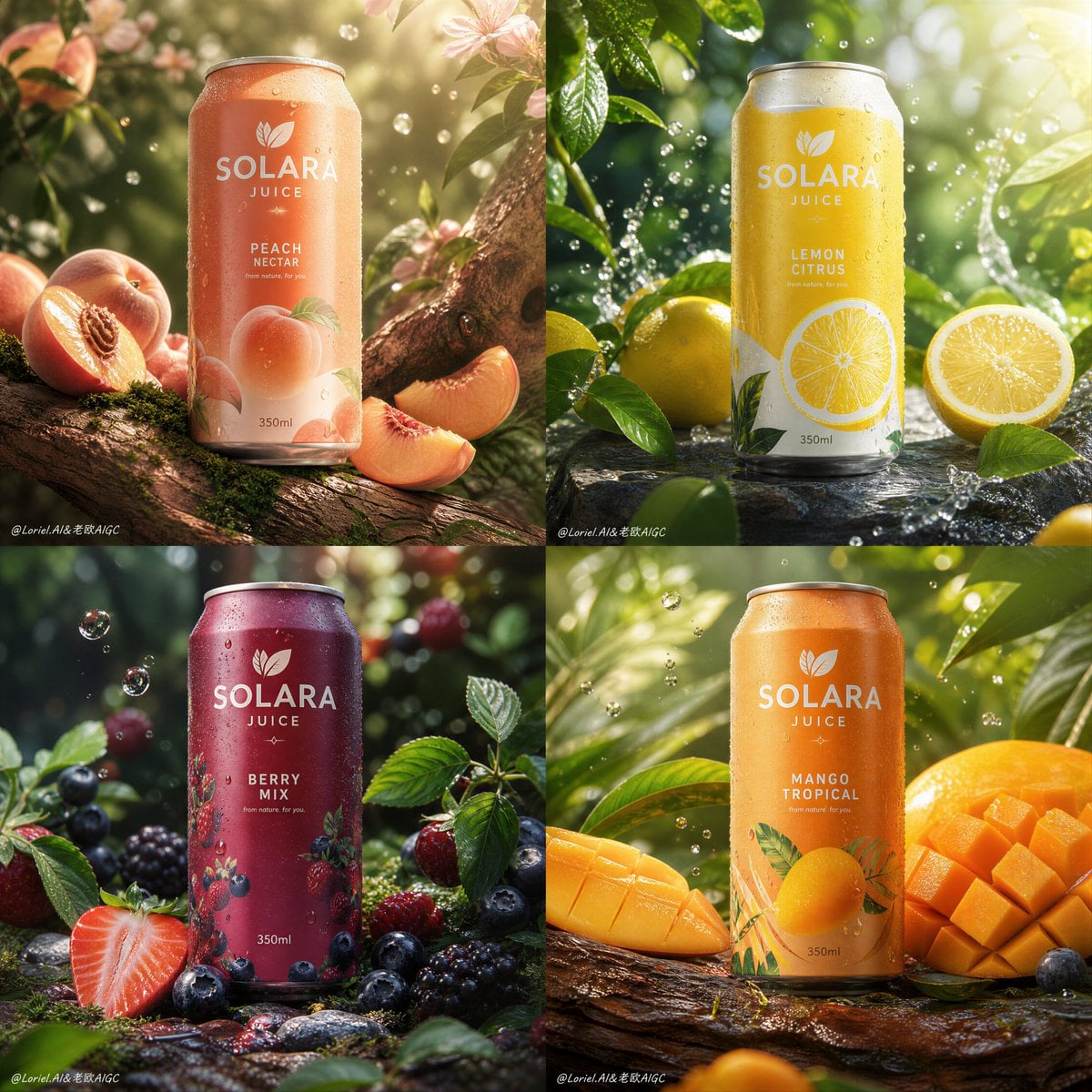
Solara Juice Premium 2x2 Nature-Centric Campaign
Prompt
Create an ultra-premium 2x2 four-panel fruit-juice can campaign poster for a self-created beverage brand called “SOLARA JUICE”. The final artwork must feel like a world-class nature-driven beverage advertisement: four highly realistic 350ml canned juice products, each representing a different natural fruit flavor, arranged in a clean four-panel system with elegant branding, minimal English typography, refined environmental storytelling, and strong product dominance. The whole campaign must feel fresh, vibrant, premium, natural, and hyper-real, with a stronger sense that each can truly belongs to its fruit habitat.
Creative direction:
Combine Milk Cloud Orbit and Cream Halo Transit, and intensify the natural feeling. Keep the exact 2x2 can-campaign skeleton, but purify the most luxurious product details while making the relationship between can, fruit, branch, leaf, bark, moss, water droplets, and natural atmosphere more organic and believable. The result must feel less like studio compositing and more like a premium beverage discovered inside a real flavor ecosystem.
Core composition:
Use a strict 2x2 grid. Each panel must feature one 350ml canned juice hero product placed prominently in a natural environment that visually supports the flavor identity. The can must remain the main focal object in each panel, with fruits, fruit particles, slices, droplets, leaves, and natural elements arranged around it in a believable but art-directed way. All four panels must feel like one unified campaign system with consistent camera logic, product scale, and visual refinement.
Brand direction:
Create a self-invented premium juice brand:
SOLARA JUICE
Brand language: natural, modern, premium, healthy, vibrant, international.
Use elegant English-only visible branding. Typography must feel refined, fresh, and globally premium, never cheap or crowded. Keep logo area, product flavor name, and support copy minimal.
Flavor lineup:
Create four distinct 350ml canned fruit juice flavors:
1. Peach Nectar
2. Lemon Citrus
3. Berry Mix
4. Mango Tropical
Each can must share one unified package system but use different label colors, fruit iconography, and flavor cues.
Can realism:
Render each can with extreme realism: accurate aluminum texture, subtle condensation droplets, soft metallic reflections, premium label print, realistic top rim, believable fruit-liquid energy, and physically correct 350ml can proportions. The cans must feel cold, fresh, and highly market-ready.
Milk Cloud Orbit product-detail logic:
This is critical. Purify the most convincing premium zones: can shoulder reflections, condensation beads, fruit-flesh translucency, cut fruit highlights, and the luminous transitions where natural light passes through juice and fruit. The can must feel more polished, the fruit more jewel-like, and the liquid more alive.
Cream Halo Transit natural-integration logic:
Keep the same structure, but reduce unnecessary graphic noise and strengthen the physical dependency between product and environment. The can should feel more convincingly supported by bark, leaves, fruit halves, moss, or natural surfaces. The fruits must feel less scattered and more behaviorally placed, as if they truly belong to the space around the can. The composition should feel more organic, more premium, and more rooted in nature.
Flavor-environment logic:
Peach Nectar:
place the can on or near a natural branch or orchard-like setting, supported by sliced peaches, soft moss, warm filtered light, and a believable botanical context.
Lemon Citrus:
place the can in a bright citrus-grove atmosphere with leaves, lemon slices, dew, zest particles, and cool freshness in the air.
Berry Mix:
place the can in a richer berry habitat with berries resting naturally among leaves, stems, and moist shaded surfaces, with jewel-like juice accents.
Mango Tropical:
place the can in a tropical green environment with mango cubes, cut mango flesh, humid botanical depth, and lush natural support sur
Copy PromptCopied!luminousFreshIntricatesoft reflectionsAluminumCondensation2x2 GridSymmetricalDepth of Fieldcommercial photographyother




![Theme: [Theme]](https://cdn.guidesref.com/trk_6aab76ffe23c31.24172334.jpg)