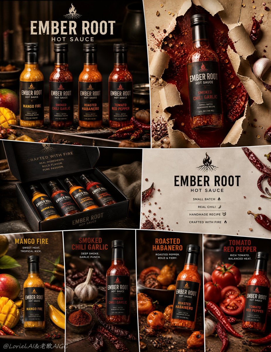
Artisanal Ember Root Hot Sauce Premium Campaign Board
Prompt
Create an ultra-premium irregular 8-panel hot sauce campaign board for a self-created artisanal brand called “EMBER ROOT HOT SAUCE”. The final artwork must feel like a collector-grade handcrafted flavor-series advertisement: highly structured but visually dynamic, with an irregular panel mosaic rather than a simple equal grid. The campaign must feature four realistic glass-bottled hot sauce products, each with a distinct flavor identity, repeated across different panel treatments, supported by chili-based ingredients, refined kitchen-accent background cues, premium English branding, and a bold tear-through-paper impact panel. The whole system must feel modern, tactile, handcrafted, fiery, and premium, while keeping the bottles as the absolute heroes.
Creative direction:
Combine Milk Cloud Orbit and Cream Halo Transit, and intensify the handcrafted hot sauce identity. Keep the exact irregular 8-panel skeleton, but make the bottles, sauce texture, ingredient styling, and packaging feel more clearly small-batch, artisan-made, and chef-driven. The final image must feel less like mass-market retail sauce and more like a premium handmade hot-sauce collection built from real peppers, real garlic, real spice oils, and slow-crafted recipes.
Core composition:
Use an irregular 8-panel board with varied panel sizes and aspect ratios, but with strong overall balance. The system should include:
1. one lineup panel showing all four sauces together,
2. one dramatic hero bottle panel with a tear-through-paper effect,
3. one premium packaging or gift-box panel,
4. one clean brand-information panel,
5. four smaller or medium product-focus panels showing the individual bottles in different flavor environments.
The board must feel like one unified artisanal flavor-series launch campaign with clear product hierarchy and excellent visual rhythm.
Brand direction:
Create a self-invented premium handcrafted hot sauce brand:
EMBER ROOT HOT SAUCE
Brand language: bold, artisanal, modern, fiery, premium, ingredient-forward, small-batch.
Use elegant English-only visible branding. Typography must feel strong, contemporary, and premium, never cheap, never generic. The logo and label system should feel globally market-ready but rooted in handcrafted authenticity.
Product lineup:
Create four distinct handcrafted glass-bottled hot sauces:
1. Mango Fire
2. Smoked Chili Garlic
3. Roasted Habanero
4. Tomato Red Pepper
All four bottles must share one unified glass-bottle shape and packaging system, but each must have its own label color, sauce tone, spice density, and ingredient cues.
Bottle realism:
Render each bottle with extreme realism: transparent glass, believable sauce viscosity, realistic cap texture, premium label print, subtle surface reflections, visible suspended chili seeds or spice particles where appropriate, and accurate bottle proportions. The bottles must feel premium, intense, and physically desirable.
Milk Cloud Orbit product-light logic:
This is critical. Purify the most convincing premium zones: glass shoulder reflections, sauce translucency, oil-rich highlight bands, chili skin specular points, and the glossy edge where thick sauce meets bottle glass. The bottles must feel more polished and more flagship-like, while the sauce itself feels richer, denser, and more alive.
Cream Halo Transit hierarchy logic:
Keep the same irregular 8-panel structure, but reduce non-product noise and tighten the relationship between packaging, single-bottle panels, and info panels. Text, icons, and supporting graphics should become more selective and more integrated so the handcrafted sauce, ingredients, and glass bottles dominate more absolutely.
Handcrafted sauce logic:
This is critical. The campaign must clearly feel like handmade hot sauce. Show subtle natural inconsistency in chili flakes, seed distribution, spice sediment, garlic texture, roasted pepper fiber, and thick slow-cooked sauce body. The sauces should feel kettle-made, chef-developed, and s
Copy PromptCopied!hyper-detailedGlasscommercial photographyBrand Campaignother
![[Letter]: {T / Y / P / E / any letter}](https://cdn.guidesref.com/trk_6a87c819aed2e6.97921757.jpg)