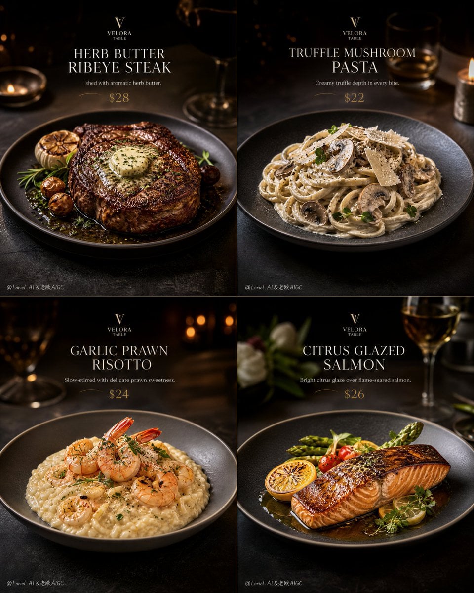
Velora Table Luxury 4-Panel Dining Campaign
Prompt
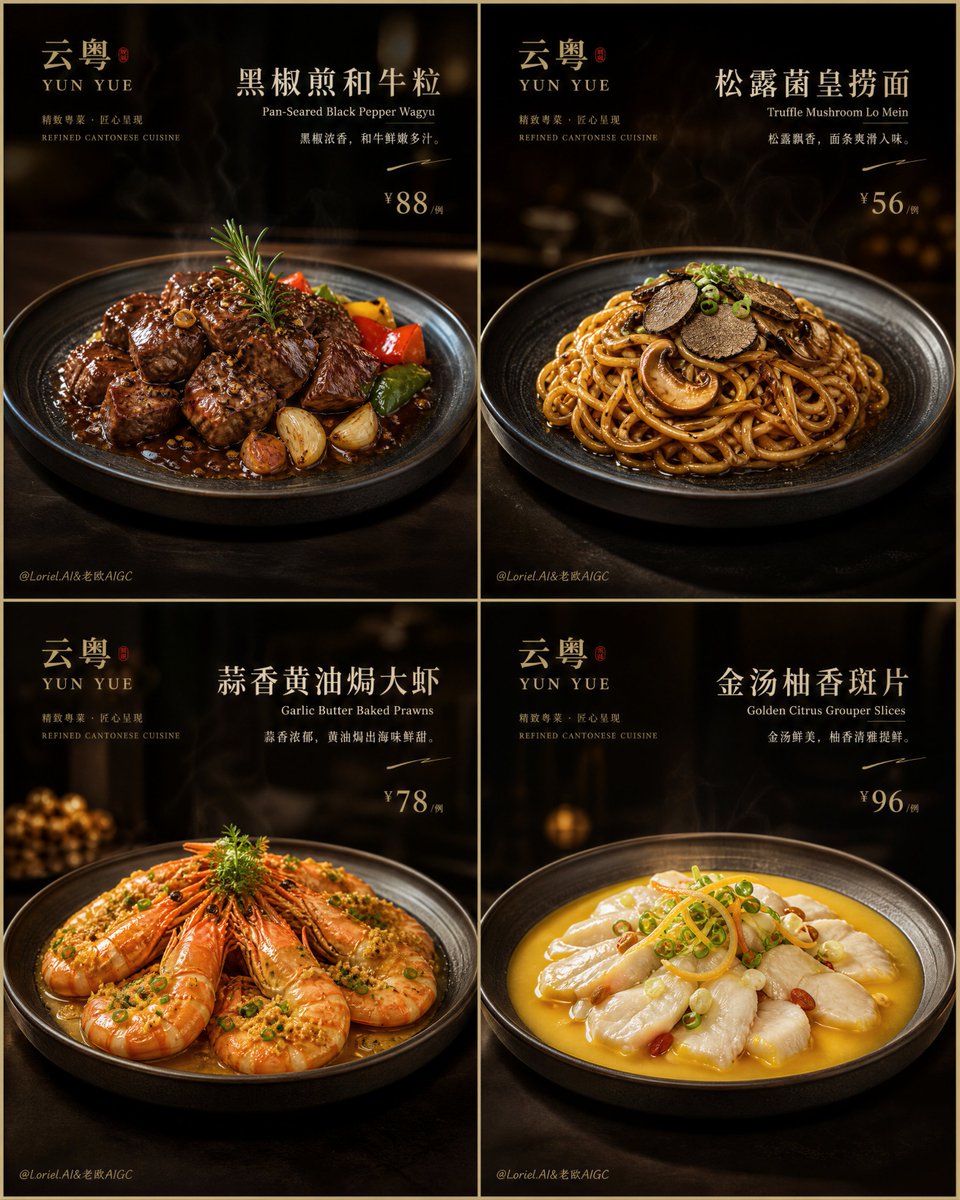
Create an ultra-premium 4-panel promotional poster for a fictional refined Western dining brand, designed as a luxury restaurant social-media key visual campaign. Use a strict 2x2 grid, with each panel functioning like a polished high-end dining promo card while remaining part of one unified boutique restaurant series. The final artwork must feel like a world-class fine-dining social campaign: hyper-realistic, luxurious, appetizing, modern, editorial, clean, and visually elevated, with strong food focus, restrained English typography, subtle promotional pricing, and a premium restaurant-art-direction mood.
Core structure:
Use a strict 2x2 four-grid layout with equal panel proportions and elegant spacing. Each panel must present one different refined Western dish, styled as an individual social-media hero visual while still belonging to one coherent restaurant identity. The full composition must feel like a curated premium dining feed or launch campaign rather than a casual menu board.
Plate consistency:
This is essential: all four plates or bowls must appear in exactly the same scale, position, and framing logic across the four panels. The dish vessel in every panel must be fully visible, never cropped by the image edge, never cut off, and never shifted randomly. Keep the plate centered or locked into the exact same compositional anchor point in each grid cell so the whole 4-panel layout feels clean, aligned, elegant, and highly collectible. The visual rhythm should feel like a luxury restaurant presentation system.
Brand identity:
Create a fictional upscale Western dining brand:
VELORA TABLE
Use elegant English-only branding with a refined, understated logo treatment. The brand must feel boutique, contemporary, polished, and expensive.
Product hierarchy:
Design four refined Western dishes with a stronger tasting-menu rhythm and high-end restaurant character:
1. Herb Butter Ribeye Steak
2. Creamy Truffle Mushroom Pasta
3. Garlic Prawn Risotto
4. Citrus Glazed Salmon
The four dishes must feel like a curated upscale dining journey, not random menu items. The first panel should feel bold and signature-led, the second rich and indulgent, the third textural and composed, and the fourth lighter, cleaner, and more elegant.
Panel design logic:
Each panel should include:
- one dominant plated hero dish
- one elegant English dish title
- one very short supporting line
- one subtle but readable promotional price
- minimal handwritten or sketch accents only if helpful
- a small refined brand mark
The food must remain the strongest visual element. Typography and pricing should feel more restrained than fast-promo design, with a luxury social-media key visual tone.
Typography and text style:
Use refined editorial English typography, cleaner and more premium than ordinary promotional layouts. Example text:
HERB BUTTER RIBEYE
TRUFFLE MUSHROOM PASTA
GARLIC PRAWN RISOTTO
CITRUS GLAZED SALMON
Short supporting lines may read:
Finished with aromatic herb butter.
Creamy truffle depth in every bite.
Slow-stirred with delicate prawn sweetness.
Bright citrus glaze over flame-seared salmon.
Add subtle social-campaign pricing such as:
$28
$22
$24
$26
Prices must be visible but elegant, integrated like premium restaurant social content rather than loud discount advertising.
Visual background system:
Use a dark premium restaurant mood with soft warm highlights, subtle bokeh, and controlled shadow depth. Each panel may vary slightly in warmth according to the dish:
- steak panel: deeper, darker, richer
- pasta panel: warm and creamy
- risotto panel: composed neutral warmth
- salmon panel: slightly brighter and cleaner
All four must belong to the same luxurious restaurant atmosphere. The panels should feel like elevated social content art direction, not busy menu graphics.
Food realism:
Push the realism to the absolute highest level. Steak must feel deeply seared, juicy, and richly textured. Butter glaze must feel warm and luminous. Pasta mus
Copy PromptCopied!Deep TonesluxuriousSophisticated2x2 GridDepth of FieldEditorial PhotographyFood Stylingother
![TITLE: [Title]](https://cdn.guidesref.com/trk_6a9e5f355e8e07.59957560.jpg)