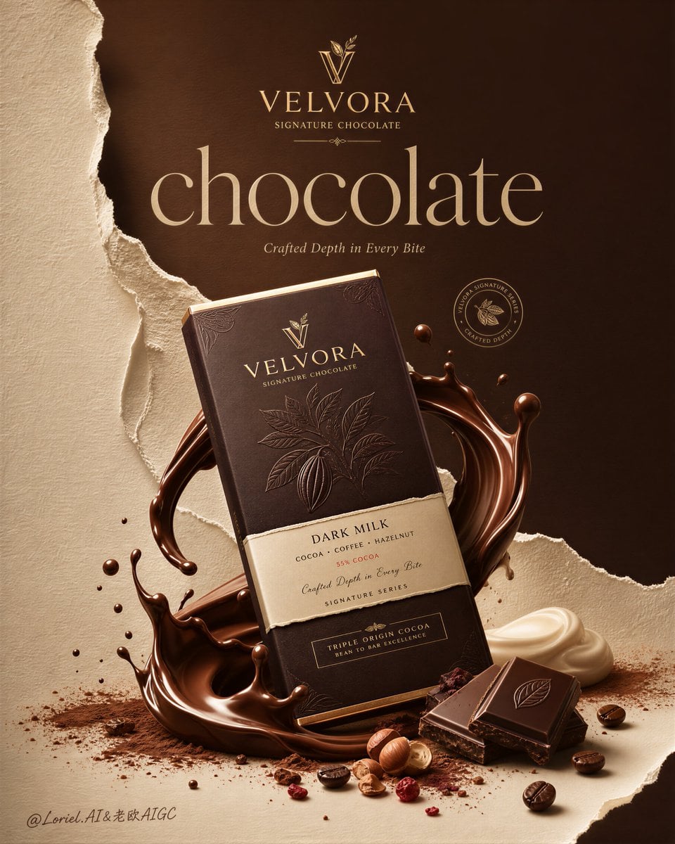
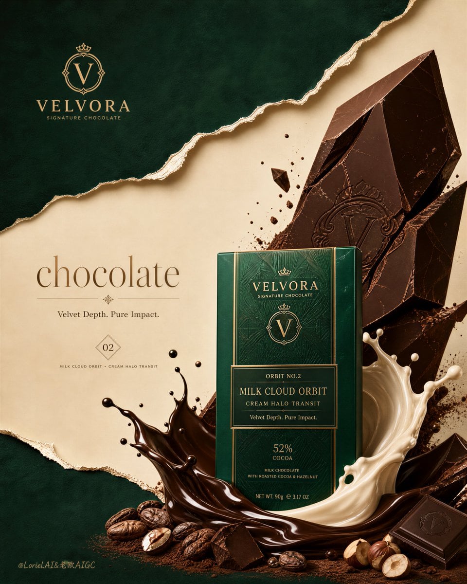
Velvora Luxury Chocolate Emerald & Gold Campaign Poster
Prompt
Create the second poster in the same ultra-premium chocolate campaign series for the fictional luxury brand VELVORA, merging the tactile richness of Milk Cloud Orbit with the series discipline of Cream Halo Transit, while dramatically expanding negative space, emerald-and-gold contrast, and torn-paper layering for a more iconic flagship-brand presence. The image must feel like a collector-edition international confectionery campaign: highly realistic, visually striking, editorial, luxurious, and unmistakably premium. Preserve the same core series structure of one dominant upright hero package in the lower center, a large broken chocolate slab rising behind it, and sculptural liquid motion wrapping the base, but let the overall composition breathe more, feel rarer, and read more like a brand masterpiece than a standard food ad. Use English-first branding only.
Core composition:
Use a tall vertical poster composition with one front-facing hero chocolate package standing upright in the lower center, fully visible and clearly dominant. Behind it, place a large broken chocolate slab in the upper-right background, angled with elegant fractured geometry and restrained flying crumbs. Around the lower portion of the package, build controlled molten splash forms in dark chocolate and pale cream, wrapping the base with premium sculptural motion. Preserve the same family structure as the previous poster, but increase the amount of breathing room around the hero product so the composition feels calmer, more expensive, and more iconic.
Series continuity:
This must clearly read as poster number two in the same VELVORA luxury chocolate series. Preserve the same brand hierarchy, same premium packaging logic, same refined ingredient world, same “hero package + broken slab + splash + editorial type” structure, and same tactile realism. The difference is that this second poster feels sharper, more graphic, and more jewel-like, with a cooler, rarer campaign atmosphere and stronger visual authority.
Milk Cloud Orbit enhancement:
Push tactile richness to a higher level. The molten chocolate must feel thicker, silkier, and more luxurious, with richer glossy drag and physical weight. The packaging embossing, foil details, chocolate fracture texture, cocoa powder dust, cream softness, and bean surface oil sheen must all be heightened. Every surface should feel touchable, dense, and collector-grade. The image should deliver a stronger “luxury indulgence” impact at first glance.
Cream Halo Transit refinement:
Strengthen the sense that this poster belongs to a highly disciplined premium chocolate series. The package design must feel like part of a mature family system with elegant sub-line hierarchy, consistent foil treatment, and polished luxury structure. The layout, typography, product placement, and ingredient logic should all feel more controlled and brand-system driven, as if this is one chapter in a refined multi-poster campaign.
Brand and title system:
Use the fictional premium identity:
Brand: VELVORA
Product line: SIGNATURE CHOCOLATE
Hero title: chocolate
Tagline: Velvet Depth. Pure Impact.
Typography must feel editorial, luxurious, and beautifully composed, using a high-end serif main title, refined supporting text, and a discreet emblem or premium logo mark. The type should feel more like an international beauty or fashion campaign adapted to chocolate branding than a retail confectionery ad.
Color direction:
This version must push the emerald-green and antique-gold campaign identity much harder. Replace ordinary cocoa-led poster feeling with a rarer luxury palette built from deep emerald-green fields, warm ivory paper tones, antique gold accents, and rich dark chocolate browns. The contrast between emerald and gold must feel clear, elegant, and premium, never loud or cheap. The chocolate remains richly realistic and dark, but the surrounding design language must unmistakably signal a new main color system.
Negative space and graphic el
Copy PromptCopied!Emerald GreenAntique GoldluxuriousCollector-gradenegative spaceVertical Compositionother



![A [Subject] photographed from an extreme low-angle ground...](https://cdn.guidesref.com/trk_6aa8eff6f044a4.86910829.jpg)