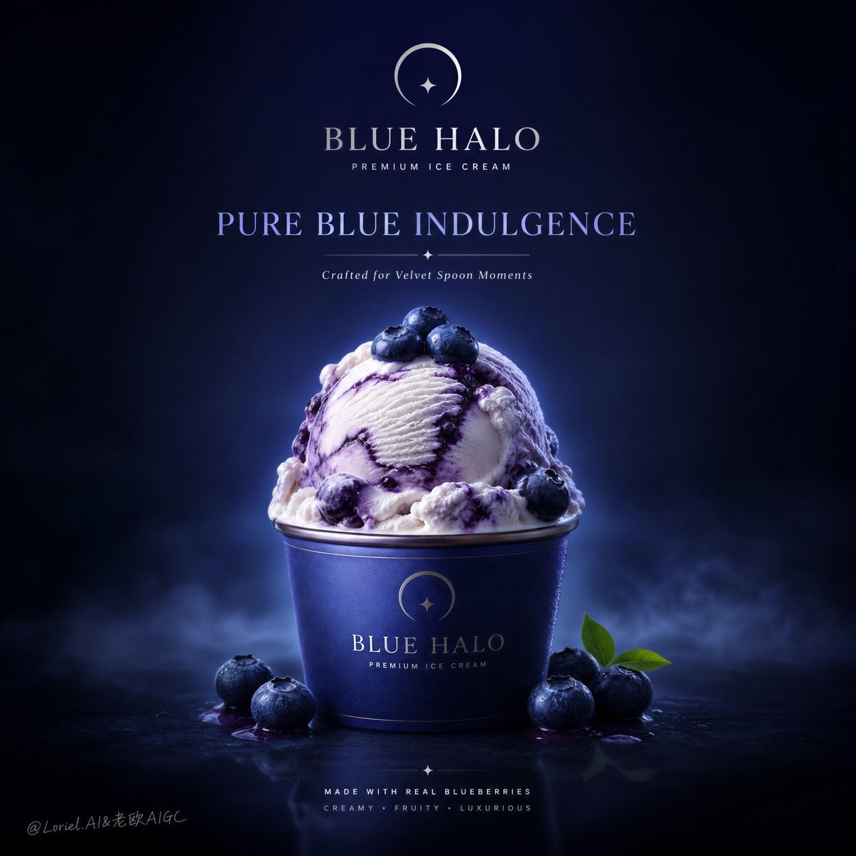
Blue Halo Luxury Blueberry Ice Cream Campaign
Prompt
Create an ultra-premium commercial poster for a fictional ice cream brand called BLUE HALO, combining the tactile richness of Milk Cloud Orbit with the structural refinement of Cream Halo Transit, while enlarging the negative space, strengthening the blue-violet color-block order, and enhancing the cool luminous quality of the blueberry ice cream against a deep dark background. The final image must feel like a world-class flagship dessert campaign: elegant, hyper-realistic, polished, and collector-grade, with one blueberry ice cream hero composition as the absolute centerpiece and a highly disciplined luxury brand system. Use English-first branding only.
Core composition:
Use a clean square or poster-friendly composition with one blueberry ice cream serving positioned exactly in the center as the absolute hero. Present the product in a premium branded cup or elegant serving vessel, with the scoop mass rising above the rim in a beautifully balanced silhouette. Expand the surrounding breathing room significantly so the composition feels more iconic, more premium, and more brand-led. The ice cream must sit in a carefully controlled visual field with strong negative space and clear center focus.
Milk Cloud Orbit enhancement:
Push tactile richness much further. The ice cream must feel colder, denser, creamier, and more luxurious, with finer scoop ridges, smoother dairy body, and richer blueberry marbling. The blueberries must show more nuanced skin bloom, tautness, and fresh fruit realism. The transition between pale milk cream and berry-purple swirl must feel silkier and more layered. Every surface should feel collector-grade and touchable.
Cream Halo Transit refinement:
Strengthen the premium dessert brand system. The logo placement, title hierarchy, cup graphics, supporting copy area, and overall poster balance must feel more disciplined, mature, and rollout-ready. The image should feel like one polished visual chapter in a serious luxury ice cream campaign rather than a single isolated ad.
Negative space:
This is critical. Expand the empty surrounding space significantly so the product feels more elevated, more luxurious, and more campaign-worthy. The unused space must feel intentional and expensive, making the central ice cream composition read like a hero object in a premium visual system.
Blue-violet color-block order:
Push the background and supporting color system into a cleaner, more sophisticated blue-violet order. Use a restrained palette of deep blueberry blue, berry-indigo, midnight violet, and cool royal-blue tonal transitions. The background should feel like a carefully constructed luxury color field rather than a flat generic backdrop. The result must feel graphic, modern, and globally premium.
Cold glow against dark background:
This is critical. Make the ice cream feel more luminous and cold against the dark surrounding field. The scoop edges, dairy highlights, berry swirls, and blueberry surfaces should hold a subtle cool glow, as if the dessert is softly illuminated from within the darkness. The contrast between the dark premium background and the fresh cold dessert must feel seductive, refined, and expensive.
Hero product logic:
The blueberry ice cream must look exceptionally rich and refined. Create creamy milk-based ice cream with visible blueberry swirl logic, subtle marbling between pale dairy cream and rich berry-purple tones, and beautiful scoop texture. The hero scoop should feel abundant, rounded, and perfectly shaped, with strong appetite appeal and polished silhouette.
Blueberry interaction:
The blueberries must feel deeply integrated into the product story. Add a few premium whole blueberries on and around the ice cream, with subtle berry juice bloom, skin texture, and natural fresh bloom finish. Their interaction with the dairy must feel intimate and beautifully balanced, not decorative-only.
Brand and typography:
Use a fictional premium brand identity:
Brand: BLUE HALO
Headline: PURE BLUE
Copy PromptCopied!saturatedCool TonesHyper-realisticelegantseductiveCollector-gradeultra-detailedCreamyCentered Compositionnegative spaceother