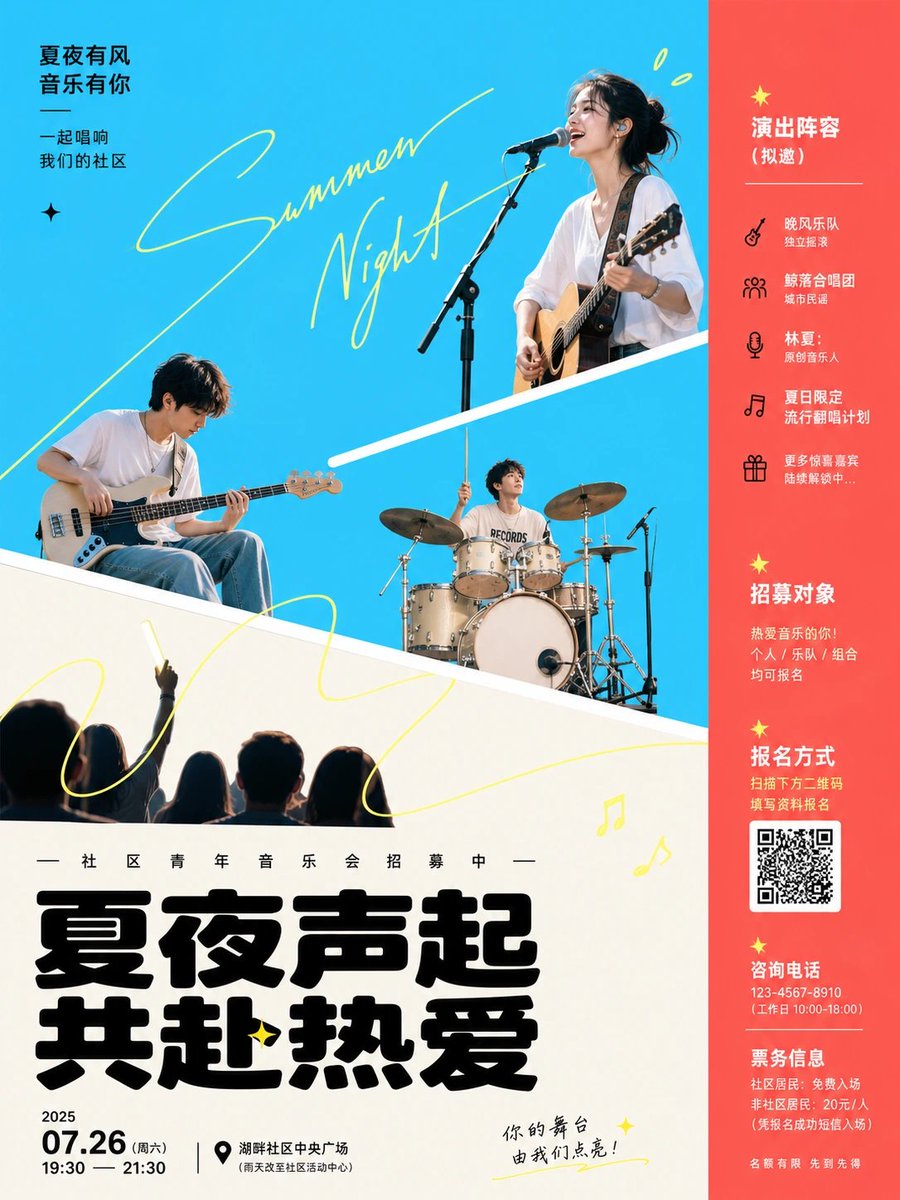
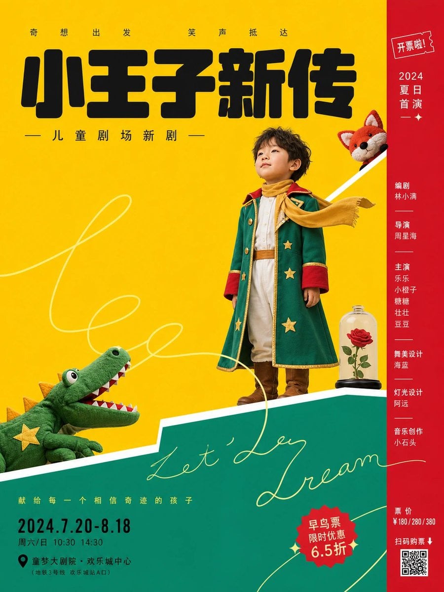
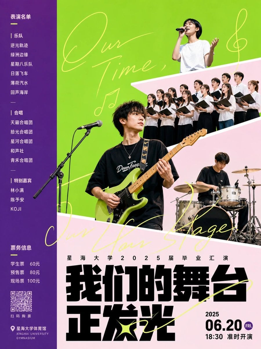

Modern Geometric Theater Collage Poster
Prompt
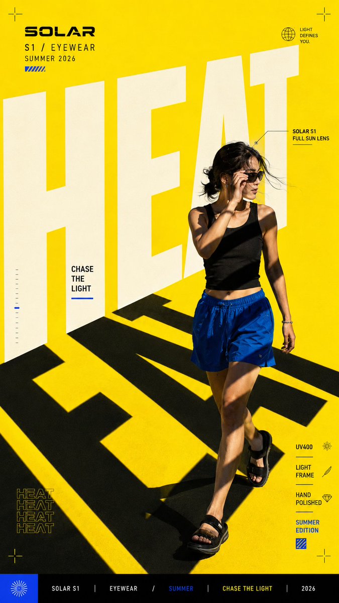
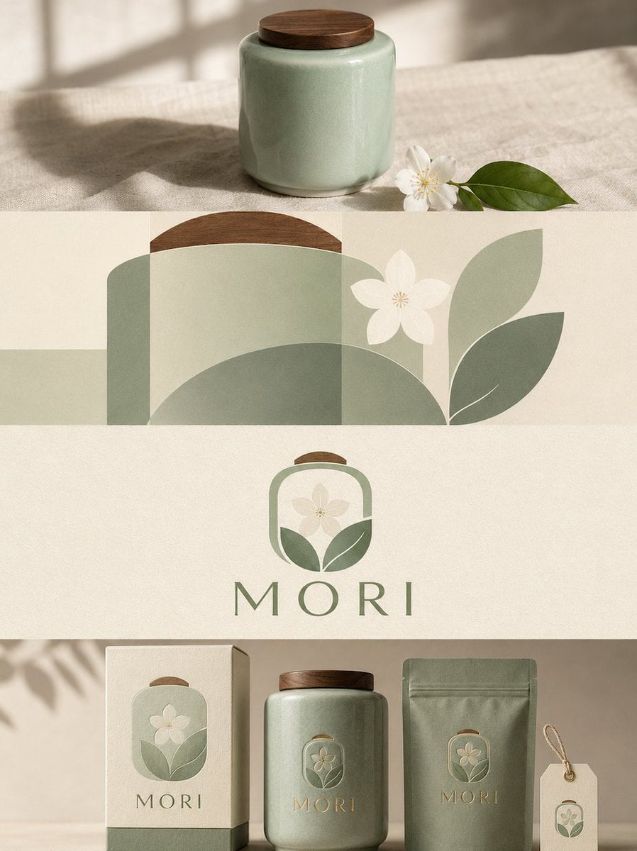
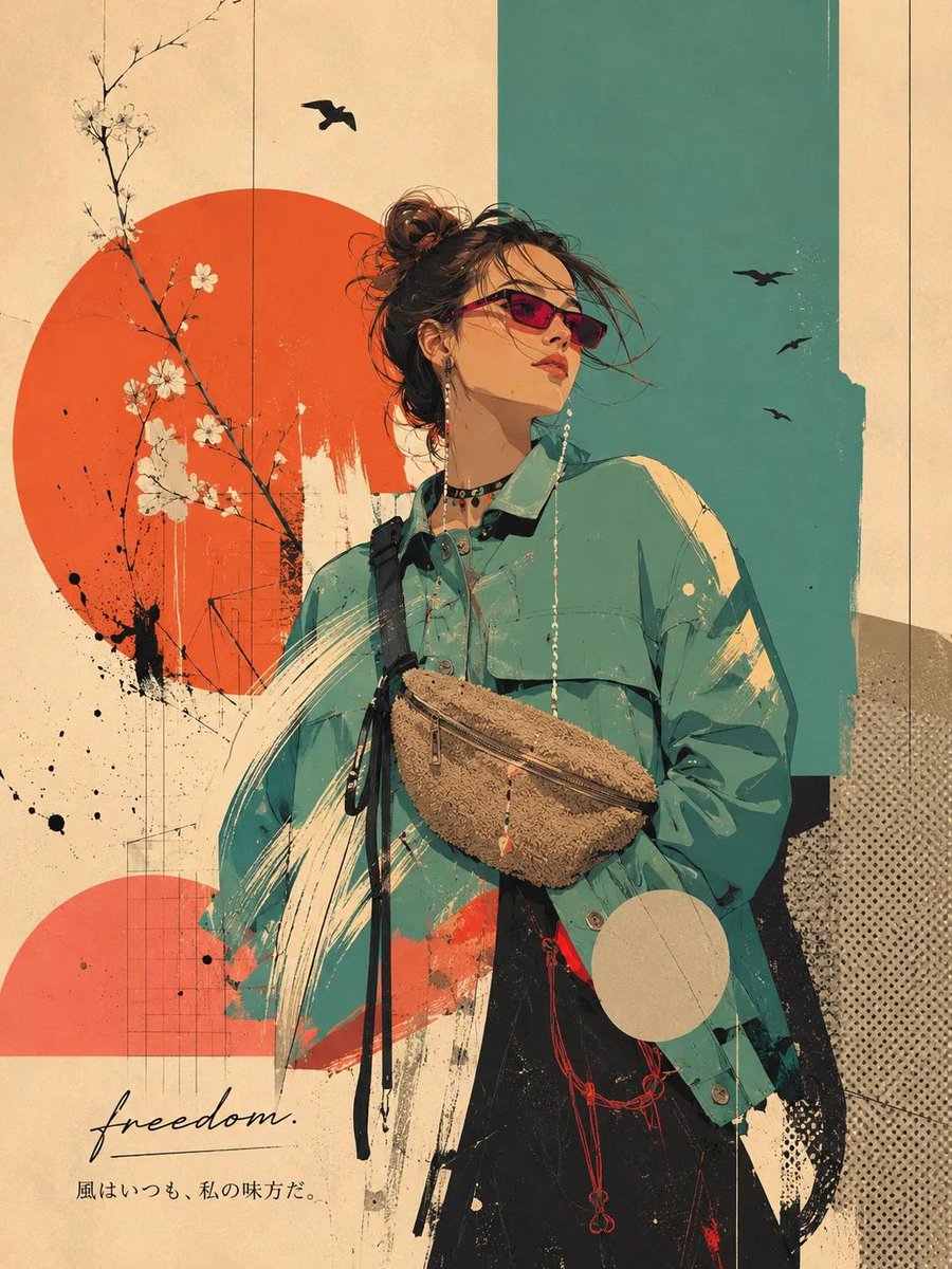
Centering on [subject object], adopt a bright and clean performance-style graphic poster treatment: the screen establishes an immediate first-impact with large areas of high-brightness solid color flat planes, with the primary color derived from the theme serving as the main open background. Auxiliary colors, in deeper or warmer saturated tones, press against one side to form a narrow vertical bar or a bottom support block; light colors serve as the foreground surface, and deep near-black is used for the core title and a small amount of key information. Hue changes according to the theme, but maintains an emotional state of high brightness, cleanliness, few gradients, few textures, and strong color block adjacency, avoiding low-saturation gray fog and complex materials. Use two to three thick white diagonal boundaries to cut the screen into displaced platforms, with boundaries acting like stage prosceniums supporting the subject object. Figures, products, symbols, or key visuals within the theme are processed as hard-edge photographic cut-outs or clear image silhouettes, stopping at different heights and on different color blocks: one larger side element presses against the lower light color block, one central core element sits near the diagonal line, and one small emotional element peeks out from the upper color block; they are not entirely on the same horizon, but are strung together by diagonal lines and gaze directions into a reading path from bottom-left to top-right. Overlay a set of ultra-fine handwritten lines in pale lemon or a high-brightness neighboring color of the theme, with relaxed brushstrokes and long loops passing through objects and white space, partially obscured by the subject, resembling an unfinished scribble signature rather than decorative patterns; the lines must cross the background, diagonal lines, and title area, creating a light sense of intimacy and spatial continuity. At the bottom, set a large black local text title, with a heavy typeface, low center of gravity, combining rounded corners and square folds, tight letter spacing but with clear internal white space; place a line of small, widely spaced explanatory text above the title, date and location information in the bottom-left, and a narrow column of names and small ticketing information in the right color bar, all text maintaining clear poster printing edges. The overall effect is like a digital collage plus a flat theater set, with clean edges, no aging, no paper grain; characters or subject images carry a slight photographic compression feel and hard-cut edges, creating a quiet contrast with a slight stage distance between the flatness of the color blocks and the static expression of the real subject.
Copy PromptCopied!GPT Imagehigh brightnesssaturated colorsdigital collagecleanQuietdiagonal compositionasymmetric balance