Create an ultra-premium food advertising poster that pres...
Prompt
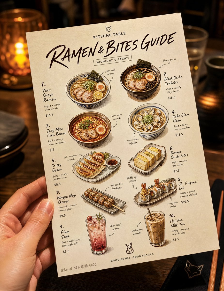
Create an ultra-premium food advertising poster that preserves the core visual logic of a hand-held illustrated tasting card photographed in a warm casual dining environment, while refining it into a more cohesive Transit-version commercial visual centered on one tightly curated product family. Design an original Japanese-inspired street-gourmet brand called KITSUNE TABLE. Show one realistic human hand holding a vertical off-white tasting card in the foreground, slightly tilted, centered in the frame, photographed above a softly blurred restaurant table scene. The card must be the absolute visual hero. It should feature a curated collection of 10 signature ramen-and-side-dish items rendered as charming hand-drawn premium food illustrations with elegant editorial spacing, stylish English-first labels, small prices, and tiny handwritten annotation marks. No copied text from the source image. All wording must be newly invented, beautiful, sparse, and brand-consistent.
Core composition:
Use a strict vertical composition with the tasting card occupying most of the frame, held naturally by one hand from the lower left corner. The card floats above a softly blurred tabletop with subtle chopsticks, napkin folds, ceramic reflections, and warm restaurant ambience, but the background remains secondary. The card should be slightly angled from lower left to upper right, creating a candid handheld snapshot feeling. Keep the design dense but breathable: small illustrated dishes distributed across the page in a balanced scattered layout, with enough white space to feel premium and collectible. The overall image must read instantly as a stylish ramen discovery card, a souvenir-like tasting guide, and a campaign poster at the same time.
Brand and title logic:
At the top of the card, place a compact brand mark “KITSUNE TABLE” and below it a bold elegant handwritten title such as “RAMEN & BITES GUIDE” in expressive English lettering. Add one small secondary location-style label such as “MIDNIGHT DISTRICT” or “ALLEY EDITION” in a neat typographic block if needed. Typography must feel hand-crafted, editorial, playful, and precise, not generic, not childish, not corporate.
Unified product system:
Include exactly 10 signature items built around a coherent ramen-and-side-dish universe:
1. Yuzu Shoyu Ramen
2. Black Garlic Tonkotsu
3. Spicy Miso Corn Ramen
4. Sake Clam Udon
5. Crispy Gyoza
6. Tamago Sando Bites
7. Wagyu Negi Skewer
8. Ebi Tempura Roll
9. Plum Soda
10. Hojicha Milk Tea
The card must feel like one curated late-night Japanese comfort-food system rather than a random assortment. Every illustration should support the same brand world: warm broths, glossy noodles, golden fried textures, grilled char marks, soft bread crumb, translucent drinks, precise garnishes, and compact editorial appetizing detail.
Food illustration realism:
Render every item as an ultra-appetizing miniature hero illustration with real product logic: broth surface shimmer, oil droplets, noodle sheen, egg yolk texture, sliced chashu marbling, seaweed softness, gyoza blistering, tempura crumb structure, skewer glaze, drink condensation, ice refraction, foam highlights, and garnish freshness. The look should feel like a hybrid of editorial food sketching and luxury product visualization. Every item must be delicious, clean, and physically believable.
Typography and annotation:
Use elegant handwritten English for item names, tiny refined descriptors below selected dishes, and restrained clean price numerals. Add thin doodled arrows, small ingredient notes, and minimal recommendation cues to connect text and dish illustrations. Keep the layout lively but controlled. No dense paragraphs, no copied foreign text, no chaotic note clutter.
Card material and print finish:
The tasting card should feel like thick premium matte paper with a soft warm ivory tone, crisp edges, subtle natural tooth, and fine print fidelity. Printed linework should use warm dark-brown or espresso ink rather than harsh black, giving the piece a softer gourmet identity. The illustrations must feel sharp, boutique-designed, and professionally printed.
Hand and realism:
Show one realistic hand holding the card from the lower left with believable anatomy, correct finger count, natural skin texture, soft knuckle folds, clean nails, and relaxed grip pressure. The hand should feel candid and unforced, supporting the authenticity of a real dining moment. No deformed fingers, no awkward grip.
Lighting:
Use warm ambient restaurant lighting with a soft key light from upper right-front, creating flattering highlights on the paper, subtle shadow beneath the fingers, and gentle glow on the tabletop behind. Add cozy golden-brown bokeh and low-contrast depth in the background. The lighting must feel intimate, appetizing, and commercial, with soft shadow transitions and no muddy black areas.
Color system:
Base palette: warm ivory, toasted cream, walnut brown, dark espresso ink, caramel beige, muted charcoal. Accent palette from the food: ramen amber, miso orange, yuzu yellow, corn gold, chashu pink-brown, seaweed green, tempura gold, plum red, hojicha brown. Keep the card restrained so the dishes provide the chromatic highlights. The overall mood must feel warm, urban, flavorful, artisanal, and premium.
Background and environment:
Set the scene in a cozy Japanese-inspired bistro or ramen bar environment, softly out of focus. Suggest a dark tabletop, a folded napkin, a pair of chopsticks, a faint glass reflection, and dim seating beyond, but keep everything blurred and clean. No messy leftovers, no distracting people, no clutter. The card remains the dominant product.
Commercial finish:
The final image must feel like a Cannes-level boutique restaurant campaign visual: hand-held authenticity, collectible tasting-card design, beautiful typography hierarchy, mouthwatering real-product illustration, elegant brand identity, and extremely clean editorial composition. Crisp focus on the card, text, printed dishes, and hand; soft atmospheric blur everywhere else. No dirt, no stains, no bad perspective, no cheap menu design.
Negative prompt:
copied source text, generic menu typography, cluttered layout, unreadable labels, messy arrows, excessive paragraphs, low-resolution food drawings, plastic-looking food, bad anatomy, extra fingers, missing fingers, fused fingers, warped hand, muddy shadows, black blotches, oversaturated colors, chaotic background, distracting people, cheap branding, duplicate dishes, flat lighting, blurry card edges, bad print texture, watermark, logo clutter
Copy PromptCopied!
![Ultra detailed anime manga character poster of [Kaiser], ...](https://cdn.guidesref.com/trk_6a93f57dcb3ab3.70881640.png)
![A burin engraving of a [Subject], swelling and tapering l...](https://cdn.guidesref.com/trk_6a82c86cdfa810.32252240.jpg)
![【主题】:[主题]](https://cdn.guidesref.com/trk_6a952cc8bcaf77.05820873.jpg)