Create an ultra-premium skincare campaign poster for an o...
Prompt
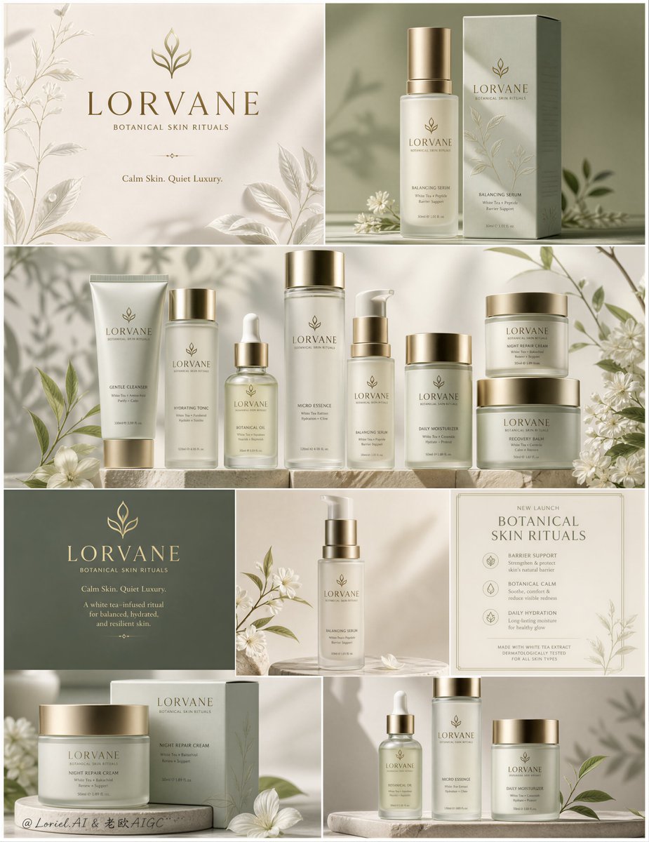
Create an ultra-premium skincare campaign poster for an original botanical beauty brand called LORVANE, preserving the exact high-end structural logic of a vertically stacked editorial collage composed of multiple clean product panels, while elevating it into a more iconic, more serene, more commercially complete launch visual. The final artwork must feel calm, modern, clinical-botanical, luxurious, softly therapeutic, and Cannes-level, with a refined sage-to-ivory identity system, brushed gold accents, white-tea and morning-dew botanical language, and highly realistic skincare packaging as the absolute visual hero.
Overall layout:
Use a tall vertical collage poster divided into multiple clean rectangular sections with seamless premium borders, preserving the look of a luxury identity board. Structure the layout as follows:
1. A top-left brand title panel with logo, tagline, and sparse white-tea botanical line art on a warm ivory background.
2. A top-right hero product panel featuring one tall serum or essence bottle beside its carton on a muted sage background.
3. A wide central hero panel showing the main skincare lineup arranged as a brand altar, with one lead product positioned as the visual core and the surrounding products supporting it like a ritual system.
4. A middle brand block panel with a darker botanical green background, gold logo, and concise campaign typography.
5. One adjacent single-product hero panel with a serum or hydrating essence isolated against a soft neutral field.
6. A lower-left panel featuring moisturizer packaging and restrained floral styling.
7. A lower-right panel featuring a trio of products on a low podium under soft natural light.
8. One formal efficacy card or release-info panel integrated into the collage, carrying concise branded skincare claims in a launch-poster format.
The full composition must feel balanced, modular, editorial, and perfectly brand-consistent.
Brand identity:
Create a completely original brand named LORVANE. Use a minimal luxury botanical emblem inspired by a white-tea leaf, unfolding petal, or dew-touched sprout. Main brand line:
LORVANE
BOTANICAL SKIN RITUALS
Optional refined campaign line:
Calm Skin. Quiet Luxury.
In the release or efficacy panel, use concise elevated language such as:
Barrier Support
Botanical Calm
Daily Hydration
Typography must feel premium, restrained, modern, and globally luxury-beauty oriented. No copied wording, no existing brand names.
Product system:
Design a cohesive skincare line including:
- Botanical Oil dropper bottle
- Gentle Cleanser tube
- Hydrating Tonic bottle
- Balancing Serum pump or essence bottle
- Daily Moisturizer bottle
- Night Repair Cream jar
- Recovery Balm jar
- Micro Essence bottle
All packaging must belong to the same family: muted sage green, pale botanical gray-green, warm ivory, foggy white, and brushed warm-gold caps or collars. Include both cartons and primary containers where appropriate. Product naming should be minimal, elegant, and clinically luxurious.
Orbit emphasis:
Push the central lineup panel into a stronger brand-sanctuary composition. One lead product, preferably the Balancing Serum or Night Repair Cream, should occupy the strongest central role, with surrounding products arranged around it like a complete skincare ritual. The hierarchy must feel intentional and ceremonial, making the middle panel the emotional and commercial core of the entire collage.
Transit refinement:
Shift the botanical language from generic leaf styling to a more elevated “white tea veins + morning dew herbals” system. Use delicate white-tea leaves, pale petal silhouettes, faint dew-drop cues, airy stem structures, and soft morning botanical shadows. The result should feel cleaner, more healing, more refined, and more internationally premium.
Port refinement:
Add one formal launch-card or efficacy panel inside the collage. This panel should use elegant typography and minimal spacing to present key benefit language such as:
Barrier Support
Botanical Calm
Daily Hydration
It must feel like an official release plaque or professional campaign statement, increasing the poster’s commercial readiness without cluttering the composition.
Material realism:
Render all packaging with extreme realism: frosted glass, satin-touch plastic, matte paper cartons, brushed gold metal caps, clean label printing, subtle embossing, realistic bottle thickness, soft reflections, lotion opacity, and physically believable shadows. The cartons should feature refined white-tea branch illustrations printed in muted gray-green or soft mineral sage ink. Jars must feel heavy, premium, and tactile, never cheap, never plastic.
Lighting:
Use soft natural editorial lighting with warm daylight entering from the upper side, creating delicate leaf and branch shadows and feathered highlights across the products and backgrounds. The lighting must feel creamy, calm, and refined, enhancing the premium botanical mood. Avoid harsh contrast. Maintain gentle shadow transitions and elegant dimensionality across every panel.
Color system:
Primary palette: soft sage green, muted olive-gray, warm ivory, pale stone beige, botanical mist green, dew white, brushed gold. Secondary accents: soft blossom white, pale stem green, subtle shadow taupe. The overall image must feel quiet, pure, restorative, elegant, and luxurious, with no loud colors and no visual noise.
Botanical styling:
Add sparse natural styling elements such as white tea leaves, small white blossoms, dew-kissed stems, and soft herb silhouettes. Keep styling highly controlled and minimal. The botanicals must support the brand world without distracting from the product packaging.
Typography placement:
In title panels, use a large elegant serif or refined luxury sans-serif for LORVANE, with smaller centered supporting lines beneath it. In the darker green brand block, place the logo and campaign line in gold or warm ivory lettering. In the efficacy card, use clean formal typography with strong spacing and short professional skincare language. Product labels should remain small, clean, and clinically luxurious.
Environment and finish:
Keep all backgrounds minimal and studio-controlled: ivory plaster tones, sage fields, matte surfaces, low podiums, and clean still-life staging. No clutter, no extra props, no messy reflections. The final image must feel like a flagship botanical skincare launch poster, suitable for boutique display, premium social campaign, luxury e-commerce homepage, and magazine advertising.
Quality rules:
ultra-clean composition, premium product realism, elegant modular layout, strong central hierarchy, consistent brand language, soft natural shadows, no black blotches, no cheap cosmetics styling, no deformed packaging, no crooked labels, no cluttered props, no oversaturated greens, no plastic shine, no messy typography, 8k, world-class luxury beauty campaign quality
Negative prompt:
copied brand names, copied text, cluttered collage, cheap skincare packaging, warped bottles, unreadable labels, plastic-looking jars, oversaturated green, muddy lighting, black stains, chaotic props, generic beauty ad, low-resolution textures, messy typography, harsh shadows, noisy background, watermark, logo clutter
Copy PromptCopied!![[Subject], Polaroid emulsion lift, the image floated off ...](https://cdn.guidesref.com/trk_6aa2298d7e3e53.78062097.jpg)