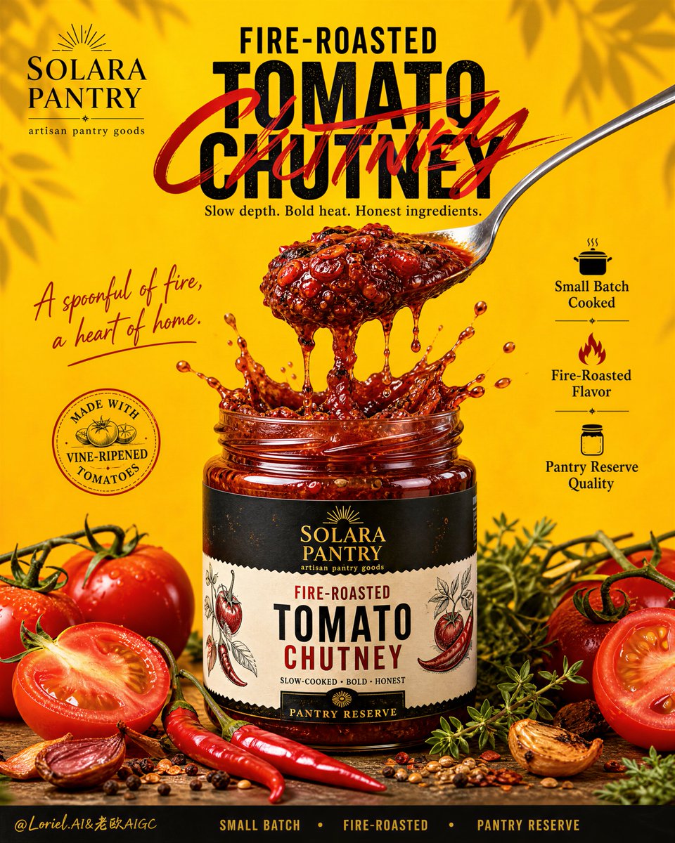
Create a high-impact premium packaged-food advertising po...
Prompt
Create a high-impact premium packaged-food advertising poster for an original artisanal condiment brand called SOLARA PANTRY, preserving the exact structural logic of a bold homemade tomato condiment campaign while elevating it into a more explosive, more refined, and more commercially complete hero visual. Use a tall vertical layout with a saturated sun-warmed yellow background, oversized centered typography, one dominant glass jar of fire-roasted tomato chutney in the middle, and a dramatic spoon-lift action as the emotional focal point. The final artwork must feel loud, delicious, handcrafted, clean, premium, and Cannes-level, with the product remaining the absolute hero.
Layout structure:
Use a strict poster composition with:
1. Top-left brand logo block for “SOLARA PANTRY”
2. Upper-center large product headline
3. Center hero jar with spoon-lift action and sculptural sauce eruption
4. Left-side handwritten emotional line
5. Right-side formal release-style benefit stack with icons
6. Bottom ingredient spread with real tomatoes, chili, herbs, and spice cues
7. Footer strip with concise premium pantry-release language
Keep hierarchy extremely clear, polished, and retail-campaign ready.
Brand and text system:
All text must be original and English only.
Top-left brand block:
“SOLARA PANTRY”
small supporting line:
“artisan pantry goods”
Main title in upper center:
“FIRE-ROASTED”
“TOMATO CHUTNEY”
with “TOMATO” or “CHUTNEY” in very large bold uppercase block lettering and a bold red brush-script layer integrated across the title for extra graphic energy.
Below title, add a short descriptor:
“Slow depth. Bold heat. Honest ingredients.”
Left-side handwritten emotional line:
“A spoonful of fire,
a heart of home.”
Right-side release-style benefit stack with simple icons:
“Small Batch Cooked”
“Fire-Roasted Flavor”
“Pantry Reserve Quality”
Optional circular seal:
“Made with vine-ripened tomatoes”
Footer line:
“SMALL BATCH • FIRE-ROASTED • PANTRY RESERVE”
Typography must feel premium, loud, clean, and poster-ready.
Hero product:
Show one realistic glass jar of fire-roasted tomato chutney at the center-bottom middle. The jar should have a premium custom label matching the brand identity in black, cream, red, and muted gold accents. The lid is removed. The chutney inside must be intensely appetizing: thick, glossy, chunky, visibly slow-cooked, with roasted tomato fibers, chili flecks, spice seeds, herb fragments, and rich cooked-down texture. A metal spoon rises above the jar lifting a dense dramatic scoop, with thick chutney strands and glossy sauce pulling downward in controlled drips. At the jar opening, create a powerful but elegant splash crown of chutney and sauce, as if the spoon has just lifted the richest bite from the jar.
Orbit emphasis:
Push the spoon action into the main theatrical gesture of the poster. The lifted chutney mass should feel irresistible and heavy, with vivid texture, dense body, and elastic sauce pull. The spoon, lifted relish, and return splash must form the visual core of the whole composition, making the flavor feel explosive yet refined. The viewer should feel the movement, weight, gloss, and richness instantly.
Transit refinement:
Unify the product identity around a sharper flavor world: fire-roasted tomato chutney. Everything in the image must support this more premium, more distinctive culinary direction. The chutney should feel deeper, smokier, more caramelized, and more crafted than a generic tomato pickle or relish. The food styling must communicate char, slow cooking, chili warmth, and pantry-level sophistication.
Port refinement:
Upgrade the right-side information column into more formal launch-style packaging language. The benefits must read like premium release notes rather than generic marketing claims. Use clean icons and concise editorial wording such as:
“Small Batch Cooked”
“Fire-Roasted Flavor”
“Pantry Reserve Quality”
This should make the poster feel more like an official product launch campaign and less like a casual food ad.
Food styling and ingredients:
At the bottom foreground, arrange a clean premium ingredient spread:
cut vine-ripened tomatoes,
whole tomatoes,
fire-red chili peppers,
scattered spice seeds,
fresh herb sprigs,
a few roasted spice cues.
Keep the ingredients vivid, realistic, and secondary to the jar. They should frame the product and reinforce freshness, authenticity, and slow-cooked flavor.
Lighting:
Use strong premium studio lighting with a warm front key and subtle side highlights. The jar, spoon, chutney texture, and sauce splash must be sharply lit with mouthwatering contrast. The yellow background should glow evenly and feel bright, warm, and appetizing. Shadows must be soft but grounding. The chutney should show rich gloss, wet highlights, depth, and roasted density without looking greasy or dirty.
Color system:
Primary palette: sunlit saffron yellow, tomato red, chili crimson, roasted red-brown, fresh leaf green, black, cream, muted gold, metallic silver.
The strongest contrast should come from the deep roasted red chutney and tomatoes against the saturated yellow background. The overall emotional balance must feel bold, sunny, crafted, flavorful, and premium.
Background and atmosphere:
Use a flat but rich textured yellow backdrop with subtle tonal depth. Add soft top-corner botanical shadow play or restrained leafy framing if needed, but keep the composition clean. A few soft blurred tomato accents near the edges are acceptable only if they support depth and focus.
Material realism:
Render everything with extreme realism:
glass thickness and reflections,
metal spoon highlights,
sticky chutney viscosity,
roasted tomato texture,
chili flecks,
spice granules,
tomato flesh translucency,
fresh herb veins,
clean printed label finish.
The product must feel intensely edible, tactile, premium, and physically believable.
Advertising finish:
The final image must look like a world-class packaged-food launch poster: oversized title, irresistible spoon-lift action, disciplined release-style selling points, real ingredients, and strong shelf-brand identity. The composition must feel finished, bold, commercial, and high-conversion, with no visual clutter and no copied branding.
Negative prompt:
copied text, copied brand, cluttered layout, weak typography, unreadable label, muddy sauce, plastic-looking food, low-detail splash, fake tomatoes, oversaturated mess, greasy dirty texture, bad reflections, broken jar shape, warped spoon, excessive props, black blotches, low-resolution packaging, generic supermarket ad, watermark, logo clutter
Copy PromptCopied!