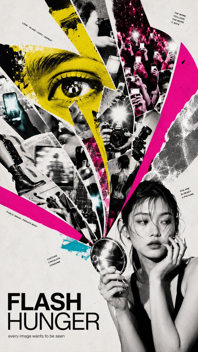
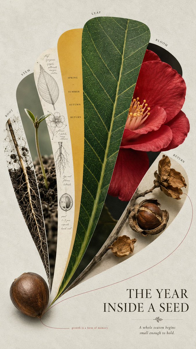
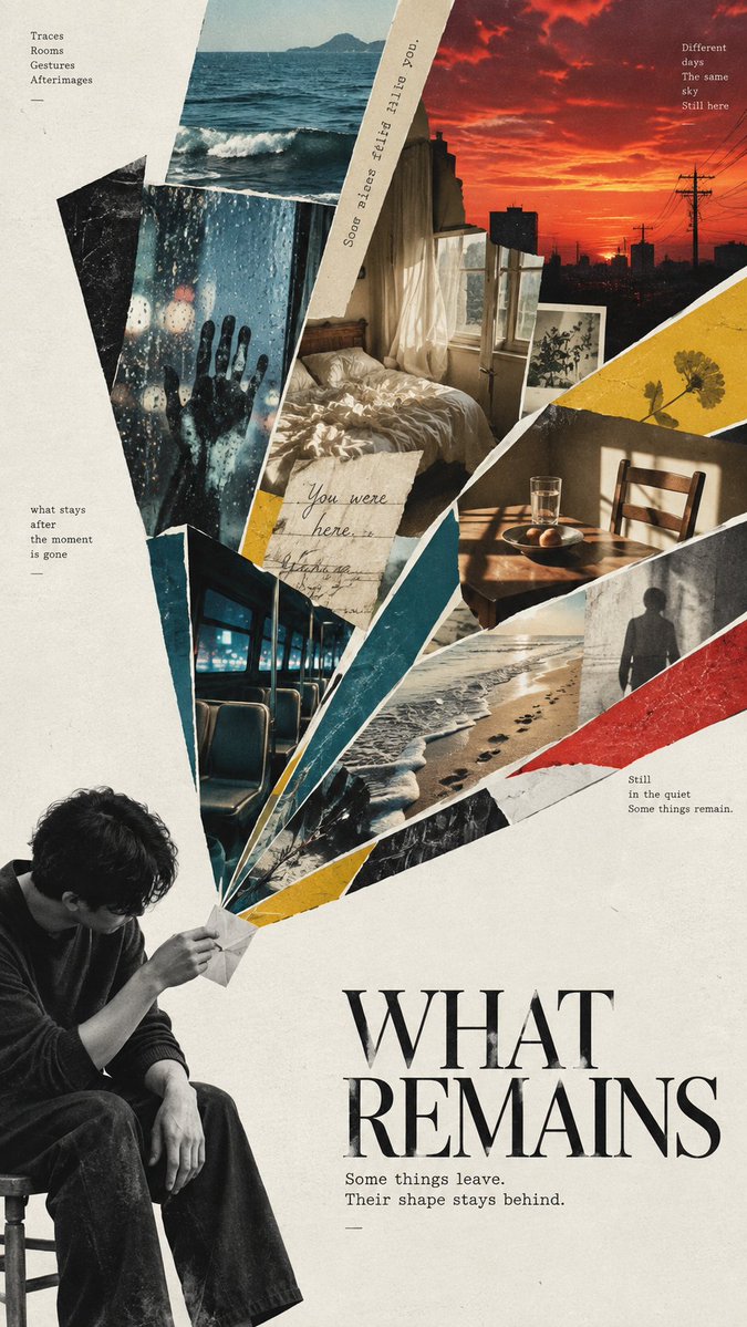
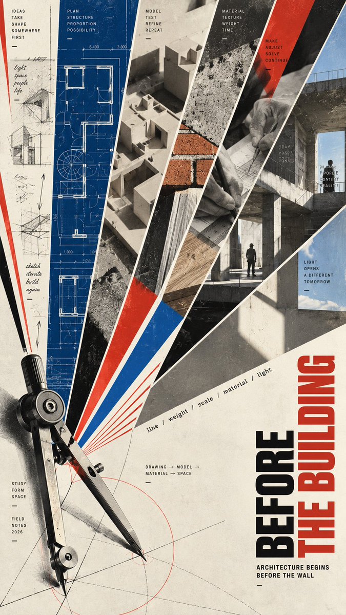
Create a 9:16 editorial collage poster built around a fan...
Prompt
Create a 9:16 editorial collage poster built around a fan-shaped composition.
SUBJECT: [Subject]
TITLE: [Title]
CONCEPT: [Concept]
FAN STRUCTURE: [Fan Structure]
VISUAL MATERIALS: [Visual Materials]
COLOR SYSTEM: [Color System]
TYPOGRAPHY: [Typography]
BACKGROUND: [Background]
TEXT DETAILS: [Text Details]
Treat the fan shape as the main visual system, not as a decorative frame. Build one strong large-scale silhouette first, then place rich visual information inside or around it.
Do not default to evenly spaced straight wedges. The fan structure may be irregular, curved, rounded, fragmented, asymmetrical, layered, partially broken, or constructed from mechanical lines depending on the concept.
Let the geometry carry meaning:
* fragmented shapes can suggest media, memory or visual overload
* rounded fan pages can suggest growth, nature or unfolding
* diagonal sections can create tension and narrative movement
* precise radial lines can suggest systems, architecture or construction
Combine photography, cropped details, textures, linework, flat color fields and negative space with clear hierarchy. Some sections may contain dense imagery, while others should remain pure color or empty space to create rhythm.
Use bold cropping, scale shifts and a few controlled elements crossing the fan boundaries so the composition feels designed rather than like photos placed inside containers.
Keep the color palette intentional and sectional. Each major area should have a clear color identity without becoming visually noisy.
Typography should feel integrated into an art poster or independent editorial publication. Use one clear title and only a small amount of meaningful supporting text. Avoid placeholder copy, excessive labels, UI-style information boxes or random tiny text.
The finished image should work at two distances:
from far away, the fan-shaped structure is immediately recognizable and visually striking;
up close, the viewer discovers layered photography, materials, details and narrative meaning.
Aim for experimental editorial design, art-poster quality, strong thumbnail impact and high information density without clutter.
Copy PromptCopied!

![Ultra-realistic exploded view of a monster-shaped [Food],...](https://cdn.guidesref.com/trk_6a8e7133d60c41.33372980.jpg)