![[BRAND]: [Brand Name]](https://cdn.guidesref.com/trk_6a9e5137a90800.66977336.jpg)
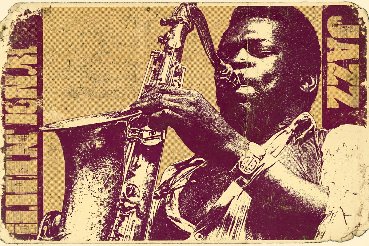
![[BRAND]: [Brand Name] - alternate](https://cdn.guidesref.com/trk_6a9e5138190a58.80572086.jpg)
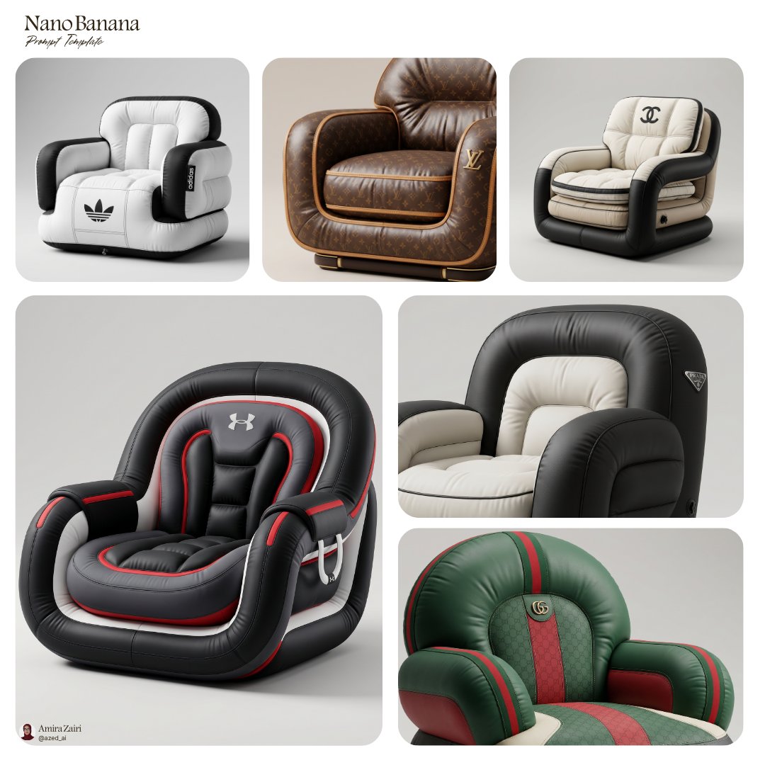
![[BRAND]: [Brand Name] - alternate](https://cdn.guidesref.com/trk_6a9e513874fc62.24921705.jpg)
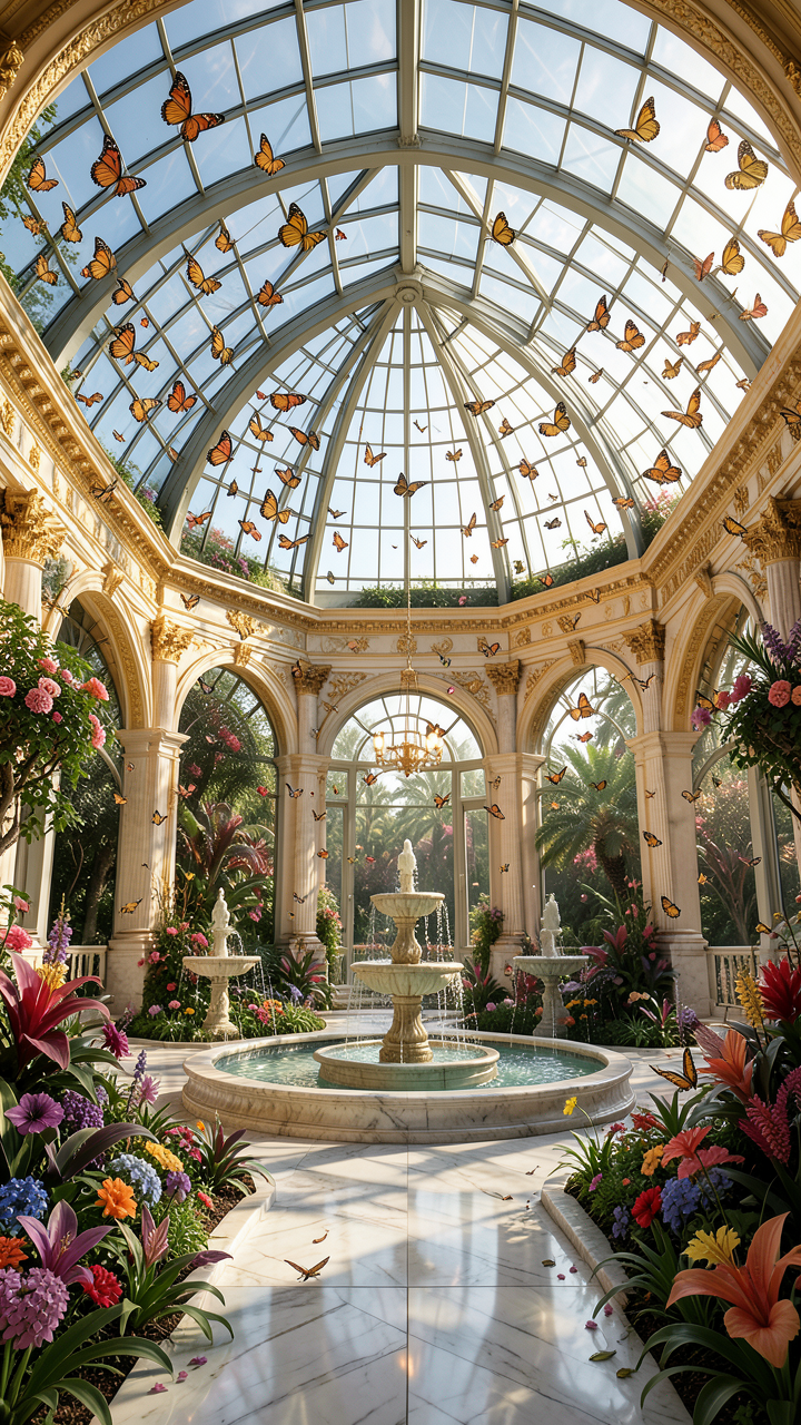
![[BRAND]: [Brand Name] - alternate](https://cdn.guidesref.com/trk_6a9e5138e3acd1.31637649.jpg)
[BRAND]: [Brand Name]
Prompt
[BRAND]: [Brand Name]
[FOOD / DISH]: [Main Product]
[HEADLINE]: [Main Word Or Short Title]
[STRUCTURE]: [Photo Filled Type / Food Layers As Grid / Modular Editorial Grid / Steam Veil]
[ACCENT COLOR]: [Accent Color]
[DETAILS]: [Details]
Create a 9:16 vertical food editorial poster that uses the food itself to build the visual structure of the page.
Use a warm cream or ivory background with subtle paper texture, highly realistic food photography, expressive editorial typography and a controlled color palette. The result should feel like a real café, bakery or restaurant campaign rather than a reusable template.
The key idea is that [STRUCTURE] should determine the composition.
For “photo-filled type,” use one continuous food photograph inside large headline letters while keeping the word immediately readable. The image should flow naturally across all letters rather than using separate textures for each character.
For “food layers as grid,” use the natural horizontal layers of the food—pastry, cream, fruit, fillings or other visible sections—as the alignment system for typography and small annotations. Let the food create the grid instead of drawing an artificial one over it.
For “modular editorial grid,” divide the page into a few unequal photography and typography modules. Use different crops, scales and viewpoints, with one or two elements subtly crossing module boundaries so the layout feels editorial rather than like a simple collage.
For “steam veil,” place bold typography behind genuinely hot food and let only the areas covered by natural rising steam become slightly softer, lighter or partially obscured. Keep all type outside the steam perfectly sharp. Do not use digital blur or smoke effects.
Make [HEADLINE] and the food the two strongest visual anchors. Use bold display typography for the main title and a restrained serif or neutral sans serif for secondary information.
Add only a few meaningful details such as [BRAND], ingredients, flavor notes, opening hours, address or one short brand line. Avoid generic filler copy.
Use [ACCENT COLOR] alongside cream, natural food colors and dark neutrals. Keep the palette clean and cohesive.
The final poster should be visually strong at thumbnail size, detailed when viewed closely, and built around one clear principle: the food does not simply sit inside the layout — its texture, layers, crops or atmosphere create the layout itself.
Copy PromptCopied!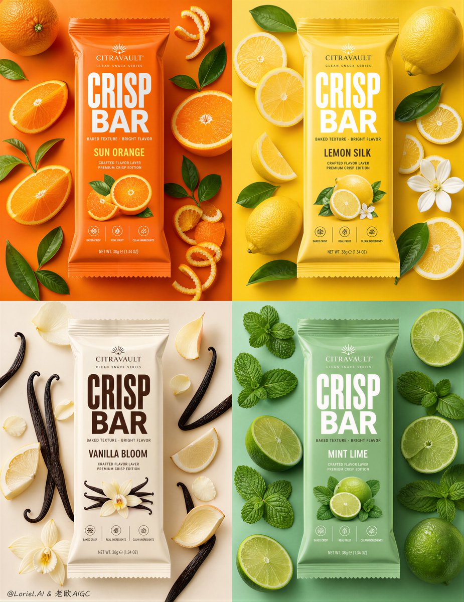

![[SUBJECT] reimagined in the style of Mythical Superhero C...](https://cdn.guidesref.com/trk_6a955381ecefd6.24150898.jpg)