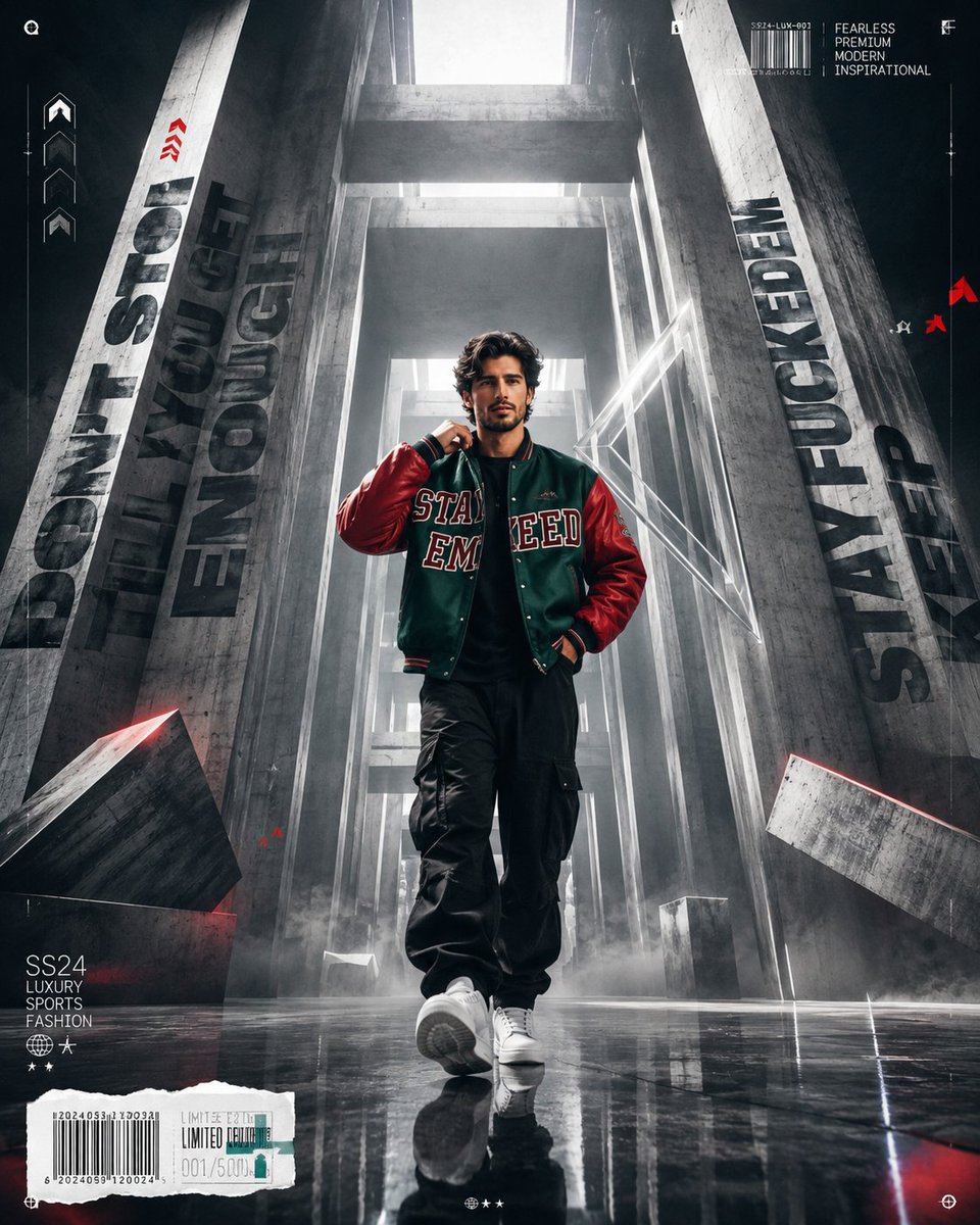
Create a Cannes-level ultra-premium commercial poster for...
Prompt
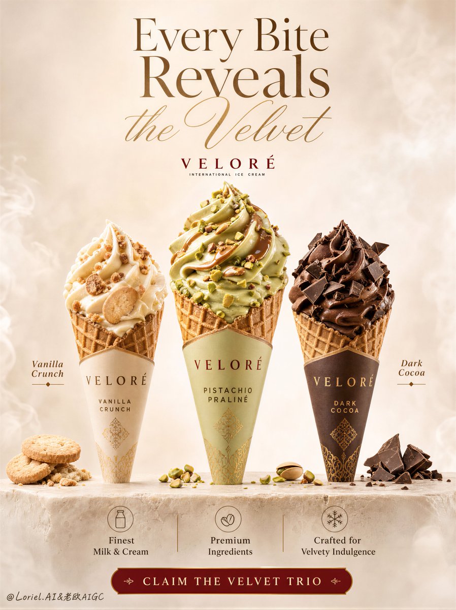
Create a Cannes-level ultra-premium commercial poster for an original international cone ice cream brand called "VELORÉ", designed in a tall vertical mobile-first format. Build a refined three-cone lineup poster centered on three hyper-real premium waffle-cone ice creams standing upright on a pale travertine or stone pedestal in the lower-middle foreground, with the products clearly dominating the composition. The center cone must be the absolute hero, slightly taller, fuller, brighter, and more visually commanding than the two side cones. The entire artwork must feel cleaner, more mature, more editorial, and more luxurious, with a minimalist milk-haze studio atmosphere and a reduced ingredient count.
Flavor system:
Shift the lineup into a more internationally premium flavor direction while preserving the same strong three-cone retail skeleton.
1. Left cone: vanilla crunch variant, with smooth ivory frozen cream, restrained biscuit crumble, delicate crisp inclusions, and elegant creamy layering.
2. Center cone: pistachio praline hero variant, with pale pistachio-gold cream swirls, refined praline gloss, subtle nut crumble, luxurious volume, and the most sculptural topping profile.
3. Right cone: dark cocoa variant, with deep cocoa frozen cream, a few crisp dark chocolate shards, soft ganache sheen, and a richer more mature chocolate identity.
All three cones must feel ultra-real, tactile, cold, creamy, and retail-ready, with premium printed wrappers, believable paper texture, precise waffle-cone geometry, appetizing frozen density, and high-end FMCG realism. The center pistachio praline cone must clearly anchor the eye and function as the crown jewel of the trio.
Composition and spatial logic:
Use a clean premium poster composition with the three cones arranged in a shallow arc across the center, standing on a minimal stone pedestal. The center cone stands front-facing; the side cones angle slightly inward to frame it. Preserve the original three-product lineup logic and premium hierarchy, but reduce all surrounding garnish and floating inclusions significantly. Use only a restrained number of carefully placed accent elements: one or two cookie fragments near the left cone, a few pistachio or praline crumbs around the center hero, and a few dark chocolate shards near the right cone. Eliminate excessive flying ingredients and keep the visual field controlled, spacious, and elegant. Strong negative space in the upper half is essential.
Background reconstruction:
Rebuild the entire background into a minimalist milk-haze studio environment. Use a creamy off-white to warm beige atmospheric backdrop with ultra-soft dessert mist, subtle volumetric milk haze, faint tonal gradients, and a quiet editorial studio mood. No busy dessert scenery, no chaotic splashes, no decorative overload. The background should feel like a luxury product photography set infused with soft cream vapor and velvety light diffusion. Add only the faintest suggestion of sculptural cream atmosphere near the far edges if needed, but keep the field largely uncluttered and premium. The overall impression should be clean, airy, tactile, and gallery-grade.
Orbit enhancement:
Push the center hero cone toward a more iconic, campaign-defining presence. Increase the pistachio praline cone’s volume, swirl height, topping depth, and luminous separation so it feels like the visual crown of the composition. Strengthen the main hero’s sculptural cream mass and topping layering, while keeping the side cones more restrained. The trio should read with a stronger hierarchy: left and right support, center dominates. The result must feel more flagship, more memorable, and more globally premium.
Transit transformation:
Keep the same three-cone structure, same premium poster rhythm, and same typography zoning, but shift the flavor language into a more mature "pistachio praline + vanilla crunch + dark cocoa" direction. Reduce overly sweet playful cues and replace them with more sophisticated material contrast: pale pistachio cream, refined nut textures, crisp vanilla biscuit notes, and deeper cocoa surfaces. The entire palette and flavor identity should feel more boutique, more elevated, and closer to premium patisserie branding.
Typography and graphic layout:
At the top, place a newly invented premium English headline, highly art-directed and elegant, such as "Every Bite Reveals the Velvet" or another original line that combines bold serif presence with flowing script refinement. The text must feel luxurious, editorial, and softly integrated into the airy milk-haze background, not pasted on. Add only minimal flavor callouts near each cone in elegant English, restrained in size and beautifully spaced. Near the lower section above the CTA, place three concise premium benefit notes with tiny tasteful icon cues, but keep them clean and not crowded. At the very bottom, include one polished branded call-to-action strip with original English wording such as "Claim the Velvet Trio". Typography density should be lower than a typical FMCG poster, with more breathing room and clearer hierarchy.
Lighting:
Use soft high-end dessert advertising light with a luminous frontal key, subtle upper-side shaping, and gentle rim separation around each cone. The lighting must enhance frozen texture, creamy volume, glossy praline highlights, chocolate sheen, and waffle-cone detail without becoming harsh. Preserve clean tonal contrast and velvety transitions inside the milk-haze environment. The whole image should feel softly radiant, tactile, and luxurious.
Material and texture logic:
Render every material with exceptional realism: velvety frozen cream, cold dense swirl structure, subtle praline gloss, crisp nut fragments, refined biscuit texture, dark chocolate shards, waffle cone pores, paper wrapper print, and faint chill softness. The contrast between creamy, crisp, glossy, and matte textures is essential. Keep all material transitions clean, elegant, and premium.
Color direction:
Use a restrained luxury dessert palette of pistachio cream, warm vanilla ivory, biscuit beige, soft praline gold, deep cocoa brown, muted stone beige, milk haze white, and tiny controlled brand-red accents only if needed. The center pistachio hero should glow slightly brighter, but the overall palette must remain refined, calm, and upscale.
Design intent:
The final artwork must feel like a world-class premium ice cream campaign poster that merges hyper-real product photography, refined FMCG branding, cleaner editorial typography, and minimalist milk-haze studio aesthetics into one award-worthy visual. The three-cone lineup must remain the hero at all times. The image must feel mature, luxurious, highly marketable, and more like a flagship global key visual than a busy supermarket ad.
Rendering style:
ultra-realistic premium ice cream advertising, luxury FMCG dessert poster, three-cone product lineup, pistachio praline vanilla crunch dark cocoa flavors, minimalist milk-haze studio backdrop, hyper-detailed frozen cream texture, refined ingredient restraint, elegant typography integration, high-end commercial retouching, premium global brand campaign, 8k, world-class image quality
Negative prompt:
copied original headline, copied source text, generic supermarket poster, ugly font, heavy black font, unreadable text, malformed letters, deformed cones, melted shapeless ice cream, broken waffle cone, low-detail toppings, muddy praline, plastic chocolate, excessive floating ingredients, cluttered layout, weak product hierarchy, oversaturated colors, flat lighting, dirty shadows, busy dessert background, chaotic splashes, cheap dessert styling, extra products, random props, low resolution, compression artifacts, amateur poster design
Copy PromptCopied!