Create a Cannes-level ultra-premium FMCG campaign board f...
Prompt
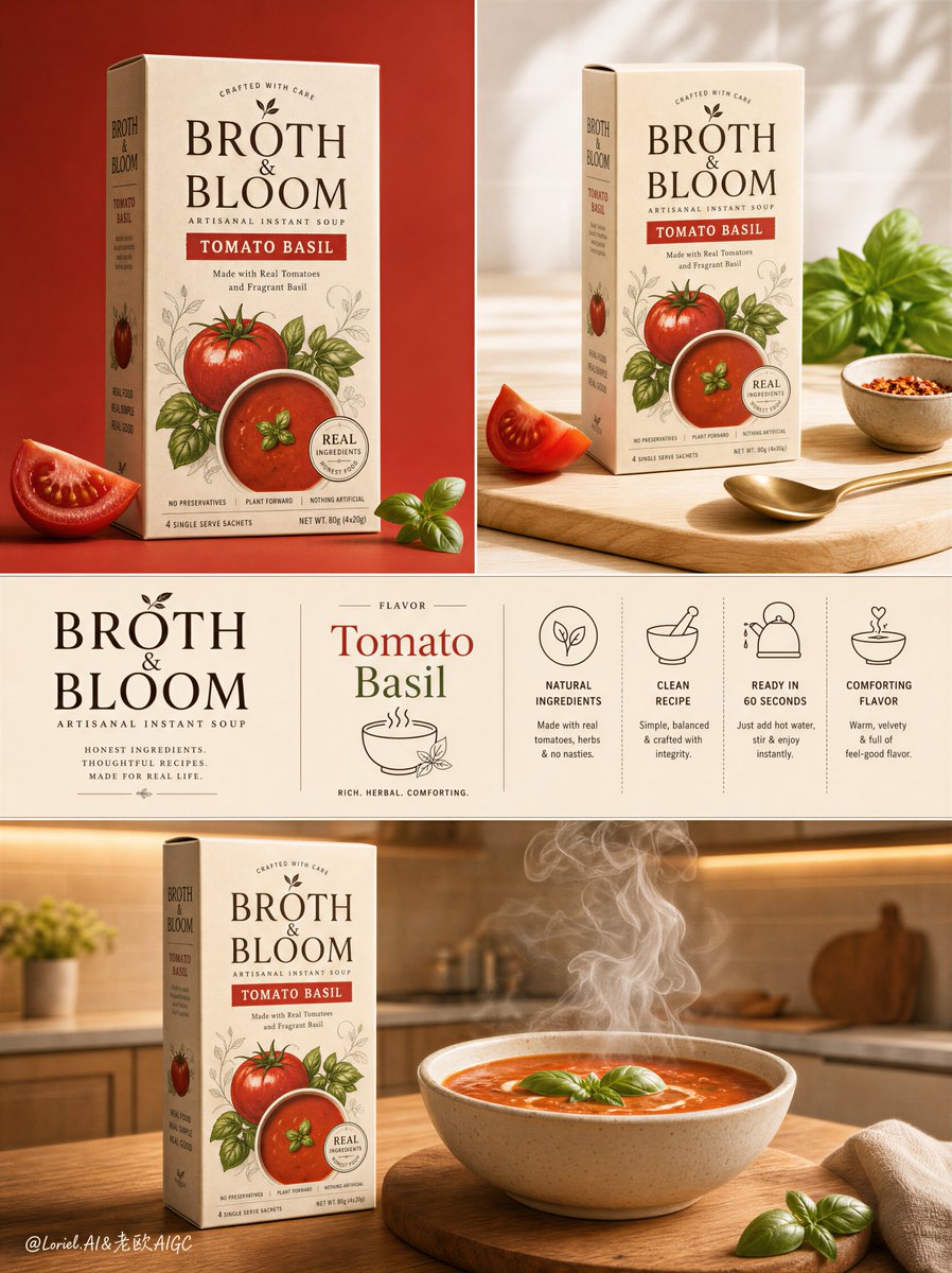
Create a Cannes-level ultra-premium FMCG campaign board for an original artisanal instant soup brand called "BROTH & BLOOM", designed as one tall vertical poster composed of three stacked sections that preserve a clean packaging-presentation logic while elevating it into a more iconic and more precise premium brand-release system. The entire artwork must feel like a flagship launch board for a boutique instant soup brand, combining hero packaging, editorial ingredient context, a highly disciplined brand-information strip, and a final serving ritual scene in one unified visual language. The flavor is Tomato Basil.
Global structure:
Use a vertical three-zone composition:
1. a top section split into two side-by-side panels,
2. a middle full-width brand-information strip,
3. a bottom full-width lifestyle serving scene.
Preserve the same campaign-board skeleton, but increase the authority of the hero packaging, sharpen the precision of the information band, and keep the whole system more spacious, polished, and internationally premium. The carton must remain the visual leader throughout.
Brand identity:
Design a premium instant soup brand called "BROTH & BLOOM" with a warm cream paperboard carton, elegant dark cocoa-brown typography, restrained tomato-red and basil-green accents, subtle ingredient motifs, and highly refined shelf-ready packaging proportions. The logo must feel contemporary, organic, memorable, and premium enough for a high-end grocery brand launch. The package should show believable paper texture, clean folds, sharp print finish, and polished commercial realism.
Top-left panel:
Create a studio-clean hero packaging shot on a warm muted tomato-red background. One upright soup carton stands front-facing and dominates the frame with exceptional authority, elegant negative space, and luxury product-shot presence. Keep supporting elements very restrained: one cut tomato wedge and one small basil sprig near the base only. Strengthen the box’s shelf power through crisp lighting, precise edge highlights, subtle shadow grounding, and impeccable print realism. This panel should feel like the master hero pack reveal.
Top-right panel:
Create a bright editorial tabletop context using a light wood board or pale kitchen-prep surface. Show the same carton positioned neatly in a refined ingredient scene, but keep the composition selective and controlled: one tomato wedge, one basil cluster, one spoon, and one small ingredient bowl are enough. Reduce all unnecessary props. The layout should feel airy, intentional, and magazine-like rather than busy. The carton must remain the focal object. This panel should feel like a premium lifestyle support image for the hero pack.
Middle strip:
Create a full-width warm cream-beige brand-information band that feels highly precise, like a premium brand-manual page. On the left, place the "BROTH & BLOOM" logotype large and refined with excellent typographic weight and spacing. In the center, place the flavor title "Tomato Basil" in elegant premium typography with one minimal line-art soup or bowl icon positioned with strong symmetry and balance. On the right and lower areas, add four minimalist feature icons with short newly invented English descriptors communicating natural ingredients, clean recipe, easy preparation, and comforting flavor. The icon family, spacing, line weight, typography rhythm, and layout alignment must feel exceptionally unified and orderly, like a sophisticated packaging-guideline page.
Bottom section:
Create a warm lifestyle kitchen serving scene with a calm premium domestic atmosphere. Place the soup carton on the left side of a wooden kitchen counter and a steaming ceramic bowl of tomato basil soup on the right or center-right, sitting on a simple round wooden board or trivet. Keep supporting props to an absolute minimum. Let the carton, bowl, and steam carry the story. The soup must look rich, velvety, and freshly served, with a subtle basil garnish and sculptural rising steam. The background should be a softly blurred premium kitchen with warm cabinetry, pale tile, and quiet architectural depth, but remain secondary and uncluttered. The carton must still read clearly and confidently as the commercial hero alongside the served bowl.
Orbit enhancement:
Push the board into stronger flagship-brand territory. Increase the hero-pack dominance in the top-left panel so the carton feels more iconic and shelf-commanding. Sharpen the graphic discipline of the middle strip so the typography, icon spacing, and information hierarchy feel more exact and premium. Refine the steam in the bottom scene so it rises in more layered, sculptural plumes, adding appetite appeal and sophistication. The whole board should feel more like a complete international brand rollout visual than a simple food presentation.
Transit refinement:
Keep the exact same three-section skeleton and the same flavor identity, but refine the middle information strip to feel even closer to a luxury packaging style guide. Improve icon consistency, spacing rhythm, word hierarchy, letter spacing, and visual alignment so the information band becomes a strong design asset rather than just a feature list. The entire board should feel more polished, more editorial, and more globally premium.
Lighting:
Use a unified premium commercial lighting system across the board, adapted by section. The top-left panel should feel studio-clean and slightly dramatic, with polished package highlights and rich depth. The top-right panel should feel fresh, bright, and editorial. The middle strip should feel even, flat, elegant, and design-led. The bottom section should feel warm, domestic, and appetizing, with natural soft directional light and beautifully readable steam. Keep the overall board cohesive in tone and polish.
Material and texture:
The carton must show realistic paperboard finish, subtle grain, crisp folds, believable edges, and premium print detail. Tomatoes must feel juicy and fresh, basil crisp and fragrant, wooden boards tactile and warm, ceramic bowl softly glazed, and soup surface velvety with gentle sheen. Steam must feel physically convincing, layered, and elegant. Every element should feel real, tactile, and premium.
Color direction:
Use a restrained premium palette of tomato red, basil green, creamy beige, warm ivory, soft wood brown, and cocoa-brown typography. Keep saturation controlled and appetizing. The whole board must feel natural, fresh, wholesome, and elegant, with no cheap retail clutter or visual noise.
Design intent:
The final artwork must feel like a world-class packaging campaign board for a premium instant soup brand, merging a commanding hero pack, a refined editorial context panel, a highly disciplined brand-information strip, and a warm serving ritual into one coherent launch system. The product must remain the visual leader throughout. The final result should feel collectible, highly marketable, and suitable for launch decks, retail displays, premium social campaigns, and FMCG brand presentations.
Rendering style:
ultra-realistic premium FMCG packaging campaign, high-end instant soup brand board, tomato basil soup packaging design, editorial product presentation, luxury typography and icon strip, refined kitchen serving lifestyle scene, natural commercial food lighting, flagship brand-release poster, 8k, world-class image quality
Negative prompt:
copied original brand name, copied original text, generic supermarket flyer, ugly typography, unreadable packaging text, malformed letters, weak product hierarchy, deformed carton, broken box edges, muddy soup texture, fake steam, cluttered ingredient layout, too many props, oversaturated cheap colors, flat lighting, low-detail kitchen background, amateur icon design, inconsistent layout rhythm, visual noise, low resolution, compression artifacts, messy campaign board composition
Copy PromptCopied!