Create a premium commercial poster board for a fictional ...
Prompt
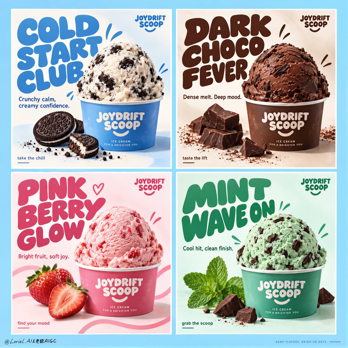
Create a premium commercial poster board for a fictional ice cream brand called JOYDRIFT SCOOP, redesigned into a unified four-panel campaign grid that merges Orbit-level commercial punch with Port-level curated restraint. The full composition is a strict 2x2 poster system on a soft sky-blue master background, with four equal rectangular panels, clean white gutters, perfect alignment, and a highly controlled visual rhythm. Each panel behaves like an individual flavor advertisement, but the whole page reads as one collectible brand campaign with stronger hierarchy, cleaner negative space, larger typography, fewer decorative distractions, and a more gallery-like sense of control. The ice cream remains the absolute hero in every panel.
The campaign concept is flavor as mood architecture. Each panel contains one centered or lower-centered hero scoop in a branded paper cup, oversized custom display typography, one concise support line, a few restrained doodle accents, and only the most essential ingredient props. Keep the composition bold, product-led, playful, and premium. Reduce unnecessary splash clutter and busy micro-elements; every graphic mark must support the scoop, not compete with it.
Panel system:
Top-left panel: cookies-and-cream scoop in a branded paper cup, cool blue-and-cream flavor world, minimal cookie crumb accents, campaign headline exactly: "COLD START CLUB". Support copy exactly: "Crunchy calm, creamy confidence."
Top-right panel: rich chocolate scoop in a branded cup with a few dark chocolate chunks and restrained cocoa accents, campaign headline exactly: "DARK CHOCO FEVER". Support copy exactly: "Dense melt. Deep mood."
Bottom-left panel: strawberry scoop in a branded cup with two or three clean fresh strawberry elements and restrained pink ribbon-like graphic curves, campaign headline exactly: "PINK BERRY GLOW". Support copy exactly: "Bright fruit, soft joy."
Bottom-right panel: mint chocolate scoop in a branded cup with crisp mint leaves and a few precise chocolate chip cues, campaign headline exactly: "MINT WAVE ON". Support copy exactly: "Cool hit, clean finish."
Brand design and typography: every panel includes a small consistent top-corner brand mark reading exactly: "JOYDRIFT SCOOP". Use large rounded custom display lettering with flavor-specific color shifts, thicker mass, tighter hierarchy, and stronger sculptural presence than before. Use a smaller clean sans-serif for support lines and tiny CTA microcopy such as "take the chill", "taste the lift", "find your mood", or "grab the scoop", but keep these sparse and secondary. Typography must behave as a graphic object integrated into the composition, wrapping around the scoop without touching the main product silhouette.
Product styling: ultra-real premium ice cream with believable scoop geometry, creamy micro-texture, gentle edge softness, realistic inclusions, minimal appetizing melt, and crisp branded cups. Cookies-and-cream shows visible cookie chunks in cool white cream; chocolate feels velvety, dense, and dark; strawberry feels airy, fruit-forward, and luminous; mint feels cool, fresh, and slightly sharper in texture with chocolate fragments. The scoops must feel physically convincing and highly edible, with no collapse, over-melt, or messy drips.
Color system: each panel operates as its own controlled flavor universe while the whole board remains harmonized. Use a refined 60/30/10 balance inside each quadrant: dominant flavor hue, white/cream support, and one accent note. Across the full four-panel board, maintain a candy-clean campaign palette built from sky blue, cream white, cocoa brown, berry pink, and mint green, with the overall master background tying the set together. The image should feel brighter, more premium, and more curated than a typical FMCG flavor poster sheet.
Lighting and finish: bright studio-commercial lighting with soft frontal fill, subtle top highlights on each scoop, gentle shadow grounding under the cups, clean white handling inside the panels, and extremely polished product retouching. Show creamy micro-texture, matte paper cup print, fresh mint leaf surfaces, glossy berry freshness, and crisp chocolate edges. The final image should feel like a Cannes-level FMCG campaign: playful yet disciplined, tactile yet clean, youthful yet art-directed.
Output and constraints: one complete four-panel ice cream campaign board, product-first, highly graphic, clean luxury execution, no people, no extra unrelated props, no copied original poster text, no real brand names, no cluttered doodle overload, no broken grid alignment, no unreadable text, no malformed scoops, no duplicated ingredients, no warped cups, no muddy colors, no messy drips, no cheap clip-art feel, no AI text gibberish, and no style drift between panels.
Copy PromptCopied!