QUECHUA — “PLAY OUTSIDE.”
Prompt
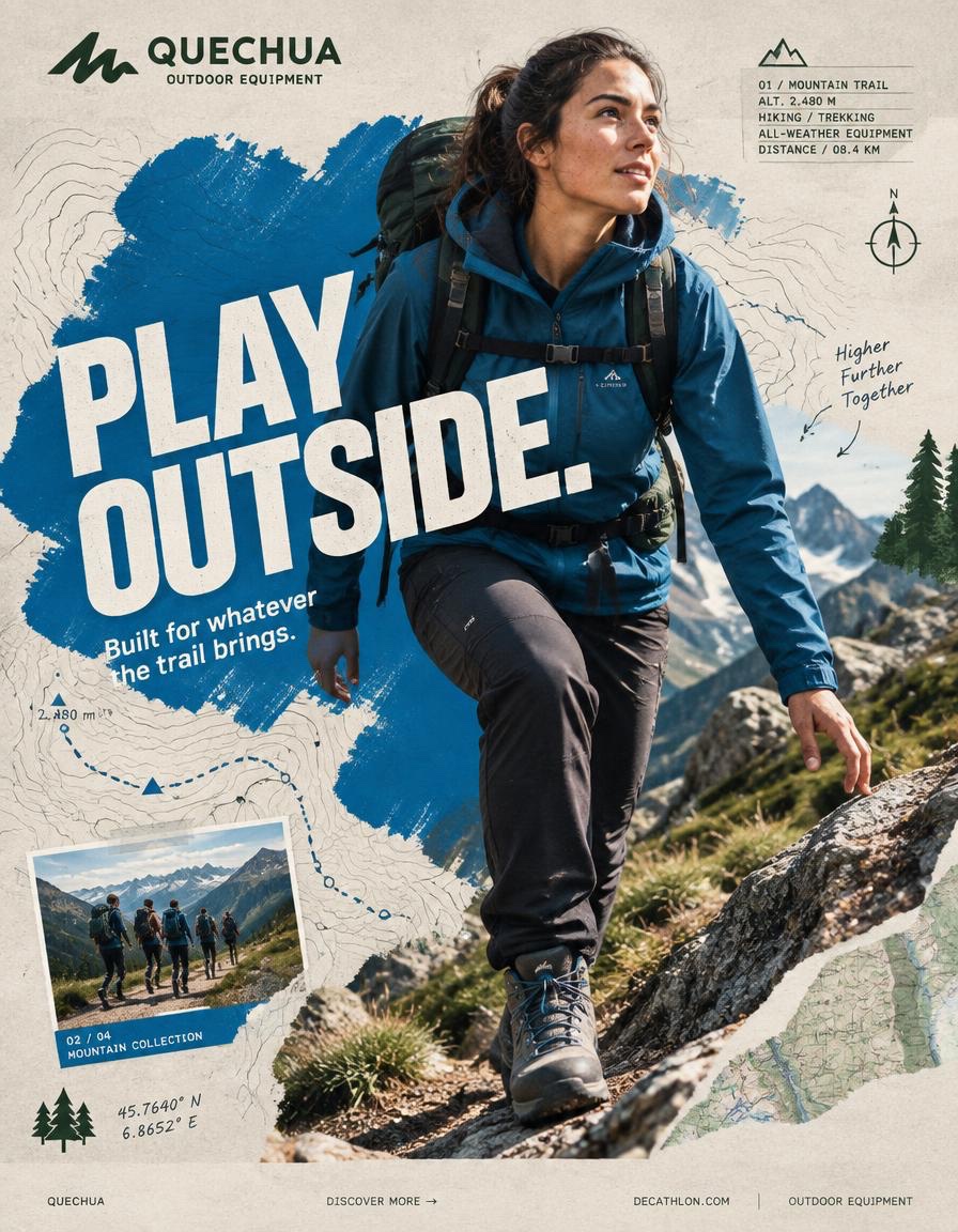
QUECHUA — “PLAY OUTSIDE.”
BEHANCE-LEVEL DIGITAL COLLAGE CAMPAIGN
FORMAT
Ultra-Premium QUECHUA Outdoor Campaign Key Visual
Vertical 4:5 Instagram Hero Creative
Behance Front Page Quality
Global Outdoor & Hiking Campaign
Senior Social Media Art Direction
Contemporary Outdoor Photography × Handcrafted Digital Collage × Editorial Graphic Design
8K UHD
Hyper-Realistic Outdoor Photography
High-End Editorial Art Direction
Print-Quality Graphic Execution
Premium Commercial Adventure Campaign
Strong Visual Storytelling
Tactile Mixed-Media Aesthetic
Zero AI Slop
Zero Generic Hiking Advertisement
Zero Stock-Photo Feeling
Zero Influencer Travel Aesthetic
Zero Corporate Catalogue Layout
Zero Luxury-Adventure Copycat
Zero Random Graphic Decoration
The final artwork must feel deliberately designed by a senior art director and assembled by a professional digital collage artist — not generated as a collection of unrelated elements.
CREATIVE CONCEPT
CAMPAIGN:
“PLAY OUTSIDE.”
CORE MESSAGE:
THE OUTDOORS BELONGS TO EVERYONE.
The campaign celebrates the instinct to leave the ordinary behind.
A trail after work.
A mountain on the weekend.
A cold morning hike.
A sudden change in weather.
A long walk with friends.
A place you have never explored before.
Quechua becomes the equipment that makes everyday exploration possible.
The visual should communicate:
EXPLORATION
FREEDOM
DISCOVERY
ADVENTURE
MOVEMENT
RESILIENCE
COMMUNITY
OUTDOOR LIFE
The campaign should feel:
AUTHENTIC
ADVENTUROUS
YOUTHFUL
RAW
OPTIMISTIC
HUMAN
ENERGETIC
ACCESSIBLE
ART DIRECTION
Think:
QUECHUA × OUTDOOR EDITORIAL × MOUNTAIN JOURNAL × HANDCRAFTED POSTER × TOPOGRAPHIC MAP × CONTEMPORARY DIGITAL COLLAGE
The artwork should combine highly realistic outdoor photography with visibly handmade graphic interventions.
The contrast is essential:
REAL HUMAN
+
REAL OUTDOOR ENVIRONMENT
+
REAL QUECHUA PRODUCT
+
HANDMADE GRAPHICS
+
TOPOGRAPHIC INFORMATION
+
EDITORIAL TYPOGRAPHY
Do not make the environment look like an artificial fantasy landscape.
The mountain must feel physically real.
The weather must feel real.
The clothing must look genuinely functional.
The person must look like someone who actually hikes.
Introduce controlled imperfections:
rough paper edges
hand-painted marks
topographic contour lines
slightly misregistered ink
screen-print texture
cut-paper shapes
field-note markings
visible paper fibers
analog grain
subtle photocopy texture
These imperfections should feel intentionally art-directed.
Never messy.
Never amateur.
PHASE 1 — HERO PHOTOGRAPHY
SUBJECT:
One energetic everyday outdoor explorer.
Age:
20–30.
Gender:
Auto select based on strongest visual composition.
Casting:
Contemporary global and diverse.
The person must look like a genuine Quechua customer rather than a fashion model.
Natural facial structure.
Natural skin texture.
Realistic body proportions.
Practical outdoor appearance.
No influencer aesthetic.
No luxury travel aesthetic.
No expedition-superhero styling.
EXPRESSION:
Focused.
Curious.
Confident.
Natural.
A subtle authentic smile or concentrated expression.
The emotion should communicate:
“I WANT TO SEE WHAT IS AROUND THE NEXT CORNER.”
ACTION
Capture the subject at the absolute peak of outdoor movement.
Preferred actions:
HIKING UPHILL
TRAIL RUNNING
CROSSING A ROCKY RIDGE
CLIMBING A STEEP TRAIL
WALKING THROUGH A FOREST
JUMPING ACROSS A SMALL STREAM
DESCENDING A MOUNTAIN PATH
TREKKING THROUGH LIGHT RAIN
Choose ONE action with the strongest silhouette.
The action must create a powerful diagonal.
The body should naturally travel from:
TOP LEFT
toward
BOTTOM RIGHT.
The terrain should reinforce the movement direction.
Capture authentic physical effort.
Boots should interact naturally with rocks, soil or trail surface.
Clothing should react naturally to wind and movement.
No impossible body positioning.
No floating feet.
No fantasy climbing.
HERO PRODUCT
ONE CLEARLY VISIBLE QUECHUA PRODUCT ONLY.
Choose the product that best supports the selected adventure.
Examples:
QUECHUA HIKING JACKET
QUECHUA BACKPACK
QUECHUA HIKING BOOTS
QUECHUA FLEECE
QUECHUA RAIN JACKET
QUECHUA TREKKING TROUSERS
QUECHUA TENT
The product must be unmistakably visible.
Product placement should feel naturally integrated into the adventure.
No floating product.
No duplicate product.
No product lineup.
The hero product receives secondary visual emphasis after the explorer.
Preserve accurate product construction:
fabric
stitching
zippers
buckles
straps
pockets
waterproof details
sole construction
technical materials
brand markings
PHOTOGRAPHIC STYLE
Premium editorial outdoor campaign photography.
Authentic natural lighting.
Documentary adventure energy.
Real mountain atmosphere.
Natural skin.
High-resolution textile detail.
Realistic terrain.
Camera:
SONY A1 II
Lens:
85mm
Aperture:
f/2.8
Camera position:
Slight low-angle hero perspective.
Crop:
3/4 body or full body depending on action.
The explorer must be isolated with an exceptionally clean professional cutout when required for the collage.
Preserve:
hair detail
fabric edges
hands
boots
backpack straps
equipment
natural movement
No artificial cutout halo.
No white outline.
No excessive sharpening.
PHASE 2 — COLOR FOUNDATION
PRIMARY QUECHUA OUTDOOR BLUE
Use a strong outdoor-inspired Quechua blue as the principal graphic accent.
SUPPORTING COLORS:
Off-white
Warm stone grey
Deep forest green
The palette should feel connected to:
mountain sky
rock
forest
trail
technical outdoor equipment
Keep the graphic system controlled.
Avoid excessive colors.
PRIMARY PAINT FORM
Create ONE enormous irregular outdoor-blue paint form.
Occupy approximately:
45–55% of the composition.
The shape should function as the visual foundation of the collage.
Appearance:
hand-painted
thick brush texture
organic edges
dry-brush imperfections
visible bristle marks
slight transparency variations
screen-print character
paper interaction
The paint should feel physically applied to recycled expedition paper.
Not a smooth digital blob.
Not a generic vector shape.
The explorer should overlap the paint form.
The product must remain completely visible.
PHASE 3 — COLLAGE SYSTEM
Introduce exactly five major handcrafted graphic elements.
Select from:
TOPOGRAPHIC CONTOUR LINES
TRAIL ROUTE LINES
HAND-DRAWN CIRCLES
COMPASS SYMBOLS
ALTITUDE MARKERS
MOUNTAIN SILHOUETTES
GPS COORDINATE MARKINGS
ELEVATION GRAPHICS
HAND-DRAWN ARROWS
WEATHER SYMBOLS
TERRAIN MAP FRAGMENTS
HALFTONE DOTS
FIELD-NOTE MARKINGS
Each element must have a visual purpose.
Do not scatter graphics randomly.
Graphics should reinforce:
direction
altitude
location
distance
terrain
exploration
Use asymmetric placement.
Create a strong diagonal rhythm.
Some elements may pass behind the explorer.
Some may partially disappear beneath typography.
One or two graphic elements may overlap the subject subtly to create physical depth.
MATERIAL LANGUAGE
Build the collage as though physically assembled from an explorer’s field notebook.
Include subtle:
torn-paper edges
folded map fragments
screen-print texture
photocopy artifacts
ink bleed
dry-brush marks
recycled paper fibers
topographic printing
handwritten route markings
subtle registration offsets
analog grain
The artwork should feel tactile.
It should resemble:
A MOUNTAIN MAP
AN OUTDOOR MAGAZINE
A HANDMADE ADVENTURE POSTER.
Do not overdo the texture.
PHASE 4 — TYPOGRAPHY
PRIMARY HEADLINE:
PLAY OUTSIDE.
Make this the second-largest visual element after the explorer.
Large bold uppercase geometric sans-serif.
Extremely strong weight.
Tight leading.
Compact composition.
Minimal tracking.
Allow a slight 2–4° rotation.
The typography should feel physically printed onto the artwork.
Not floating.
Not glossy.
Not 3D.
Not futuristic.
Typography should interact with the collage.
Allow:
partial cropping
layer overlap
masking
paint interruption
map-line interruption
edge cropping
PRIMARY COPY:
PLAY OUTSIDE.
SUPPORTING COPY:
Built for whatever the trail brings.
Keep supporting copy small and highly readable.
TYPOGRAPHIC HIERARCHY
01
QUECHUA BRANDING
02
PLAY OUTSIDE.
03
Built for whatever the trail brings.
04
TRAIL / ALTITUDE / ADVENTURE INFORMATION
05
DISCOVER MORE
The headline must remain instantly readable even at Instagram thumbnail size.
PHASE 5 — QUECHUA BRANDING
Place the official QUECHUA branding in the upper-left.
Preserve:
correct proportions
clear space
accurate wordmark
brand integrity
Do not distort.
Do not stretch.
Do not place the logo inside unnecessary effects.
Small supporting line:
OUTDOOR EQUIPMENT
The branding should remain visible but should not compete with:
PLAY OUTSIDE.
PHASE 6 — BACKGROUND
BACKGROUND COLOR:
Warm Light Stone Grey
The background should resemble premium recycled expedition paper.
Add extremely subtle:
paper grain
recycled fiber
analogue noise
soft printing imperfections
faint topographic texture
Texture opacity:
Below 15%.
The background must remain visually quiet.
The energy comes from:
THE EXPLORER
THE TERRAIN
THE PAINT FORM
THE TOPOGRAPHIC GRAPHICS.
PHASE 7 — COMPOSITION
MODEL POSITION:
Off-center.
Never dead center.
Place the explorer slightly toward the visual intersection of the composition.
NEGATIVE SPACE:
Approximately 18%.
Allow breathing room around the major elements.
LAYER ORDER:
01 BACKGROUND
02 PAPER TEXTURE
03 TOPOGRAPHIC MAP FRAGMENTS
04 PAINT FORM
05 HANDMADE GRAPHIC ELEMENTS
06 EXPLORER PHOTOGRAPH
07 PRODUCT
08 TYPOGRAPHY
09 MICRO INFORMATION
10 BRANDING
11 FOOTER
The explorer should appear to physically exist inside the collage.
MOVEMENT DIRECTION
TOP LEFT
↓
MOUNTAIN RIDGE
↓
EXPLORER
↓
BOTTOM RIGHT
The entire composition should feel as if it is moving toward an unseen destination.
The eye should travel naturally:
BRANDING
↓
HEADLINE
↓
FACE
↓
PRODUCT
↓
TRAIL
↓
CTA
PHASE 8 — VISUAL DEPTH
Create three distinct depth planes.
BACKGROUND:
Recycled paper, faint mountain forms and subtle map texture.
MIDGROUND:
Paint forms, contour lines, trail maps, compass graphics and altitude information.
FOREGROUND:
Explorer, product and typography.
Some contour lines should disappear behind the explorer.
Some typography should overlap the paint.
One small map element should overlap the subject subtly.
This creates the feeling of a physically assembled outdoor editorial collage rather than a flat AI composition.
PHASE 9 — BRAND DNA
The artwork must communicate Quechua’s core outdoor identity:
ACCESSIBLE ADVENTURE
EVERYDAY EXPLORATION
HIKING
OUTDOOR DISCOVERY
PRACTICAL INNOVATION
WEATHER READINESS
COMFORT
COMMUNITY
NATURE
MOVEMENT
The explorer should never look like an untouchable professional expedition athlete.
The campaign should make the viewer think:
“I could go there.”
That feeling is more important than displaying extreme athletic performance.
PHASE 10 — INFORMATION DESIGN
Introduce a small editorial information block.
Example:
01 / MOUNTAIN TRAIL
ALT. 2,480 M
HIKING / TREKKING
ALL-WEATHER EQUIPMENT
DISTANCE / 08.4 KM
Use tiny but perfectly legible typography.
Create visual hierarchy through:
scale
weight
spacing
alignment
Not through excessive colors.
PHASE 11 — SECONDARY COLLAGE FRAME
Introduce ONE small secondary photographic frame.
Place it asymmetrically.
Inside:
A secondary outdoor adventure moment.
For example:
a small group of hikers crossing a mountain trail.
Frame it with a thin outdoor-blue border.
Add:
02 / 04
MOUNTAIN COLLECTION
The secondary image must feel like part of a printed outdoor field journal.
It should support the campaign narrative without competing with the hero explorer.
PHASE 12 — FOOTER
Create a minimal bottom strip.
Include:
QUECHUA
DISCOVER MORE →
OUTDOOR EQUIPMENT
Use very small clean typography.
Keep the footer extremely restrained.
No sale banner.
No clutter.
PHASE 13 — GRAPHIC IMPERFECTION
Introduce controlled imperfections characteristic of high-end physical outdoor collage:
slightly uneven paint edges
tiny ink inconsistencies
subtle map displacement
minor registration shift
hand-drawn contour variation
faint photocopy noise
slight paper edge wear
These details should make the artwork feel human-made.
The composition must still feel extremely polished.
Think:
ART-DIRECTED IMPERFECTION.
Not RANDOM IMPERFECTION.
PHASE 14 — LIGHTING & IMAGE QUALITY
The original outdoor photograph must retain premium commercial photography quality.
Natural mountain sunlight.
Strong directional light.
Realistic atmospheric depth.
Crisp highlights.
Controlled shadows.
Natural skin exposure.
Detailed technical fabric.
Realistic rock and vegetation texture.
Sharp hero product.
Natural environmental reflections.
No artificial HDR.
No plastic skin.
No beauty retouching.
No excessive clarity.
No fake cinematic glow.
No neon.
No fantasy lighting. over-saturated landscape.
PHASE 15 — FINAL ART DIRECTION
The final visual should look like a real campaign artwork created by:
A SENIOR SOCIAL MEDIA ART DIRECTOR
A PROFESSIONAL OUTDOOR PHOTOGRAPHER
A DIGITAL COLLAGE ARTIST
A TYPOGRAPHER
A MAP / EDITORIAL DESIGNER
Every element should appear intentional.
Every layer should have a purpose.
The explorer should provide realism.
The Quechua product should provide commercial relevance.
The typography should provide communication.
The mountain environment should provide emotion.
The map graphics should provide exploration.
The paint form should provide brand energy.
The paper texture should provide physicality.
The composition should provide movement.
FINAL FEEL
If:
QUECHUA
×
A CONTEMPORARY OUTDOOR MAGAZINE
×
A HAND-PAINTED MOUNTAIN POSTER
×
A TOPOGRAPHIC FIELD JOURNAL
×
A MODERN GRAPHIC DESIGN STUDIO
created one campaign together.
The final result should feel:
RAW.
HUMAN.
OUTDOOR.
TACTILE.
ADVENTUROUS.
ACCESSIBLE.
YOUTHFUL.
EXPLORATIVE.
REAL.
Not a catalogue.
Not a generic hiking advertisement.
Not a luxury outdoor campaign.
Not a travel-influencer post.
Not a corporate retail graphic.
Not an AI-generated mountain collage.
A genuine Quechua campaign where:
PHOTOGRAPHY + TERRAIN + PRODUCT + TYPOGRAPHY + TOPOGRAPHIC GRAPHICS + HANDCRAFTED COLLAGE
become one visual system.
FINAL GENERATION SPECIFICATION
Vertical 4:5
8K UHD
Hyper-realistic outdoor photography
Sony A1 II
85mm
f/2.8
Authentic human anatomy
Natural skin texture
Detailed technical outdoor apparel
Accurate Quechua product construction
Clean professional cutout
Outdoor blue / off-white / stone grey / forest green
Controlled graphic palette
Hand-painted collage elements
Topographic map graphics
Recycled paper texture
Editorial typography
Asymmetrical composition
Strong diagonal movement
18% negative space
Premium commercial photography
Contemporary digital collage
Behance front-page art direction
Instagram hero creative
Print-ready finish
High visual hierarchy
High brand recognition
ZERO AI SLOP
Copy PromptCopied!