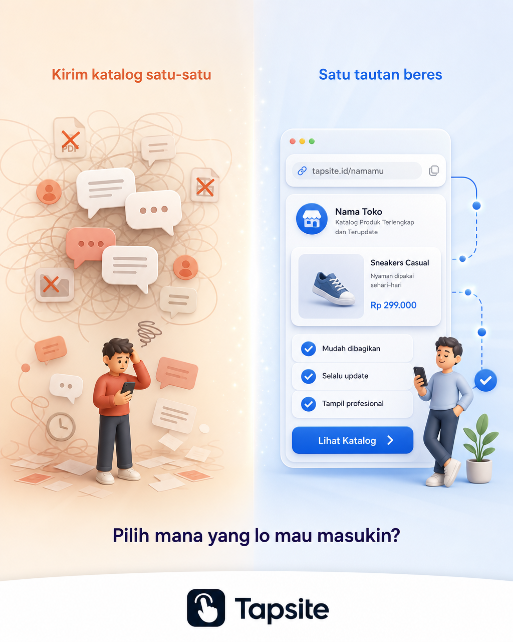
Chaotic vs. Organized Shopping Experience Comparison
Prompt
Create a vertical 4:5 (1080x1350) mixed-style visual comparing two shopping experiences side by side. Background: Soft gradient from warm beige (#FFF5EB) on left to clean light blue (#E8F0FE) on right, creating two distinct zones. Subtle light rays from center. Visual metaphor: Split composition. Left side shows a messy chaotic scene with scattered chat bubbles, crossed-out icons, tangled lines, muted orange-red tones, a tiny overwhelmed figure, subtle text "Kirim katalog satu-satu". Right side shows a clean minimalist landing page with card layout, check icons, clear flow, product card, price label, CTA button in blue (#2563EB) accent, connected dots showing flow, a tiny relaxed figure, warm bright tones with soft glow, subtle text "Satu tautan beres". Center divider: subtle vertical line with small sparkle particles. Bottom area has text "Pilih mana yang lo mau masukin?" in Deep Indigo (#1E1B4B), small, centered. Style: Clean flat illustration blended with subtle 3D depth. Smooth gradients, no harsh shadows. Modern, approachable. Logo Tapsite at bottom-center in dark navy (#0F172A) on clean white band.
Copy PromptCopied!Warm Beigelight blueFlat IllustrationSplit CompositionGPT Image