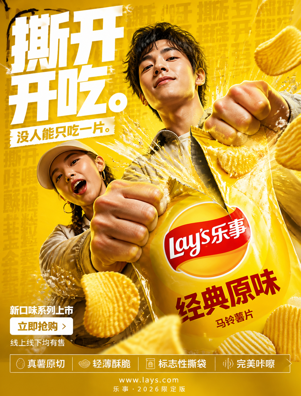
Dynamic High-Energy Potato Chip Commercial Poster
Prompt
FORMAT:4:5 Vertical ultra-commercial snack campaign poster, ultra-high resolution (8K), outdoor billboard + social media advertising grade output. Style: bold FMCG advertising × modern potato chip campaign × high-energy commercial poster design × high-impact product photography. Core Proposition: Everyone can hear it—that tear. Build the image around crispness, anticipation, and the satisfying crunch sound. All elements in the composition respond to the iconic Lay's bag-tearing action. Main Composition: Background: Deep Lay's yellow environment layering: - Rich yellow gradient - Potato texture overlays - Dynamic speed lines - Subtle salt crystals - Repeated typographic text patterns - Glossy studio reflections. Atmospheric feeling: bold, appetizing, high-energy, commercial explosive power. Human Subject: Gen Z young male and female models. Expression: Playful, confident, a moment of enjoyment. Action: Extending the Lay's bag toward the camera, in the act of tearing it open. Camera angle: Slight low angle + close-up perspective to strengthen product dominance. Clothing: Modern street style, neutral tones to let the yellow main tone dominate absolutely. Visual Explosion Point: The 'TEAR' becomes the center of visual explosion. At the tear point: - Potato chips splashing outwards - Salt crystals suspended in mid-air - Golden oil streaks - Dynamic lines radiating from the tear. Typography physically tears following the trajectory of the bag tear. Feeling: Satisfying, impactful, commercially exaggerated. Product Protagonist: Lay's classic chip bag + potato chips. Position: Foreground middle-right. Angle: Extreme 3/4 hero view. Product details: - Hyper-realistic chip texture - Visible wavy ridges - Glossy golden oil highlights - Realistic salt crystals - Embossed Lay's logo - High-end packaging bag reflections. Chips should convey: crispy, light, irresistible. Font System: Main Title: 'Tear Open and Eat.' Font style: - Ultra-bold compressed sans-serif - Massive stacked layout - White font - Extremely tight letter spacing - Torn/distorted at the tear point. Sub-copy: 'No one can eat just one.' Background text: Low opacity repeated words: tear, crunch, crispy, potato, salt, golden integrated into background layers. Selling point info bar: Bottom high-end selling point bar: □ Real potato cut □ Thin and crispy □ Iconic bag tear □ Perfect crunch, minimalist modern icon system. Call to Action area: Bottom left: 'New Flavor Series Launch' CTA Button: Pure white rectangular button. Button text: 'Buy Now'. Secondary micro-copy: 'Available online and offline'. Website and brand info: Bottom center: www.lays.com. Bottom micro-text: 'Lay's · 2026 Limited Edition'. Color System: Main color: Lay's Yellow, Deep Potato Gold. Auxiliary color: White font. Accent color: Warm potato highlight golden oil. Color palette feeling: bold, delicious, high-energy, commercial. Lighting System: Main light: Strong commercial studio main light. Rim light: Warm potato highlights around the product. Atmospheric light: Soft yellow light behind the tearing action. Ambient light: Subtle suspended salt particle reflections. Lighting reflections: FMCG grade glossy reflections. Lighting feeling: High-end snack ad × modern commercial photography. Ultra-fine details: - Hyper-realistic potato texture - Sharp chip bag tear details - Realistic suspended salt crystals - Golden oil reflections - High-end packaging bag texture - Maintain outdoor billboard readability - Ultra-clean font edges - High-end FMCG rendering quality. Composition flow: Upper area: Giant typography dominant; Middle area: Tearing explosion + human interaction; Foreground: Product protagonist; Bottom left: CTA + selling points. Visual flow: Title → Tear → Product → Chip dynamics → CTA. Lens and Rendering: - Commercial food photography - Phase One medium format quality - 35–50mm lens - HDR commercial rendering - Ultra-clean sharpness - High-end FMCG color grading. Final Tone: Like: Nike energy campaign × high-end snack premiere × modern Behance commercial food poster.
Copy PromptCopied!Appetizing8k resolutionstudio lightingrim lightLow angledynamic compositionGPT Image

![【诗词原句】:[诗词原句]](https://cdn.guidesref.com/trk_6a9e583736df32.02368478.jpg)

![[BRAND]: [Brand Name]](https://cdn.guidesref.com/trk_6a9e54cb840ad2.48917898.jpg)