Conversion Rate Comparison: Landing Page vs Linktree Dashboard
Prompt
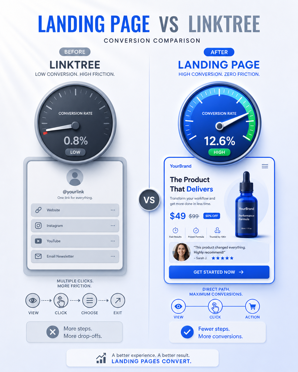
Create a vertical 4:5 (1080x1350) mixed-style visual for a social media thread about landing page vs linktree conversion comparison.
**Visual metaphor — Dashboard / Gauges (Instrument Panel):**
Split-view comparison: Left side shows a simple, minimalist "Linktree" style interface with a single gauge needle barely moving — representing low conversion and high friction. Right side shows a professional dashboard-like "Landing Page" interface with multiple gauges showing high activity — representing smooth conversion flow.
**Left side (Before — "Linktree"):**
A simple vertical list-style interface with 4 generic buttons. A gauge/instrument dial showing low reading. Arrow icons suggesting multiple clicks needed. Color tone: muted gray-blue (#94A3B8) giving a feeling of friction and lost momentum.
**Right side (After — "Landing Page"):**
A professional landing page mockup showing product image, price tag, testimonial snippet, and CTA button. A gauge dial showing high reading. Arrow icon showing direct path from view to action. Color tone: vibrant (#2563EB accent) indicating efficiency and direct conversion.
**Center divider:**
A subtle vertical split line with a VS label in a small modern pill badge.
**Style:** Modern clean tech editorial with infographic elements. Clean sans-serif labels, subtle 3D depth on dashboard elements. Sharp, crisp, professional. Mood: data-driven, educational.
**Background:** Clean gradient from #FAFAFA (top) to #E8F0FE (bottom), with subtle light ray effect from upper-left. Soft glow layer.
Copy PromptCopied!InfographiceducationalSharpGPT Image