MASTER PROMPT — WHYTOKENS BAKERY BRAND IDENTITY PRESENTAT...
Prompt
MASTER PROMPT — WHYTOKENS BAKERY BRAND IDENTITY PRESENTATION BOARD
SUBJECT AND PURPOSE
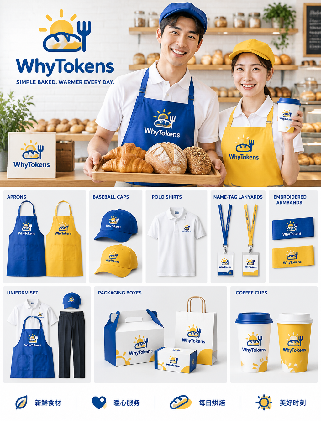
Create a premium, polished commercial brand identity presentation board for WhyTokens bakery. Present it as a refined, modular visual identity manual against a pure white, minimalist background. The finished board should feel clean, welcoming, contemporary, cohesive, and highly shareable on Instagram.
CORE BRAND SYSTEM
Use a crisp, consistent palette of vivid Klein blue and warm golden yellow, balanced with white and subtle natural wood tones. Maintain consistent color values, logo application, typography, spacing, and visual language across every section. Build a clear visual hierarchy with precise alignment, consistent module spacing, and generous white space.
LOGO AND SLOGAN
Place the WhyTokens logo prominently in the upper-left corner. Pair the wordmark with a simple, flat, minimalist cartoon emblem that combines a small sun with a fork-and-bread motif. Keep the emblem friendly, distinctive, and easy to read at small sizes. Directly beneath the logo, reproduce this slogan exactly, including punctuation and capitalization: “SIMPLE BAKED. WARMER EVERY DAY.”
HERO SCENE
Feature a bright, spotless bakery kitchen with clean white brick walls. Show a smiling young East Asian male employee and a smiling young East Asian female employee standing side by side, framed from the waist up. Both wear white short-sleeved polo shirts.
The man wears a Klein-blue apron and matching baker’s cap, and holds a wooden tray displaying golden croissants and European-style artisan bread. The woman wears a warm-yellow apron and matching cap, and holds a branded takeaway coffee cup. Give both employees natural, genuinely warm expressions. Keep their clothing, faces, bread, and cup clearly visible and unobstructed. Use realistic proportions, natural poses, and anatomically correct hands.
MERCHANDISE COLLECTION
Below the hero scene, arrange the complete bakery merchandise collection in distinct, orderly modules. Include:
- Canvas aprons
- Baseball caps
- Short-sleeved polo shirts
- Name-tag lanyards
- Embroidered armbands
- A complete uniform set
- Branded packaging boxes
- Coffee cups
Apply coordinated Klein-blue and warm-yellow accents throughout. Show each item fully, with accurate shape, scale, and proportions. Render realistic embroidered fabric, visible stitching, natural canvas weave, crisp garment seams, sturdy paper packaging, and carefully printed branding. Keep the merchandise neatly presented and consistent with the brand system.
LAYOUT AND PRESENTATION
Organize the logo, hero scene, merchandise, and footer as a balanced, modular identity-board composition. Use clean alignment, consistent spacing, clear grouping, and ample white space. Make every module feel intentionally designed and easy to scan. Ensure all products and important brand details remain fully visible, without overlap, cropping, or clutter.
FOOTER ICONS AND CHINESE TEXT
Along the bottom edge, add four simple, consistent service icons, each paired with its corresponding Chinese text, rendered exactly and legibly:
“新鲜食材”
“暖心服务”
“每日烘焙”
“美好时刻”
Keep the icon style flat, friendly, and visually aligned with the logo illustration. Space and align the four icon-and-text pairs evenly.
LIGHTING, MATERIALS, AND IMAGE QUALITY
Use high-key commercial photography with bright, diffused, near-shadowless indoor lighting, delicate product highlights, even exposure, and clean whites. Combine photorealistic employees and merchandise with a flat, minimalist illustrated logo and icons. Emphasize a fresh, heartwarming bakery atmosphere, refined presentation-board craftsmanship, realistic textile and packaging textures, sharp details, and high-definition commercial image quality.
TEXT AND BRAND ACCURACY
Preserve the exact spelling “WhyTokens” and reproduce the slogan and all four Chinese footer labels exactly as provided. Keep every requested text element clean, correctly spelled, and legible. Do not add any extra copy.
NEGATIVE CONSTRAINTS
No watermarks, unrelated logos, extra text, misspelled lettering, clutter, distorted faces or hands, malformed products, inconsistent brand colors, heavy shadows, oversaturated colors, or plastic-looking fabric.
style: remotion
Copy PromptCopied!

![A [Subject] photographed from an extreme low-angle ground...](https://cdn.guidesref.com/trk_6aa8eff6f044a4.86910829.jpg)