Gourmet Summer Chocolate Thermal Contrast Campaign
Prompt
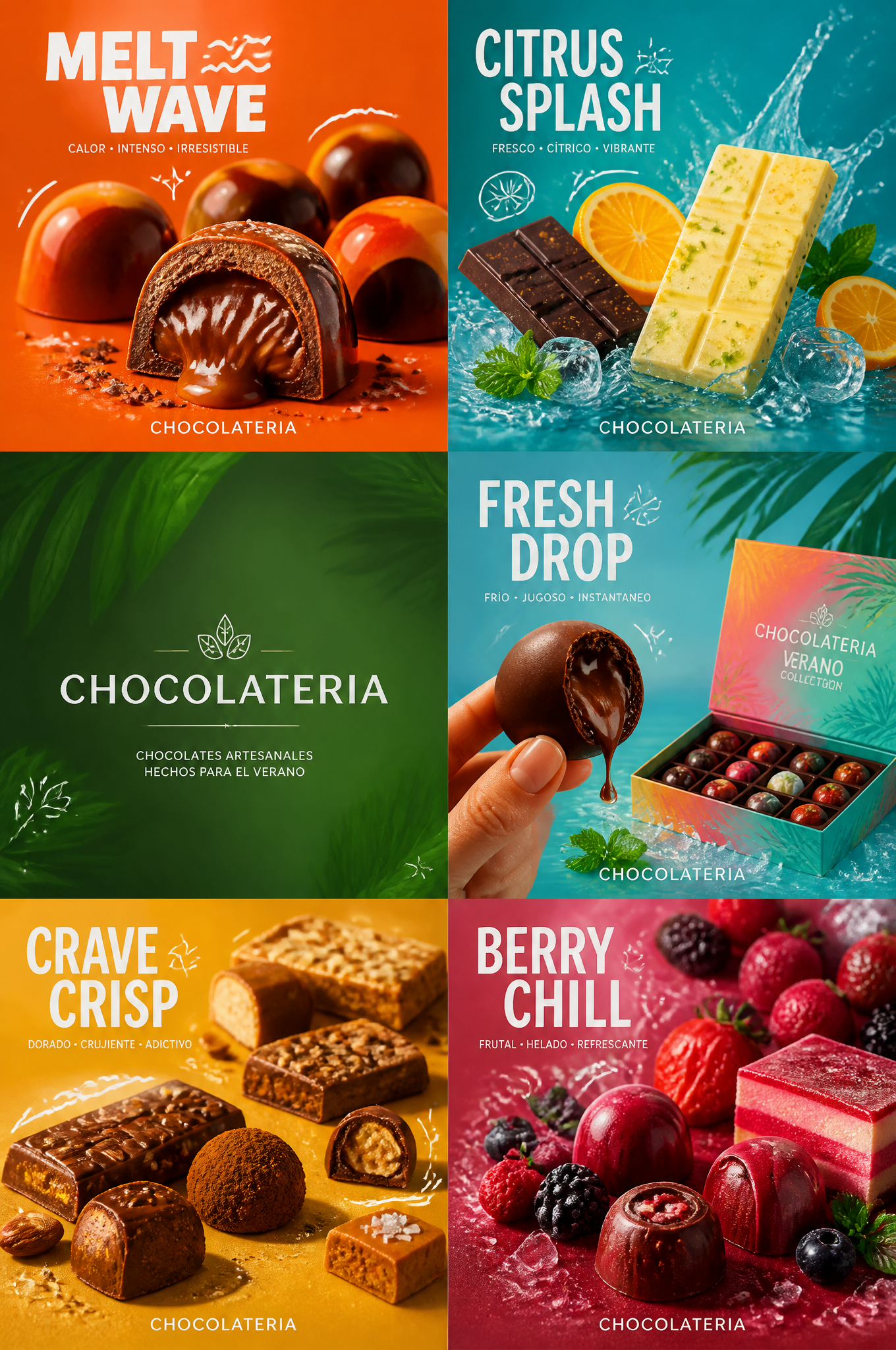
Create a high-quality six-panel (2x3) summer campaign poster for the gourmet artisanal chocolate brand “CHOCOLATERIA”. The final design must convey the feeling of a top-tier seasonal brand promotion: bold, fun, flawless, highly appetizing, with a strong graphic impact and centered on the product. Maintain a strict six-panel grid with absolute coherence, where each panel works as a flagship mini-ad, but simultaneously belongs to a coherent summer campaign. Use refined Spanish branding, minimal supporting text, saturated seasonal color palettes, subtle graphic details, and extremely realistic food photography.
Creative Direction: Follow the Milk Cloud Orbit line and make the contrast between hot and cold much more explicit. The campaign must communicate summer appetite through thermal tension: hot panels should convey a feeling of melting, tasty, sweet, crunchy, glossy, and freshly made; cold panels should convey a sense of ice, humidity, translucency, refreshing, juicy, and instantly cooling. The visual system must clearly differentiate the thermal moods while still belonging to a premium summer brand universe.
Main Composition: Use a strict 2x3 grid with six equal square or near-square panels. Each panel should feature a star summer confectionery product or a composition of seasonal bonbons and bars that identify the brand. The overall panel should have a varied yet coherent rhythm. Keep each panel clean, striking, and immediately legible, with a solid product hierarchy and high-quality negative space.
Brand Direction: Create a custom Western artisanal chocolate summer branding system: CHOCOLATERIA using only elegant and bold typography in Spanish for the headlines, with a youthful, refreshing, and premium casual fast-food identity. The typography must be graphic, modern, clean, and with a strong brand presence, never cheap or cluttered.
Thermal Contrast Logic: This is fundamental. The six panels must clearly differentiate between hot appetite and cold refreshment. Hot chocolate panels should show: melted cheese, hot steam, crunchy edges, artisanal cocoa marks, amber glow from heat, very provocative ganache, and bonbons where the interior is visible. Cold chocolate panels should show: ice clarity, citrus humidity, soda effervescence, berry freshness, condensation droplets, moist fruit pulp, fresh splashes, and bluish-green freshness. The viewer should instantly feel the summer contrast between the desire for heat and refreshing coolness.
Six-Panel Content System:
Panel 1: Close-up of bonbons painted with a spectacular, imposing and irresistible design, with a unique shine, on a summer orange background. This panel must convey heat, richness, and a sense of desire.
Panel 2: A mosaic of white and black citrus chocolate bars, with orange slices, iced water splashes, mint, and a bluish-green background. This panel must convey cold, humidity, and a sense of freshness.
Panel 3: A mosaic with the Vélora logo, clean and with a fresh seasonal green background and a subtle graphic texture, acting as a visual breath between warm and cold worlds.
Panel 4: A hand holding a bitten bonbon with ganache drops dripping like cold flying, along with the image of a summer chocolate box and a tropical, fresh atmosphere. This panel must convey a refreshing feeling, not warm.
Panel 5: A mosaic of a star snack with truffles, bonbons, tablets, and energy bars in an intense yellow panel, showing a golden, dry, and crunchy heat, a salty glow, and warmth.
Copy PromptCopied!saturated colorshigh contrastRefreshinghyper-detailedCondensation2x3 GridGPT Image