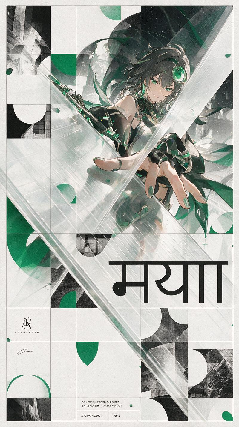
Swiss Modernist Anime Fusion Poster
Prompt
Priority: Character Identity → Composition → Graphic System → Typography → Branding → Print Texture.Create a collectible 9:16 editorial art poster where high-end anime fantasy illustration merges seamlessly with Swiss Modernist graphic design. The composition should feel intentional, architectural, timeless, and gallery-worthy rather than decorative. A monumental translucent architectural plane acts as the primary structural element, dividing perception and reality while expressing the philosophical concept of Maya (Illusion). Typography, geometry, and branding function as structural design elements rather than decoration. The final artwork should resemble a museum exhibition poster, luxury fashion campaign, or contemporary graphic design annual cover.Character Identity: Preserve the character's original facial identity, hairstyle, outfit, accessories, silhouette, body proportions, and signature color accents with near-perfect fidelity. The face is the highest priority and must remain instantly recognizable. Preserve the original eyes, eyebrows, nose, lips, jawline, expression, and all defining facial features without redesigning or beautifying them. Maintain consistent facial identity, anatomy, and proportions throughout the entire composition.Composition: The character leans naturally toward a monumental translucent architectural plane extending diagonally from the lower-left corner to the upper-right corner. The translucent plane becomes the architectural centerpiece of the composition, dividing perception and reality into two interconnected visual planes. Rather than functioning as a mirror, it partially conceals, refracts, and reveals different parts of the same character through subtle transparency, layered depth, and controlled refraction. The character always remains singular and physically complete—never duplicated or cloned. Use dramatic cinematic perspective with enlarged foreground elements such as the hand, weapon, eye accessory, or another iconic object while maintaining believable anatomy and perspective. The viewer's eye should naturally travel across the composition through the interaction between the character, the translucent plane, typography, and Swiss geometry.Graphic Design Style: Inspired by Armin Hofmann, Josef Müller-Brockmann, and the Swiss International Typographic Style. Incorporate strict modular grids, transparent geometric overlays, oversized negative space, repeating semicircles, precise mathematical proportions, black-and-white photographic slicing, clean International Style sans-serif typography, and contemporary editorial composition. Every element should feel intentionally placed and visually disciplined.Sanskrit Typography System: Incorporate authentic Devanagari typography as an essential part of the visual language. Use the Sanskrit word:मायाRender it as oversized editorial typography aligned to the Swiss modular grid, naturally interacting with the translucent architectural plane, transparent geometric forms, and negative space. The typography should function as architectural structure rather than decoration, carrying visual weight comparable to the character itself. Use only correctly spelled Sanskrit with balanced letterforms and clean contemporary typesetting. Avoid random characters, ornamental calligraphy, or meaningless text.Branding: Integrate a refined editorial identity using AETHERION as the sole brand. Include a minimalist geometric monogram, a subtle AETHERION signature, and tasteful archival-style editorial labels naturally embedded within the Swiss layout rather than applied afterward. Branding should support the composition instead of dominating it. Physical branding attached to the character may be partially obscured by the translucent plane, but do not generate duplicate floating logos or unnecessary branding elements.Color Palette: Restrict the artwork to Black, White, and Emerald Green. Use Emerald Green selectively for geometric overlays, translucent architectural ac
Copy PromptCopied!Swiss ModernismdisciplinedModular Gridasymmetrical balanceSeedream 5.0 Pro

![Create a premium vertical 4:5 travel poster of [CITY], [C...](https://cdn.guidesref.com/trk_6a8d18ac19e6e0.48349681.jpg)