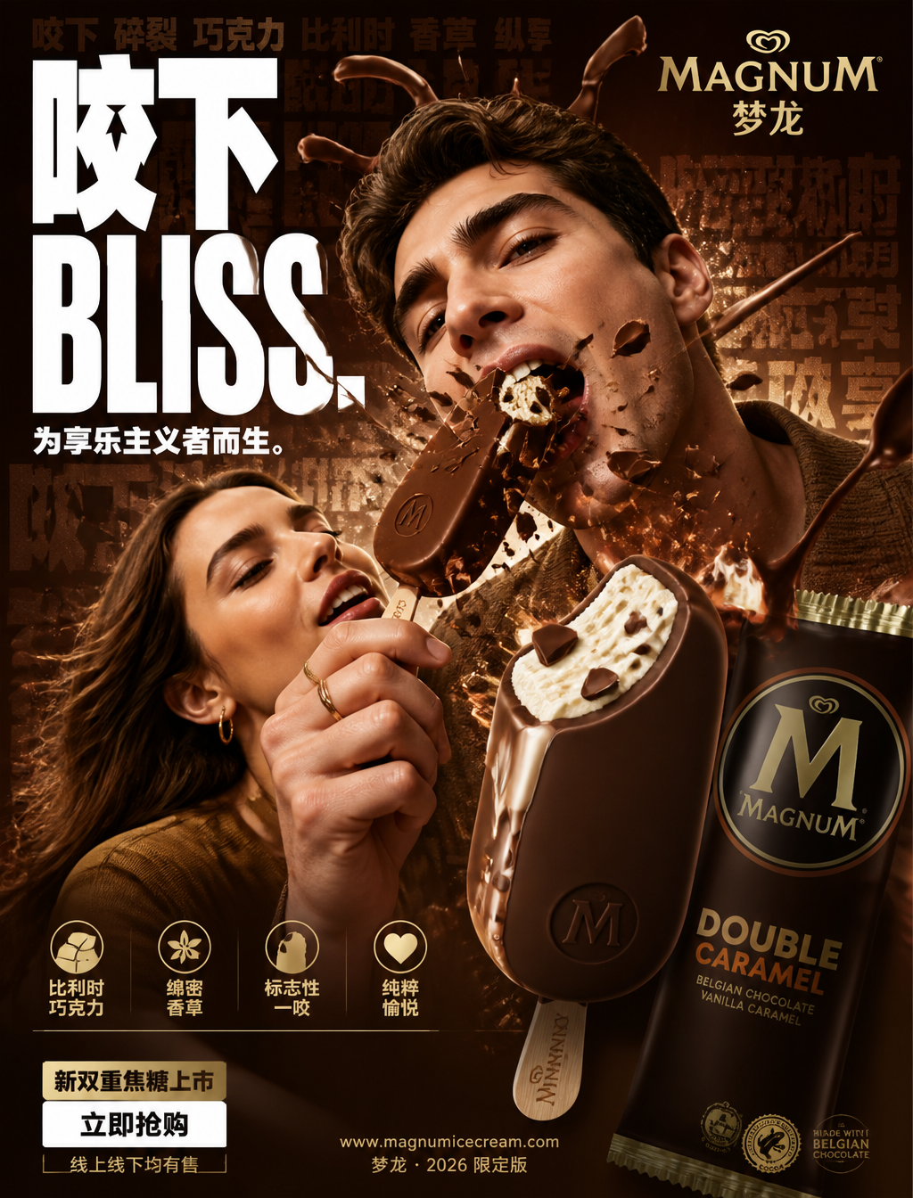
Luxury Magnum Ice Cream Commercial Campaign
Prompt
FORMAT:4:5 vertical ultra-commercial ice cream campaign poster, ultra-high resolution (8K), outdoor billboard + social media ad grade output. Style: bold FMCG advertising × modern luxury ice cream campaign × immersive commercial poster design × high-impact product photography. Core proposition: Everyone is tasting—that one bite. Construct the image around the sense of indulgence, the feeling of cracking, and the satisfaction of biting through. All elements in the composition respond to that iconic Magnum bite. Main Composition: Background: Deep Magnum gold-brown environment with layered levels: - Rich chocolate gradients - Belgian chocolate texture layers - Dynamic cracking lines - Subtle cocoa powder particles - Repeated typographic text underlay - Glossy studio reflection atmosphere. Feeling: bold, indulgent, luxurious, commercial explosive power. Subject: Young adult male and female models. Expression: Playful, confident, the moment of indulgence. Action: Holding the Magnum toward the camera in the act of biting down. Camera Angle: Slight low angle + close-up perspective to strengthen product dominance. Clothing: Elegant casual style, neutral tones to let the gold-brown main theme dominate. Visual Explosion Point: The BITE becomes the visual center of the explosion. At the cracking point: - Chocolate shell fragments flying outwards - Vanilla ice cream suspended in mid-air - Belgian chocolate stretching/stringing - Dynamic lines radiating from the bite mark. Typography physically cracks following the trajectory of the Magnum bite. Feeling: satisfaction, decadent, commercial exaggeration. Product Protagonist: Classic Magnum ice cream bar + packaging. Position: Front right foreground. Angle: Extreme 3/4 hero perspective. Product Details: - Ultra-realistic Belgian chocolate texture - Visible vanilla ice cream core - Glossy melting chocolate highlights - Realistic cocoa powder - Embossed Magnum logo - High-end packaging reflections. Chocolate should convey: thickness, decadent, irresistible. Typography System: Main Title: "Bite into Bliss." Font Style: - Ultra-bold compressed sans-serif - Huge stacked layout - White font - Extremely tight letter spacing - Cracked/distorted deformation at the bite point. Sub-copy: "Born for the Hedonists." Background Text: Low transparency repeated words: Bite, Crack, Chocolate, Belgian, Vanilla, Indulgence integrated into background layers. Selling Point Info Bar: Bottom high-end selling point bar: □ Belgian Chocolate □ Creamy Vanilla □ Iconic Bite □ Pure Pleasure with minimalist modern icon system. Call to Action Area: Bottom left: "New Double Caramel Launch" CTA Button: Pure white rectangular button. Button Text: "Buy Now" Secondary micro-copy: "Available online and offline" Website and brand info: Bottom center: www.magnumicecream.com Bottom micro-text: "Magnum · 2026 Limited Edition". Color System: Main Color: Magnum gold-brown, deep Belgian chocolate. Auxiliary Color: White typography. Accent Color: Warm chocolate highlight, golden caramel. Palette Feeling: bold, indulgent, high energy, commercial. Lighting System: Main Light: Strong commercial studio main light. Rim Light: Warm chocolate highlights around the product. Atmospheric Light: Soft gold light behind the biting action. Ambient Light: Subtle suspended cocoa powder reflections. Lighting Feeling: High-end ice cream ad × modern commercial photography. Ultra-fine details: - Ultra-realistic Belgian chocolate texture - Sharp shell cracking details - Realistic suspended cocoa powder - Melting chocolate reflections - High-end packaging texture - Maintain outdoor billboard readability - Ultra-clean font edges - High-end FMCG rendering quality. Composition flow: Upper area: Giant typography dominates; Middle area: Bite explosion + character interaction; Foreground: Product protagonist; Bottom left: CTA + selling points. Visual flow: Title → Bite → Product → Chocolate dynamics → CTA. Lens and Rendering: - Commercial food photography - Phase One medium format quality - 35–50mm lens - HDR commercial rendering - Ultra-clean sharpness - High-end FMCG color grading. Final Tone: Like a Nike energy campaign × high-end ice cream premiere × modern Behance commercial dessert poster.
Copy PromptCopied!luxuriousIndulgentstudio lightingrim lightLow angleClose-upFMCG Advertisingcommercial photographyGPT Image