Create an ultra-premium FMCG concept card for a consumer ...
Prompt
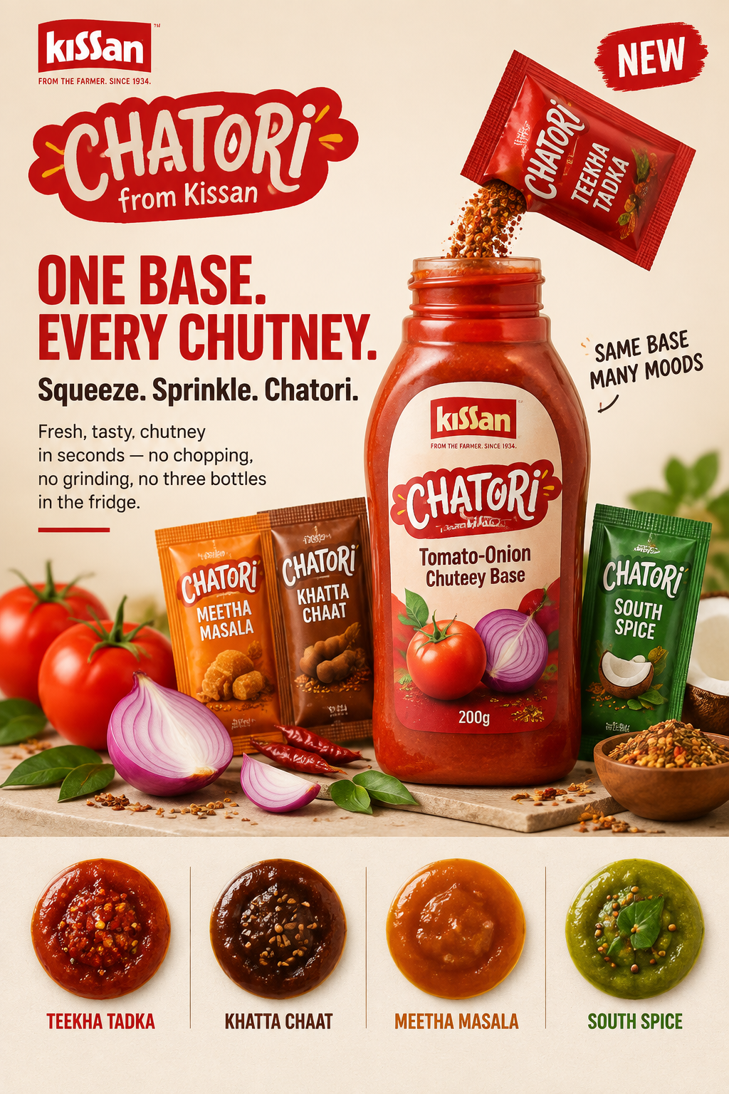
Create an ultra-premium FMCG concept card for a consumer pitch — a single 6:9 slide for aself-invented Hindustan Unilever sub-brand called "CHATORI from Kissan", strictly preservingthe exact layout logic of a classic Unilever concept card: dominant pack hero on the right,left-aligned text hierarchy on the left, brand lockup top-left, "NEW" badge top-right,supporting variant swatch strip along the bottom. Do not change this composition. Keep thesame left-right split, the same vertical pack lineup, the same descending text block rhythm,and the same lower variant-strip continuation. The final artwork must feel like a real HULbrand team's sign-off slide: appetising, bold, warm, tactile, instantly readable, andcommercially confident — a card a consumer could understand in four seconds.Brand identity:"CHATORI from Kissan" — a chutney sub-brand endorsed by Kissan. Use the Kissan wordmark smalland top-left as the endorsing masterbrand, with "FROM THE FARMER. SINCE 1934." micro-lockup.The CHATORI mark itself should feel young, playful and Indian — a confident custom wordmark,slightly irregular, hand-drawn energy, set against Kissan red. The brand must read modern,street-food-native, culturally proud, and shelf-ready, not nostalgic or sanitised.Strict concept-card structure:This is critical. Preserve exactly:- one dominant hero pack cluster anchoring the right two-thirds- left column carrying headline, sub-headline, and a short benefit line- Kissan endorsement lockup top-left, NEW badge top-right- a lower horizontal strip of four variant swatches with names- one clean reading path: brand → headline → pack → variantsDo not convert it into a poster collage, a detail page, a moodboard, or a grid.Central hero product block:Show a 200g squeeze bottle of tomato-onion chutney base standing upright, flanked by foursmall single-use dry-seasoning sachets fanned beside it — one per finisher. The bottle mustfeel materially real: matte label stock, crisp offset print, soft satin finish, a clean flip-top cap with believable moulding, and a visible window of deep tomato-onion chutney with realbody. The sachets should be small, matte-foil, each in its own flavour colour, with sharp tearnotches. A light dusting of spice powder from an opened sachet lands on the chutney surface.The pack cluster must look like it was shot on a real photo set for a launch deck.Tactile realism:Push food realism to the highest level:- chutney with visible tomato and onion pulp, thick pourable viscosity, no gloss plastic look- spice powder with individual grain definition and believable fall- roasted cumin, mustard seed, curry leaf and chilli texture in the swatch strip- condensation-free, dry, clean packaging surfaces with honest label sheen- foil sachet crinkle, print sharpness, and edge highlights- one hero drip or spoon-lift of chutney showing cling and bodyEverything must feel edible, de-AI, and photographable.Lower variant strip:Four equal swatch tiles along the bottom, each a small circular dollop of finished chutney inits true colour, with its name below in clean caps:- TEEKHA TADKA — deep garlic-chilli red, glossy, flecked- KHATTA CHAAT — dark tamarind brown, cumin-flecked- MEETHA MASALA — warm date-jaggery amber- SOUTH SPICE — pale coconut-curry-leaf greenKeep these quiet, evenly spaced and sculptural. They exist to prove range, not to compete withthe hero pack.Text zones:Preserve the original left-column placement. Use short, bold, consumer-facing English withlight Hinglish warmth. Headline reads: "ONE BASE. EVERY CHUTNEY." Sub-line: "Squeeze. Sprinkle.Chatori." Add one compact benefit line about fresh chutney in seconds without chopping,grinding or three bottles in the fridge. Total copy on the card must stay under 80 words. Donot print an insight statement, a strategy line, a framework, or any internal jargon. Thetypography must be clean, high-contrast, generously spaced, and unmistakably legible atthumbnail size.Colour direction:Anchor on Kissan red as the brand signal. Build the supporting palette from real food — tomatored, onion purple-white, tamarind brown, jaggery amber, curry-leaf green, chilli scarlet — ona clean warm-white or soft ivory ground. Preserve strong contrast between the pack and thebackground. Unify everything into one confident, appetising Indian food-brand family.Lighting:Soft premium food-commercial lighting. Bright, clean key light with warm falloff, honestshadows under the bottle and sachets, controlled reflections on the cap and foil, and richcolour saturation in the chutney without going neon. The card must feel fresh, hungry andexpensive — never flat catalogue, never harsh flash.Typography and layout system:Minimal bold English headlines, one clean sans family across the card, consistent baselinegrid, calm hierarchy, generous white space, and a single accent colour for emphasis. The NEWbadge stays small and top-right. The card must look like it came out of a real HUL brandteam's deck template.Rendering style:ultra-premium FMCG concept card, classic Unilever consumer-pitch slide layout, hero chutneysqueeze bottle with four finisher sachets, four-variant swatch strip, bold minimal Englishheadline copy under 80 words, Kissan endorsement lockup, hyper-real Indian food and packagingphotography, appetising commercial lighting, 16:9, 8k, masterpiece qualityNegative prompt:changed slide structure, poster collage, moodboard, product detail page, grid layout, clutteredtext, paragraphs of copy, strategy jargon on card, visible insight statement, ketchup-onlyframing, fake plastic-looking sauce, cartoon spice illustrations, stock-photo Indian family,oversaturated neon colours, harsh flash lighting, busy props, generic template, low-endpackaging, misspelled brand names, text under 14pt
Copy PromptCopied!