Brand: MellowFood: Fresh LemonHeadline: ZESTPhysical Inte...
Prompt
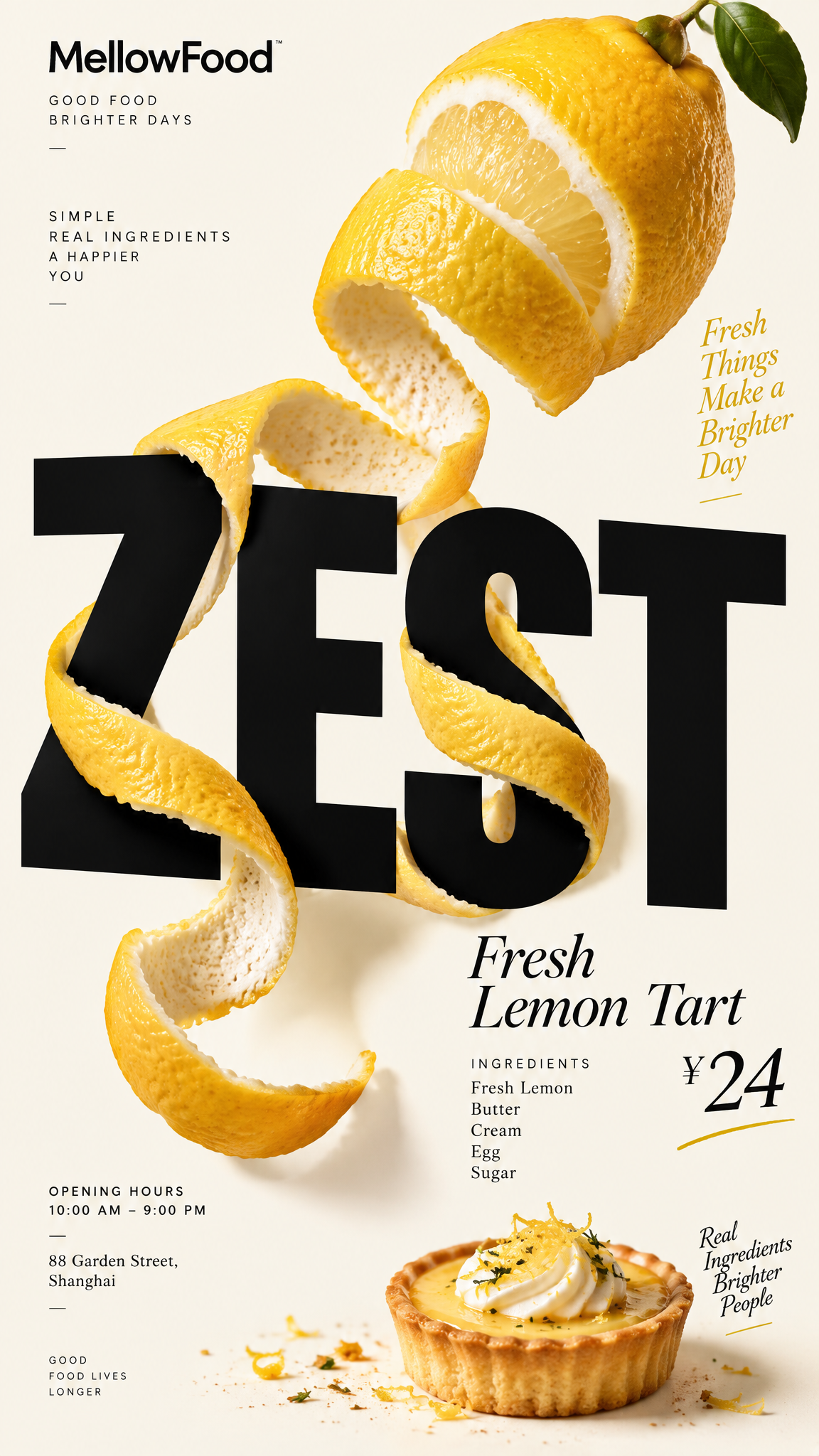
Brand: MellowFood: Fresh LemonHeadline: ZESTPhysical Interaction: PEEL & WRAP — A long continuous strip of fresh lemon peel is being removed from a real lemon, curling naturally through, around, in front of, and behind selected strokes of the oversized “ZEST” typography. The tension of the peel subtly pulls and bends the contacted letter edges.Accent Color: Lemon YellowProduct Name: Fresh Lemon TartPrice: ¥24Ingredients: Fresh Lemon, Butter, Cream, Egg, SugarOpening Hours: 10:00 AM – 9:00 PMAddress: 88 Garden Street, ShanghaiAspect Ratio: 9:16Create a premium editorial food poster where a real fresh lemon and its continuous spiral peel physically interact with and reshape oversized “ZEST” typography.Use a warm cream or soft ivory background, bold black Heavy Grotesk typography, photorealistic food materials, generous negative space, and a broken editorial grid inspired by high-end European food branding and contemporary magazine design.The lemon must not simply sit beside or overlap the typography. Treat the lemon, peel, and letters as solid physical objects existing inside the same three-dimensional world.Focus on one primary physical mechanism: PEEL & WRAP.Show one fresh yellow lemon with a long continuous strip of peel being naturally removed from its surface.The peel should curl outward from the lemon and travel directly through the oversized “ZEST” typography.It passes behind one letter stroke, emerges in front of another, wraps tightly around selected sections, and continues through the composition as one physically connected strip.Where the lemon peel tightens around the typography, its tension should subtly compress, pull, bend, or lift the contacted edges of the letters.The deformation must occur only at real contact points.The lemon peel should behave like real citrus skin: flexible but slightly stiff, naturally curling because of its structure, with realistic thickness, weight, tension, and gravity.Parts of the inner peel should reveal a soft pale-white pith texture while the exterior remains vibrant natural yellow.Create a strong contrast between the soft organic spiral of the lemon peel and the rigid geometric construction of the black typography.Keep most of the “ZEST” letters completely clean, hard, black, geometric, and highly readable.Avoid random liquify effects, excessive twisting, decorative ribbons, disconnected lemon peel, floating lemon slices, artificial splashes, generic 3D lettering, or digital-looking distortion.The lemon should be extremely photorealistic with natural pores, subtle imperfections, realistic highlights, fresh cut surfaces, and a rich but believable yellow color.Use a broken editorial grid with strong scale contrast and asymmetric placement.Make “ZEST” extremely large and dominant, occupying a substantial portion of the vertical composition. Allow selected parts of the typography to approach or extend beyond the image edges.Position the lemon asymmetrically rather than directly in the center.Let the long spiral peel create a visual path through the typography and guide the viewer’s eye across the composition.Maintain generous intentional negative space.Add small editorial information around the outer edges of the composition:INGREDIENTS — Fresh Lemon, Butter, Cream, Egg, SugarOPENING HOURS — 10:00 AM – 9:00 PMADDRESS — 88 Garden Street, ShanghaiAvoid traditional menu rows, long horizontal divider lines, boxed prices, rigid bottom information bars, centered menu layouts, and template-like compositions.Use bold Heavy Grotesk Sans Serif for the oversized “ZEST” typography.Use high-contrast Editorial Serif or Italic Serif for “Fresh Lemon Tart”, the price, and selected secondary information.Keep the palette minimal: warm ivory background, deep black typography, natural lemon yellow, pale citrus flesh, and vivid lemon yellow as the single accent color.The final image should feel fresh, clever, tactile, physical, premium, contemporary, and editorial.At first glance, the viewer should immediately recognize the fresh lemon and oversized “ZEST” headline.At second glance, the viewer should discover that the continuous lemon peel physically travels through, wraps around, and pulls parts of the typography.The contrast between rigid black letterforms and the organic curling citrus peel should become the central visual concept of the poster.
Copy PromptCopied!