Lululemon Premium Athletic Campaign Board Layout
Prompt
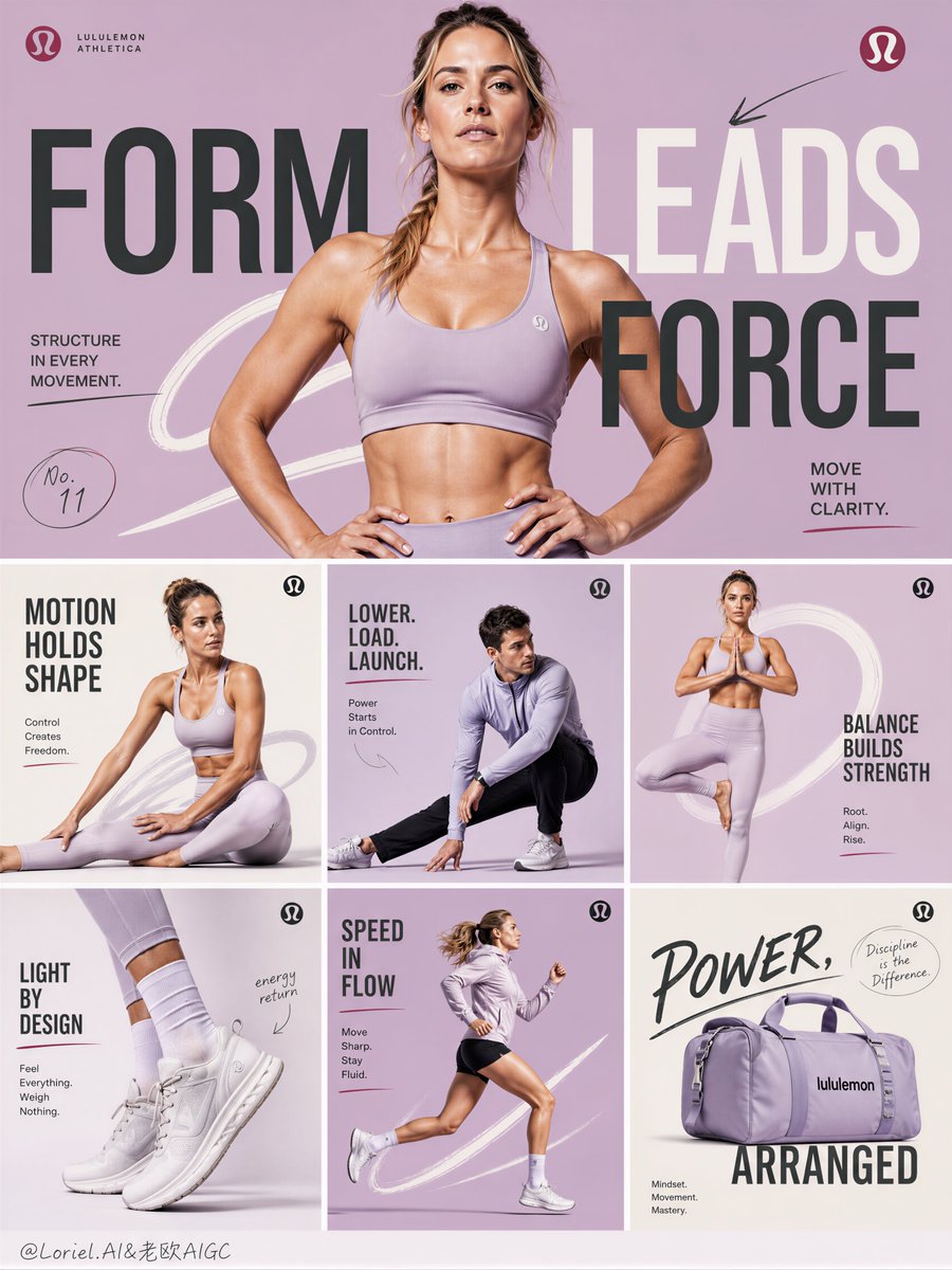
Create the eleventh poster in a unified campaign series for Lululemon Athletica, designed as a structured campaign board with one large horizontal hero banner and six smaller supporting panels arranged in a clean editorial system. The image must feel hyper-real, visually striking, fashion-forward, modern, and premium, with strong layout discipline, minimalist pure-color backgrounds, expressive narrative typography, and athletic figures interacting with hand-drawn graphic storytelling.
Overall layout:
Use a vertical poster composition divided into two major sections:
a large horizontal hero banner occupying the upper or central dominant area,
and six smaller rectangular panels arranged below or around it in a clean, rule-based grid system.
The composition must feel organized, rhythmic, and premium, like a complete seasonal campaign presentation rather than a random collage.
Critical layout rule:
The hero banner is the main visual anchor and must dominate the board.
The six smaller panels must feel like supporting campaign modules, each with its own motion theme, but all must clearly belong to the same Lululemon visual family.
The overall board must feel consistent, intentional, and highly art-directed.
Color system:
Shift the palette into a refined fashion-forward system built around:
cool pink-lilac,
powder lavender,
ivory white,
deep charcoal black,
and small controlled accents of soft berry or silver-gray.
The whole composition should feel cleaner, more elevated, and more contemporary than previous versions.
Each panel can vary slightly in tone, but the full board must maintain one unified color family.
Hero banner:
Create one large dominant hero panel featuring a healthy Western female athletic model as the main campaign face. She should have realistic anatomy, a strong fit physique, modern facial structure, and a poised editorial presence.
Her pose should feel confident, front-facing or slightly angled, with a clear high-fashion athletic attitude. This hero pose can be more grounded and commanding than explosive, acting as the visual center of the whole board.
Show authentic Lululemon Athletica apparel with premium realism, strong fabric clarity, and commercial readability.
Large typography should interact with the figure in a bold but elegant way, helping define the campaign message.
Six supporting panels:
Design six smaller campaign tiles, each showing a different supporting story through movement, product emphasis, or graphic narrative. Use a mix of figures and product-led frames such as:
a female athlete in a stretch or seated active pose,
a crouched or low stance action pose,
a standing balance pose,
a detail-driven footwear or apparel emphasis panel,
a motion-focused dynamic panel,
and a more product-centric or slogan-focused panel.
Each tile should still include either a real athlete, a Lululemon product focus, or both.
Each one must feel clean, premium, and visually distinct while following the same system.
Athletes:
Use healthy Western male and female athletic models with realistic anatomy, sculpted but believable physiques, and fashion-sport editorial presence. Their poses must feel physically correct, sharp, and modern. No distorted anatomy, no awkward hands, no influencer-style posing, no weak posture.
Wardrobe and product:
Show authentic Lululemon Athletica apparel and accessories throughout the board, rendered with extreme realism and premium fabric fidelity. Include a range of activewear pieces such as:
sports bras,
technical jackets,
cropped training tops,
leggings,
performance joggers,
shorts,
lightweight layers,
sneakers,
and possibly bags or accessories if compositionally useful.
All products must feel premium, technical, and highly wearable, with realistic folds, stretch tension, seam precision, matte performance surfaces, and strong brand clarity.
Typography:
Typography is a major storytelling device in both the hero banner and the six small panels.
Use large modern English words and phrases, w
Copy PromptCopied!editorial designHyper-realismExtreme RealismGrid SystemGPT Image