Premium Dicos 2x2 Grid Fast-Food Campaign Poster
Prompt
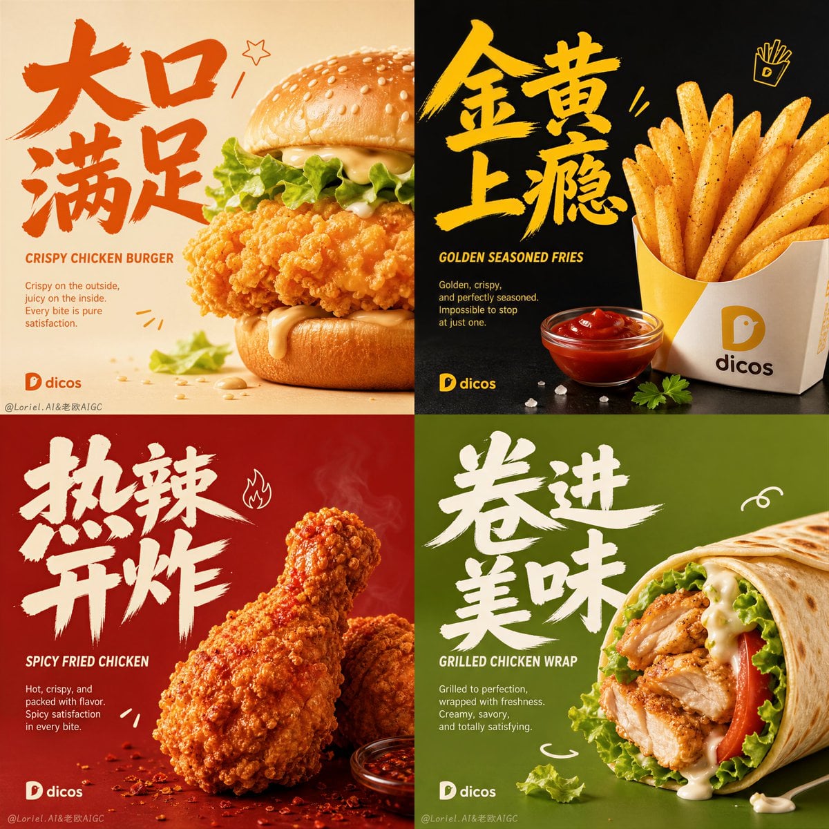
Create an ultra-premium 2x2 four-panel fast-food campaign poster for Dicos, transforming playful fast-food poster energy into a highly refined, product-dominant, design-annual-level commercial visual system. The final artwork must feel bold, youthful, appetizing, modern, and sharply art-directed, while keeping the food as the absolute hero. Use four square panels arranged in a strict grid, each panel featuring one different classic Dicos fast-food item, one much larger expressive Chinese main title, one smaller English subtitle, restrained supporting English copy, minimal official Dicos branding, and only a very small number of clean playful hand-drawn doodles.
Core composition:
Use a strict 2x2 grid. Each panel must preserve the same campaign rhythm:
1. one hero fast-food item dominating the right or center-right area,
2. one very large artistic Chinese hand-lettered title occupying the left or upper-left area,
3. one smaller English subtitle beneath or near the Chinese title,
4. one short supporting English copy block,
5. one refined Dicos logo or clean brand mark,
6. only a few minimal doodle accents integrated around the typography,
7. a clean foreground surface with a tiny number of crumbs, sauce accents, or ingredient echoes.
All four panels must feel like one unified campaign system.
Creative direction:
Combine Milk Cloud Orbit and Cream Halo Transit. Keep the exact four-panel skeleton, but intensify the strongest product-light details: cleaner fried-surface highlights, purer sauce reflections, brighter salt-crystal sparkle, more precise gloss on buns and wraps, and richer appetizing realism. At the same time, reduce the doodles so they become tighter, cleaner, and more intentional, and enlarge the Chinese titles so the graphic impact becomes stronger without stealing attention from the food.
Brand direction:
This is a Dicos campaign. Keep the brand unmistakably youthful, bold, friendly, and commercial, but elevate it into a premium design-annual visual system. Use Chinese main titles plus smaller English subtitles. The logo and brand marks must feel minimal, official, and clean. Typography must be artistic, energetic, and premium, never crude, never cheap.
Product lineup:
Create four self-invented but classic Dicos hero items:
Panel 1: signature crispy chicken burger
Panel 2: golden seasoned fries
Panel 3: spicy juicy fried chicken drumsticks
Panel 4: grilled chicken wrap with fresh vegetables and creamy sauce
Each item must feel iconic, craveable, realistic, and strongly differentiated.
Panel color worlds:
Give each panel a different saturated minimal color identity while preserving total campaign unity:
Panel 1: warm cream and toasted orange
Panel 2: deep charcoal-black and golden yellow
Panel 3: rich chili red and amber brown
Panel 4: fresh olive green and soft beige
The backgrounds must stay minimal, bold, smooth, and spacious.
Food realism:
Render every item with extreme realism and premium tactile detail: crispy fried coating, golden crumb texture, juicy chicken fibers, glossy burger bun, fresh lettuce moisture, melted sauce sheen, realistic potato texture, salt crystals, pepper specks, tortilla surface detail, char marks, subtle steam, and appetizing oil highlights. The food must feel hot, fresh, crunchy, and physically irresistible.
Milk Cloud Orbit product-light logic:
This is critical. Increase the purity of highlights on fried crust, salt crystals, sauce surfaces, bun reflections, wrap gloss, and key ingredient edges. The food must feel brighter in the right places, cleaner, hotter, and more luxurious without becoming greasy or artificial. Let every hero item read like a flagship product key visual.
Cream Halo Transit layout logic:
Keep the same composition skeleton, but compress the decorative layer. Reduce the number of hand-drawn doodles so they become more refined and selective. Enlarge the Chinese titles so they occupy more of the panel and create a stronger graphic identity. The larger type and
Copy PromptCopied!saturatedYouthfulAppetizingExtreme Realismhyper-detailedCrispyGlossy2x2 GridSymmetricalAdvertisingother